Charts and line charts Excel for making reports and presentations
Principles of constructing presentable charts and diagrams in Excel in forming analytical or statistics reports.Building of diagrams and charts
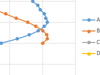
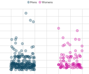 How to Create Jitter Scatter Chart for Statistics in Excel.
An example of creating a scatter chart of jitter distributions in the statistical data view for visual analysis of the most popular values. Free Download MS Excel Chart Template.
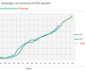 How to Make Forecast Using Holt Winters Model in Excel.
An example of making a forecast of future values using the Holt-Winters algorithm model. Download a chart template with a forecast of the dynamics of trend changes.
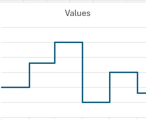 How to Create a Step Chart in Excel Download Template.
Download a template with an example of how to make a step chart for a detailed and convenient visual analysis of the history of indicators by time periods.
 Drawing of charts and diagrams in Excel.
The methods for rapid construction of graphs and diagrams for ready-made templates. Why do you need to create graphs and charts for data tables? The advantages of graphs in data representation.
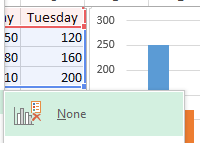 How to change the chart in Excel with the settings of the axes and colors.
There are editing and customizing charts. Deleting of the legend and changing the signatures of the axes. Adding a data table to the chart. Changing the color of the columns.
 How to build a chart on a table in Excel: step by step instruction.
How to build a dynamic diagram on a table in Excel? How to quickly add data to an existing histogram? Creating Gantt charts. A step-by-step guide for creating dynamic charts and diagrams.
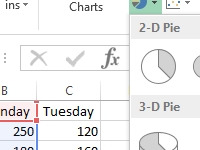
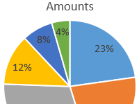 Percent charts in Excel: creation instruction.
How to construct a percentage chart: circular and columnar (histogram). A step-by-step guide with pictures. Percentage ratio on different types of diagrams.
 Draw charts in excel according to the table.
The rules for plotting under various conditions with the ability to edit the elements of graphs.
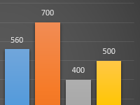
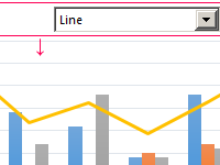 How to create a column chart and to combine it with a line in Excel.
Histograms: updated and accumulated, the sequence of their construction. In which cases is it necessary to combine the histogram with the graph and how?
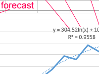 Trendline in Excel on different charts.
Examples of adding, managing and constructing a trend line on different types of graphs. And also the mapping of its equations and functions. Equations on graphs with a trend line.
