Trendline in Excel on different charts
Trendline is applied for illustrating price change trends. The element of technical analysis is a geometrical representation of the mean values of the analyzed indicator.
Here's how to add a trendline to a chart in Excel.
Adding a trendline to a chart
For example, let’s take average oil prices since 2000 from open sources. Type the analysis data in the spreadsheet:

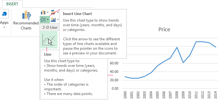
- Create a chart based on the spreadsheet. Select the range A1:P2 and click on the «Insert»-«Charts»-«Insert Line Chart»-«Line». Choose a simple graph out of the offered chart types. The horizontal direction represents year, and the vertical one shows price.
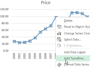
- Right-click the chart itself. Click «Add Trendline».
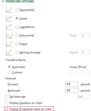
- The window for setting line parameters opens. Select the line type and enter R-squared value (the approximation accuracy value) in the chart.
- A skew line appears on the chart.
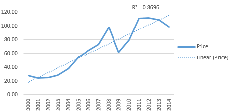
Trendline in Excel is an approximating function chart. It is used for making predictions based on statistical data. To this end, we need to extend the line and determine its values.
If R2 = 1, the approximation error is zero. In our example, the choice of the linear approximation has given a low accuracy and poor result. The prediction will be inaccurate.
Note: that a trendline can not be added to the following types of charts and graphs:
- radar;
- circular;
- surface;
- doughnut;
- stereogram;
- stacked.
Equation of trendline in Excel
In the example above the linear approximation has been chosen only for illustrating the algorithm. The R-squared value demonstrates that the choice has not been successful.
It is necessary to choose the type of representation that will best illustrates the trend of changes in the data entered by the user. Let’s examine the options.
Linear approximation
Its geometric representation is a straight line. Hence, linear approximation is used to illustrate the indicator which increases or decreases at a constant rate.
Let’s consider the conditional number of contracts concluded by a manager for 10 months:
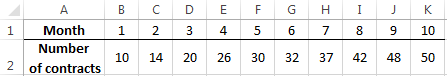
Based on the Excel spreadsheet data make a scatter chart (it will help illustrate a linear type):
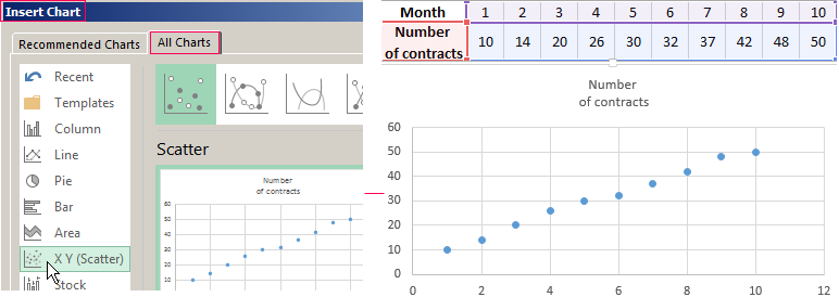
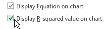
Highlight the chart, select «Add Trendline». In the settings, select the linear type. Add the R-squared value and the equation of a trendline (simply tick the box at the bottom of the «Options» window).
We get the result:
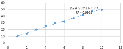
Note that in the linear approximation type data points are located very close to the line. This type uses the following equation:
y = 4,503x + 6,1333
- where 4,503 – slope indicator;
- 6,1333 - offset;
- y - sequence of values,
- x - period number.
The straight line on the graph shows a steady increase in the quality of the manager's job. The R-squared value is equal to 0.9929, indicating a good agreement between the calculated straight line and the source data. Forecasts must be accurate.
To predict the number of concluded contracts, for example, in period 11, it is necessary to put number 11 instead of x in the equation. After calculating, we find out that in period 11 the manager will conclude 55-56 contracts.
The exponential trendline
This type is useful if the input values change with increasing speed. Exponential approximation is not applied if there are zero or negative characteristics.
Let’s create an exponential trendline in Excel. Take for example the conditional values of electric power supply in X region:
Make the chart «Line with Markers». Add the exponential line.
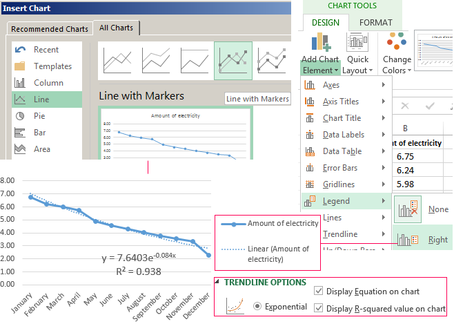
The equation is as follows:
y = 7,6403е^-0,084x
where:
- 7.6403 and -0.084 – constants;
- e – base of natural logarithm.
The indicator of R-squared value is 0.938, which means that the curve corresponds to the data, the error is minimal, and the forecasts will be accurate.
Logarithmic trendline and sales forecast
It is used for the following indicator changes: first, rapid growth or decrease, then - relative stability. The optimized curve adapts well to this value "behavior". The logarithmic trend is suitable for forecasting sales of a new product that has just entered the market.
The initial task of the manufacturer is to expand the customer base. When the goods have their buyer, it will be necessary to hold and serve him.
Make a chart and add a logarithmic trend line for a conditional product sales forecast:
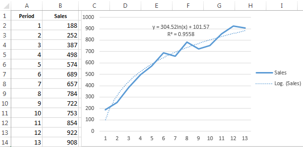
R2 is close in value to 1 (0.9558), indicating the minimum error of approximation. Let’s forecast sales volume for further periods. To do this, put period number instead of x in the equation.
For example:

To calculate forecast figures we use the formula: =304.52*LN(A18)+101.57, where A18 is period number.
Polynomial trendline in Excel
This curve features alternate increase and decrease. The degree (by the number of minimum and maximum values) is determined for polynomials. For example, one extreme (minimum and maximum) is the second degree, two extremes make the third degree, three extremes – the fourth one.
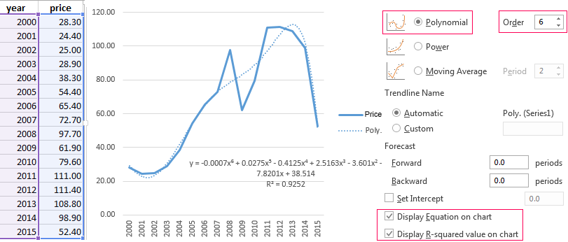
A polynomial trend in Excel is used for the analysis of a large data set of unstable value. Let's look at the example of the first set of values (oil prices).
Table of oil price dynamics by years:
| Year | 2000 | 2001 | 2002 | 2003 | 2004 | 2005 | 2006 | 2007 | 2008 | 2009 | 2010 | 2011 | 2012 | 2013 | 2014 | 2015 |
| Price per barrel | 28.30 | 24.40 | 25.00 | 28.90 | 38.30 | 54.40 | 65.40 | 72.70 | 97.70 | 61.90 | 79.60 | 111.00 | 111.40 | 108.80 | 98.90 | 52.40 |
Download examples of graphs with a trendline
To get this R-squared value (0.9252), we had to put the sixth degree.
However, this trend allows for making more or less accurate predictions.
