What pivot table toolbar button update data in Excel
We have to work with pivot Excel tables in different areas. You can quickly process large amounts of information, compare and group data. This greatly facilitates the work of managers, sellers, executives, marketers, sociologists, etc.
Pivot tables allow you to quickly generate different reports on the same data. In addition, these reports can be flexibly configured, modified, updated and detailed.
Creating a report with a pivot tables wizard
We have a training table with the data:
| Product Name | Date | Store number | Amount | Seller |
| Table | 2/1/2017 | 1 | $23,450.00 | Alex |
| Chair | 12/12/2017 | 2 | $17,200.00 | Blake |
| Double bed | 3/25/2017 | 2 | $- | Blake |
| Armchair-bed | 3/10/2017 | 2 | $1,210.00 | Alex |
| Soft chair | 4/25/2017 | 1 | $- | Ashley |
| Sofa "book" | 2/28/2017 | 1 | $13,420.00 | Ashley |
| Corner sofa | 1/5/2017 | 3 | $1,278.00 | Caroline |
| Single bed | 3/17/2017 | 3 | $1,260.00 | Caroline |
| Cupboard | 4/4/2017 | 3 | $130.00 | Caroline |
| Armchair leather | 3/24/2017 | 1 | $23,780.00 | Alex |
| Armchair wicker | 1/30/2017 | 2 | $120.00 | Blake |
| Rocking chair | 4/21/2017 | 2 | $10,500.00 | Alex |
| Bench | 3/17/2017 | 3 | $870.00 | Ashley |
| Stool | 3/18/2017 | 3 | $750.00 | Blake |
This table can be copied directly to Excel. It should look something like this:
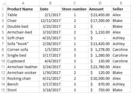
Each line gives us an exhaustive information about one transaction:
- which store sold the goods;
- name of goods and amount of sale;
- what seller sold the goods;
- when (day, month).
If this is a huge chain of stores and sales are growing, then within three months the size of the table will become horrendous. It will be very difficult to analyze the data in a hundred lines. And it will take a day to compile the report. Pivot table is necessary in this situation.
Let’s create a report using the pivot table wizard. It is hidden deep in the settings in new versions of Excel for some reason:
- Select «FILE»-«Excel Options»-«Quick Access Tollbar».
- In the drop-down list of the left column: choose «All Commands» in the field «Choose commands from:».
- Search by alphabetical order in the left column and select: «PivotTable and PivotChart Wizard». Click on the button between the columns: «Add» to move the tool to the right column and click OK.
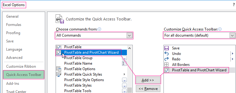
Now the tool is in the Quick Access Toolbar, which means that it's always will be in touch.
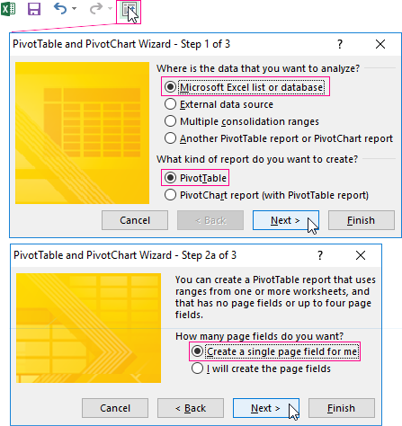
- We put the cursor anywhere in the data table. We call the pivot table Wizard by clicking on the appropriate tool, which is now located on the Quick Access toolbar.
- For the first step select the data source for the pivot table. Choose «Microsoft Excel list or database». Click «Next».
- For the second step we define the range of data on which the report will be based. The range will be indicated automatically since we have a cursor in the table.
- For the third step Excel offers you to choose where to put the pivot table. Click «Finish» and the layout opens.
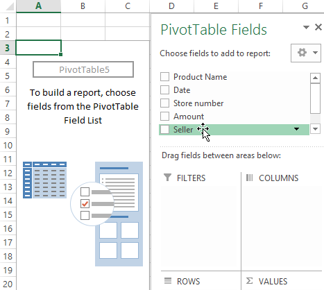
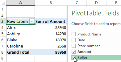
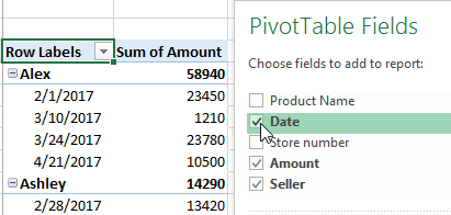
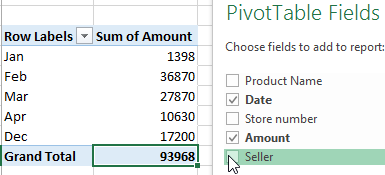
- You must specify the fields to display in the report. Let's say we want to know the amount of sales for each seller. Put ticks and get next pivot table:
A made-up report can be formatted and modified.
How can I update the data in the Excel pivot table?
This can be done manually and automatically.
Manually:
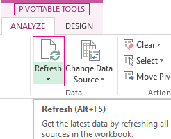
- We put the cursor anywhere in the pivot table. As a result, the tab «PIVOTTABLE TOOLS»-«ANALIZE» becomes visible.
- In the «Data» menu click the «Refresh» button (or use ALT + F5 hotkey combination).
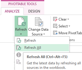
- Select the «Refresh All» button (or CTRL + ALT + F5) if you want to update all reports in the Excel workbook.
Configuring automatic updates when changing data:
- On the «PIVOTTABLE TOOL» tab (you need to click on the report) select the «Options» menu.
- In the «Data» section check the box next to «Refresh data when opening the file».
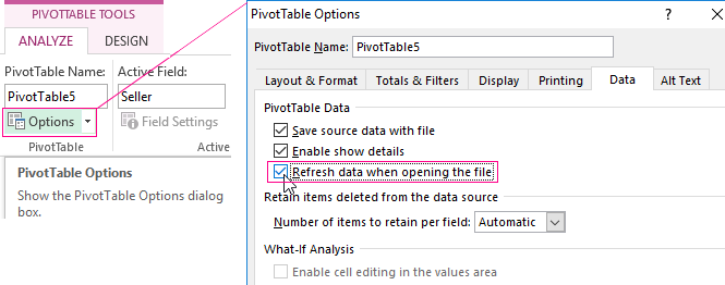
Now the pivot table will be automatically updated each time you open a file with changed data.
Few secrets about formatting
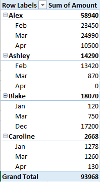
When we summarize a large amount of data in a report, grouping may be necessary to draw conclusions and make some decisions. Let's say we need to see the results for a month or a quarter.
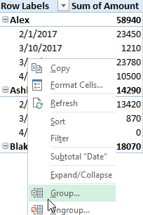
Group by date in the Excel pivot table:
- Source of information is a report with data.
- Select any cell with the corresponding value since we need grouping by date. Right-click.
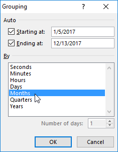
- From the drop-down menu select "Grouping". A tool opens which look like this:
- Excel automatically put the starting and ending dates of the data range in the fields «Starting at:» and «Ending at:». Let’s determine the grouping step. For our example it is months or quarters. Let's dwell on the months.
We get a report, which clearly shows the amount of sales by months. Let’s make experiment and set the step with «Quarters». The result is a pivot table of the next form:
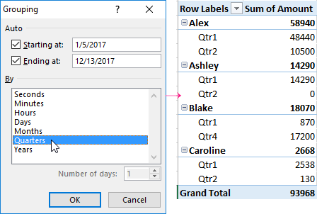
We can generate a report with quarterly income if the surname of sellers is not important for the activity analysis of the chain store.
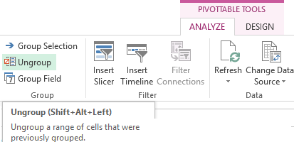
To remove grouping results you must right-click on the cell with the data and press ungroup. Or you may select this option in the «PIVOTTABLE TOOLS»-«ANALIZE»-«Group»-«Ungroup» (SHIFT+ALT+LEFT) menu.
Working with the totals
We have a pivot report looks like this:
The results are shown by months (made by «Group») and by the names of the goods. Let’s make the report more convenient for analysis.
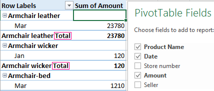
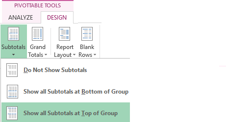
How to make the totals in the pivot table atop:
- «PIVOTTABLE TOOLS»-«DESIGN» . On the «Layout» tab click «Subtotals». Select «Show Subtotals at Top of Group».
- You get the following report type:
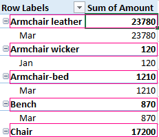
There is no more congestion which made difficult the perception of information.
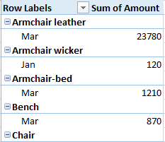
How to delete subtotals? On the layout tab choose «Do Not Show Subtotals»:

We will receive the report without additional sums:
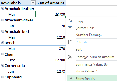
How to detail the information?
Huge pivot tables which are compiled on the basis of "another's" tables, periodically need to be detailed. We do not know where the amount from the specific Excel cell came from. But you can find out this if you split the pivot table into several sheets.
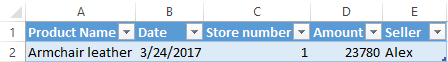
- There were sold double beds for the amount of 23 780 USD in March. Where did this figure come from? Select the cell with the given amount and click the right mouse button and select the option:
- A table with goods sales data opens in the new sheet.
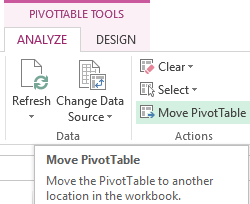
We can move the entire pivot table to a new worksheet by clicking the «Move PivotTable» button on the «Actions» tab.
By default, the data table contains absolutely all the information from the column that we add to the report.
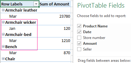
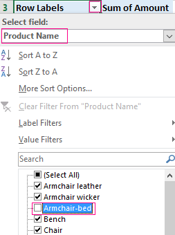
In our example it is ALL products, ALL dates, ALL amounts and stores. Perhaps the user does not need some elements. They just clutter up the report and put a crimp into focusing on the main thing. We remove unnecessary elements.
- Click on the arrow at the column name where we will adjust the amount of information.
- Choose the field name from the drop-down menu. In our example, this is the product name or the date. We will dwell on the product name.
- Set the filter by value. Exclude information on single beds from the report. Remove the checkbox next to the product name.
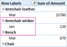
The table changes after clicking OK.
