Beautiful Pie Chart for Beginner Designers in Excel
Order-to-sale conversion analysis helps identify weak stages in the sales funnel and improve the performance of the sales team. With Excel, you can quickly create a beautiful pie chart that visually presents the ratio of received orders to closed deals.
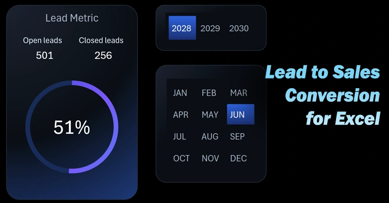
Beautiful Excel Pie Chart to Present Lead Conversion
The conversion rate is the calling card of the sales department. By using standard Excel tools for data visualization and creative color design ideas, you can create impressive interactive presentations.
How to build a conversion pie chart in Excel? If you're a beginner data visualization designer, this video tutorial will help you with the example:
- Create a layout design for placing the data visualization and button blocks.
- Create a smart table in Excel based on the source data.
- Use the smart table as a data source for a pivot table in Excel.
- Use the dynamic GETPIVOTDATA formula to selectively extract final values from the pivot table.
- Create a metrics table for open and closed leads to build the interactive chart template.
- Adjust the default doughnut chart settings and apply a color palette for an eye-catching design.
- Add dynamic data labels linked to Excel formulas.
- Use pivot table slicers as buttons to control data visualization in Excel.
- Customize the appearance of the pivot table slicer buttons and create a new design based on the template.
- Present Excel's capabilities for creating a stylish design of an interactive data visualization presentation.
Where can you use a lead-to-sale conversion chart template? This type of compelling visualization fits seamlessly into the UI design of any Excel dashboard:
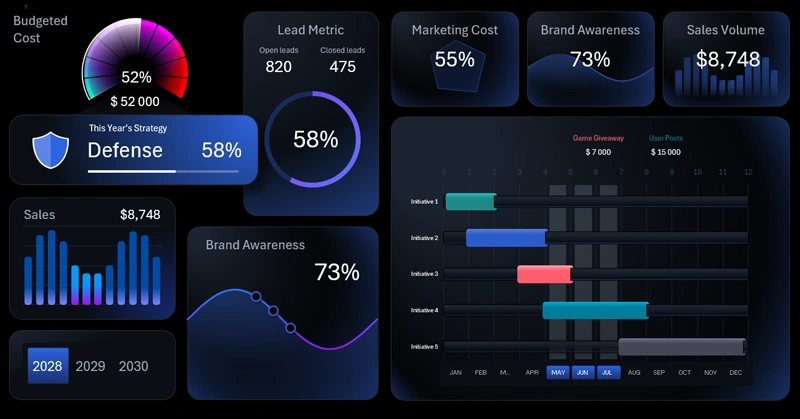
Dashboard for Analyzing Marketing Strategy in Excel.
A clear pie chart allows for a quick assessment of sales funnel effectiveness. This Excel tool helps visualize critical information for timely action. It’s very important to make informed decisions on time to boost conversion.


Data Visualization Charts for Interactive Report Creation in Excel.
Dashboard Templates