Consolidated Excel dashboard for logistics route analysis
Effective logistics requires precise analysis of routes and resources. A consolidated Excel dashboard allows you to combine transportation data, visualize key metrics, and make quick decisions to optimize routes.
Main features of a consolidated logistics dashboard
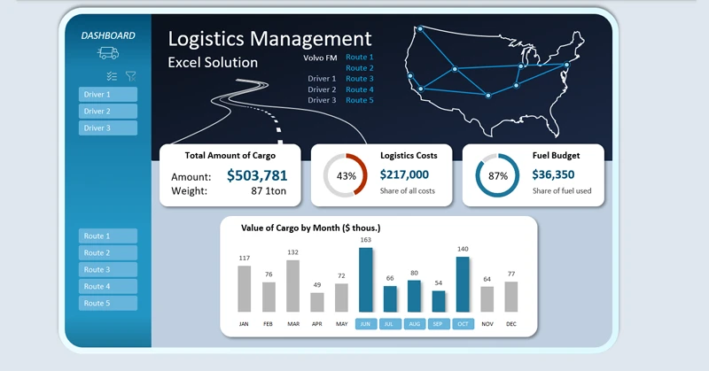
The user can flexibly filter conditions using pivot table slicers. Slicer buttons provide interactive capabilities in the Excel dashboard and are highly functional. For example, the user can perform multi-selection of data, selecting multiple routes for several drivers across multiple months or quarters simultaneously. This allows for flexible configuration of conditions to maximize the optimization of logistics routes in terms of transportation cost efficiency.
Visualizing routes and KPIs on the dashboard allows you to assess transportation efficiency and identify bottlenecks. If you are interested in this template, we recommend checking out the full dashboard with advanced logistics analytics features:

Dashboard for supply chain management in Excel
The consolidated mini logistics dashboard in Excel transforms route data into a clear and interactive control panel. It helps to:
- Monitor delivery times.
- Optimize resources.
- Increase the efficiency of the logistics team.
- Make processes more transparent and manageable.
How to create, configure, and use a consolidated dashboard in Excel is shown in this video tutorial:
Download the consolidated logistics analysis dashboard in Excel

Data Visualization Charts for Interactive Report Creation in Excel.
Dashboard Templates