Doughnut and Bubble Chart for Excel Dashboard Template
Let's consider two examples of presenting three metrics on Excel charts. Each visualization example has its own advantages and disadvantages. Therefore, making a rational choice is to use both examples simultaneously on one dashboard.
How to Create a Doughnut Chart with Three Values in One Direction

First, let's create the first visualization example based on a doughnut chart for three variable values. Suppose we need to display a comparison of the top 3 best metrics with each other over a specific reporting period.
Preparing the Source Data
Prepare a table with the source data. Note that there are empty rows between the value rows of the table. There should be one empty row between each row with a value. This is necessary to create a stylish and easily perceivable design of the doughnut chart with three values in one direction.
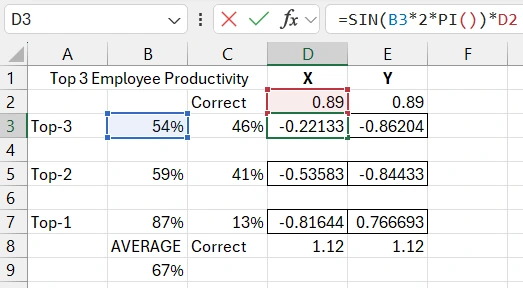
In column B, fill in the source values in percentage format cells. In column C, there is a formula for calculating the share of the remainder from 100% after subtracting the source value. Columns D and E will contain formulas for calculating the coordinates of the points. The position of the points dynamically changes around the chart, so we will need to use the sine function in the formulas to calculate the position on the X-axis and the cosine function to calculate the coordinates of the points on the Y-axis.
Creating a Doughnut Chart Template in Excel
Select the source table for the chart in the range A3:C7 and create a doughnut chart through the menu Insert – Charts – Doughnut. Use the switch rows and columns button. After all, the values will change on the chart in one direction.
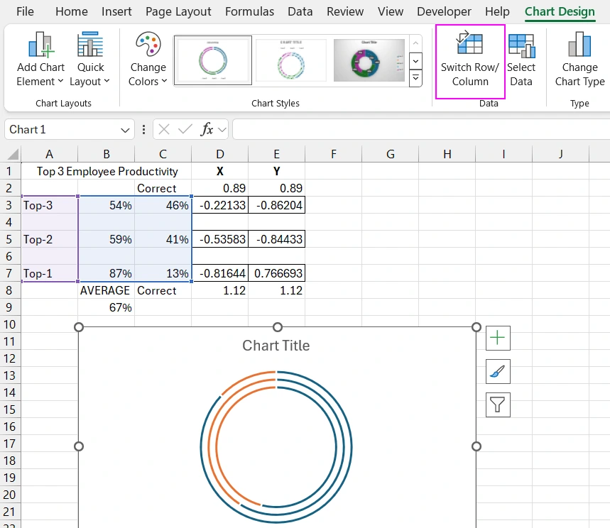
Now, to decorate the Doughnut Chart, add three more data series using the "Select Data Source" tool. At this stage, each new series will refer to the Y values in column E, in turn. Each series name starts with the word "Light".
Now, for all three new data series, change the chart type to Scatter, resulting in points for which the formulas calculated the coordinates. Set and fix the minimum and maximum values on the coordinate axes so that the points are exactly in place.
The Scatter points are still not in place because they still need to specify not only Y but also the X value to determine their position on the doughnut chart. Again, use the "Select Data Source" tool, and now, after changing the chart type to Scatter, we have the opportunity to fill in another field in all three new added data series to specify the X value.
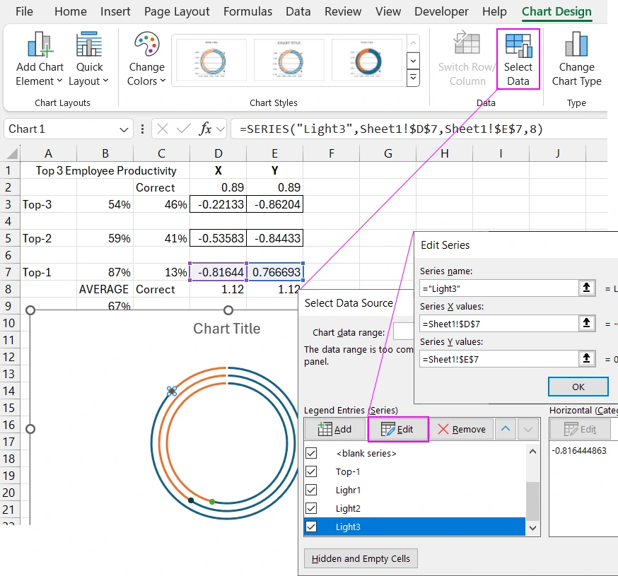
The logic of managing the placement of points on the chart is now clear. Now we need to make adjustments because we are using a three-layer doughnut chart in one direction of presenting all data series.
When adjusting for the third and first values, slightly change the formulas for calculating the coordinates on the XY axes. Now all points are in place.
Creating a Mini Dashboard for Presentation in Excel
On a new sheet, create a rounded rectangle shape with gradient background and border fill to design the visualization.
How to Create a Beautiful Design for a Chart in Excel
Transfer the combined doughnut chart with points to the created panel. Set the size, location, and create a stylish design.
Fill the remainder segments with a solid dark color. Fill the value sectors with a gradient fill from the same dark color to magenta at a 90-degree angle.
Create beautiful starbursts from the points on the chart. To do this, use the Scatter chart marker color and size settings. Add a glow effect to the marker points. Set the size to 39 points and transparency to 60%. The light color is magenta.
Add a text label referring from the TextBox element to the cell with the name of the source table B1. Specify the reference in the formula when the TextBox element is selected. Only then format the size and color of the label font.
We will need another formula in cell B9 from one function to calculate the arithmetic mean value of the three source values. And display the result of the formula on the visualization using a reference from a new TextBox element.
How to Create Interactive Buttons for the Dashboard in Excel
We will create interactive elements and functionality for visualizing a doughnut chart with three values. To do this, we will use a pivot table and slicer buttons. Suppose the database for the top three metrics for the week is in the table located in the range H2:K8. For example, we will fill the table with random relative values in percentages for each day of the week. Use the formula from the RANDBETWEEN function divided by 100. Copy the random calculation results and paste only the values into the same range so that they no longer update. Then sort each column separately and use the SUM function to find the highest, average, and lowest values from the three columns to fill the mini-database accordingly.
Select the entire database table and create a pivot table based on it. In the pivot table designer, specify the days of the week as row headers. All other data columns are automatically added to the values field.
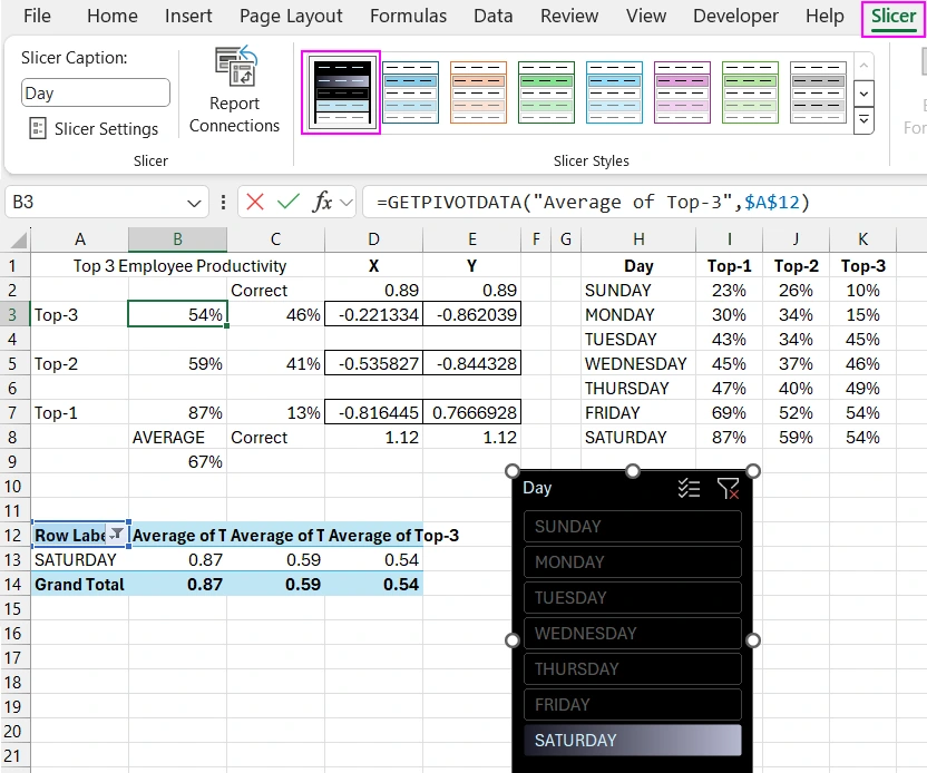
Change the final values in each column of the pivot table to averages in the field settings because we are using percentages. Only then connect the final values from the pivot table to the chart's source table using formulas with the GETPIVOTDATA function.
Create a slicer element based on the pivot table and design it.
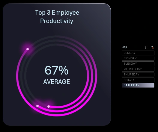
Check the interactive capabilities of the doughnut chart with three values in the comet or three-star flight design style.
How to Create a Bubble Chart with Three Variables in Excel
Now, for comparison, let's create another visualization using a bubble chart. First, create the source table for the chart in the range H10:K13. The table also consists of three variable values, as in the previous example. The values in the X and Y columns are constants, they do not change, as this is necessary for the design. Only the variable values in the last column Rank change.
Creating a Bubble Chart Template for Three Values
Select all the rows of the source table in the range H11:K13 and create a bubble chart by selecting Insert – Charts – Bubble. Without deselecting the new chart, choose the "Select Data Source" tool to edit the data series references. The value ranges in the reference arguments should cover the vertical axis. Fill in all fields accordingly and without errors.
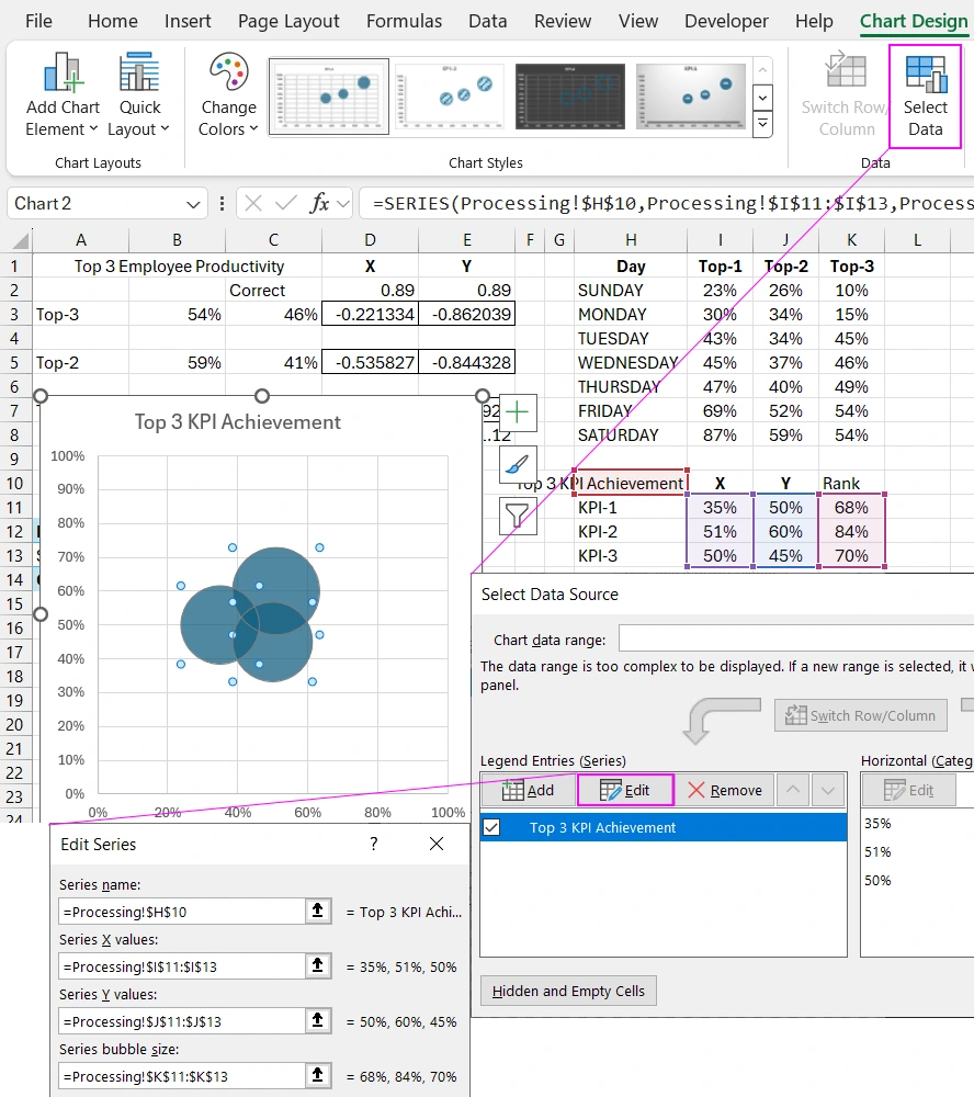
Now, set the minimum value to 0% and the maximum value to 100% for the coordinate axes.
Here is an important point for the beauty of this type of visualization design. We need to set proportional height and width sizes for the chart so that everything looks nice. When resizing, maintain the proportion, so always hold the SHIFT key on the keyboard when changing the size of this chart.
Connecting the Bubble Chart to the Dashboard
Prepare a space for the new data visualization block. Copy the label and the rounded rectangle shape simultaneously. Transfer the bubble chart template to the new panel. Create a design and resize it, but do not violate the height and width proportion of the chart. Hold the SHIFT key on the keyboard when resizing with the mouse.
Use gradients with semi-transparent colors and different directions for filling the bubbles.
Add new columns to the mini-database for the second visualization block and fill them with random values as before.
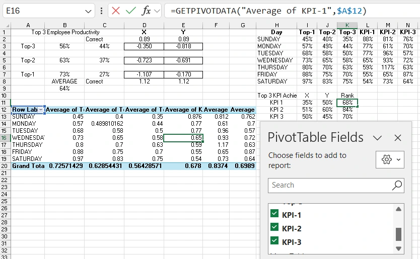
Now inform the pivot table that the database has been expanded. To do this, change the reference arguments to the new data range for the pivot table. Use the pivot table analysis tool – change data source. In the "Table Range" input field, specify the reference to the new range. As a result, new data appeared in the designer. Connect them by checking the box, and the pivot table will expand.
Again, change all final values of the pivot table to averages in the field settings. Only then connect the final values to the source data table for the bubble chart.
Presenting the Mini Dashboard in Excel
Check the final result of presenting all data visualization blocks with three values.
As you can see, each visualization chart for comparing three values has its own advantages and disadvantages. Therefore, it will be useful for an Excel dashboard developer to learn how to create both visualization styles.
Download doughnut and bubble chart with three variables in Excel 
