Download Interactive Weekly Sales Chart in Excel
Example of creating an interactive weekly chart for analyzing sales of different categories by day throughout a week. The large, daily, external bars on the chart represent the sum of the small intraday bars of the sales quantity for each category.
Example of How to Build a Weekly Chart in Excel
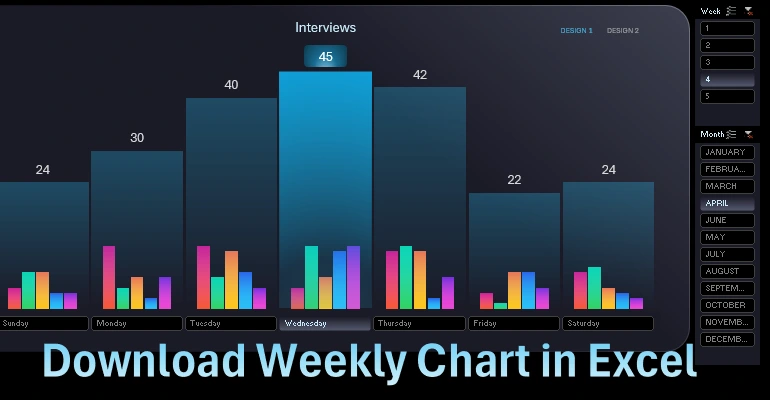
On a single combined chart, we can visually analyze data for each day of the week. This is a very convenient chart and is often used in practice. It effectively visualizes data.
Formulas for the Source Data Table
Create a table to fill in the source data. The table structure includes column headers for the days of the week and row headers for the data categories for each day. To start creating the chart template, fill the table with random data.
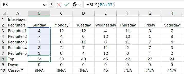
The row labeled "Top" contains a formula summing all category intraday values for each day of the week. The row labeled "Down" simply contains zero values. We need this for the design of a combined and functional layout.
The row labeled "Cursor Y" will later contain a conditional logic formula. The formula will be specified when the source table is connected to the database, and for now, we simulate the logic formula values. One day, "Wednesday," contains a final value, and all other days show a data error.
Creating a Template Chart with Daily and Intraday Bars
Select all values from the table to create a combined chart template. Choose "Insert," "Charts," "2D-Column," "Clustered Column."
We see that the default chart structure is not suitable for our task. Reverse the chart structure by clicking the "Switch Row and Column" button.
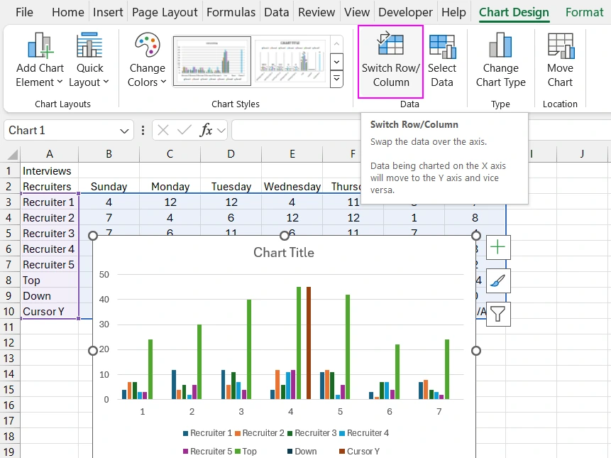
Now the data structure on the chart is organized according to our task requirements.
For the "Top" data series, change the chart type to a line chart. Do the same for the "Down" data series by changing the chart type to a line chart.
For the "Cursor Y" data series, change the chart type to Scatter. This adds unnecessary auxiliary vertical and horizontal axes to our chart template. Disable them using the "Change Chart Type" tool. In the "Combo" section, uncheck the "Secondary Axis" column for all data series. Click "OK."
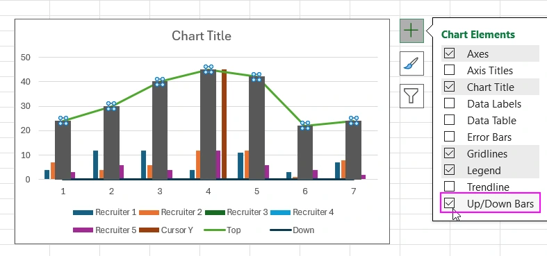
Click the large plus button in the upper right corner of the chart template to open a dropdown menu. Uncheck the unnecessary options to clean up the template and give it a minimalist design style.
Now select the "Top" data series and check the last option in the dropdown menu, "Up and Down Bars."
Next, open the additional "Format Data Series" window and set the gap width between bars to 3%.
Adjust the colors and gradient fill parameters for all bars. Pay attention to the color codes.
Be sure to use color transparency settings to display all visualization data behind the daily bars of the chart.
On a new "DASHBOARD" sheet, set a black fill background for the entire sheet and create a large rounded rectangle shape for the chart panel design.
Use gradient fill for the rounded rectangle shape and its border line.
Move the combined weekly sales chart template to the new "DASHBOARD" sheet and resize it to fit the rounded rectangle shape.
Customize the design of the interactive weekly sales analysis chart.
Remove the line and make the template background transparent. Make the "Top" series line transparent. Similarly, disable the "Down" series line visibility. Add data labels to the "Top" series above the bars. Customize the color and font size of the labels.
How to Create a Chart with an Interactive Cursor
It's time to start designing the cursor on the weekly sales chart. Select the "Cursor Y" data series and add the rarely used "Error Bars" option from the plus dropdown menu. But add it not with a checkbox, but with the "More Options" submenu option. Note that by default, horizontal "X Error Bars" are added, but we are interested in vertical ones. Therefore, select "Y Error Bars" from the Excel "Current Selection" tools group dropdown list. Next, in the "Error Bar Options" section of the additional parameters window, in the "Error Amount" section, select the "Custom" option and click the "Specify Value" button. In the second input field "Negative Error Value," specify the reference to the range of values in the source table on the "Cursors Y" row – it is: =Processing!$B$10:$H$10. The first "Positive Error Value" field should be completely empty. Then, with a single click of the mouse, select the horizontal bars and press the "Delete" key on the keyboard to remove them. It is also very important in the "Error Bar Options" section of the additional parameters window to select the "Minus" option in the "Vertical Error Bar," "Direction" section.
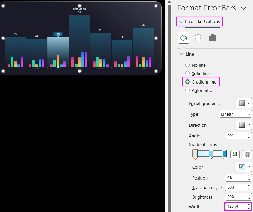
Set the line width of the Error Bar to 125 points and give the cursor its own unique gradient fill that will highlight the cursor against the background of the daily bars. The cursor's gradient fill settings should also have semi-transparent colors to avoid obstructing the view of the intraday bars of the weekly sales chart.
Now select the "Cursor Y" data series and add data label elements to it from above. The font size of the cursor labels should match the font sizes of the other data labels on the chart. Then, right-click on the area of the cursor data labels and select the "Change Data Label Shapes" option from the context menu. A dropdown menu with the "Data Label Shapes" panel will open. Select the "Rectangle: Rounded Corners" shape to design the cursor data labels and immediately apply gradient fill and resize them. To resize, double-click the label shape. The cursor series marker can be hidden by disabling its background fill and border.
To decorate the sales chart design, change the color of the horizontal X-axis lines.
Now we need to color the intraday bars of the data categories. To easily access them with a single mouse click, we will disable the "Top" data series from view. Use the "Select Data" tool and uncheck the "Top" series to temporarily disable it for access to the intraday category bars. The external daily bars of the "Top" series are on the top layer of visualization above the category bars within each day of the week. The daily bars are semi-transparent but do not allow clicking to select the intraday category bars. Access to them can only be obtained from the dropdown list of all chart elements. Therefore, temporarily disable the large, daily, external bars and open access to the small internal category bars simultaneously for each day of the week.
On the "Resources" sheet, we already have pre-prepared gradient fills on rectangle shapes for each intraday bar. At the bottom, you can download the interactive weekly sales chart template, which also contains rectangle shapes with pre-prepared gradient fills on the "Resources" sheet. If you are making your template based on a video tutorial, all gradient color codes are shown on the screen. Use the pause button on the YouTube player.
Reconnect the external daily bars of the "Top" series.
We have created a cursor for convenient visual analysis on the weekly sales chart. Now it's time to make it interactive. It's also time to connect the database to the source table since we have almost completed the development of the weekly sales chart template.
On the "Data" sheet, there is a table with real data on sales figures for all categories throughout the year. Combine all the table values into one database using a named range and call it "mydata" for connection. Select the range of cells A1:I366 and in the "NameBox" input field, specify the name for this range "mydata."
Without deselecting the area, proceed to create a pivot table, but in the parameters, instead of the range reference, specify the name of the newly created database "mydata" in the "Table Range" input field. In the second "Location" input field, specify the reference to cell A3 on the pre-created "Control" sheet.
In the pivot table constructor, use the "Day" field for rows and all sales categories for values.
We will need two such pivot tables, so copy the already created table to cell A17. Now, based on the second copied pivot table, create three data slicers. For the three fields "Month," "Week," and "Day." These will be our interactive controls for the weekly sales chart.
Create a new slicer style template. First, duplicate any existing slicer style template, then modify it. Design the slicer and configure the fill background colors for the enabled and disabled buttons. Apply this slicer style template to all three slicers.
Move all slicers to the dashboard sheet and set them up in the correct position. For the slicer to switch by day, disable the display of the title panel in the slicer settings called from the right-click context menu.
Connect the source table to the database through formulas with references to the pivot tables. To get intraday sales values by categories, reference the second pivot table A17. In the formula arguments, specify the appropriate references to the row and column names. The argument values in the formula for connecting to the pivot table must be of text type. Therefore, use concatenation of an empty string with the reference address. The cursor row contains a logical formula with a reference to the first pivot table A3. The formula checks if the current day of the week is selected; if so, it returns the final sum of all categories, the same as for the daily bar. If not, the formula returns a "no data" error.
Check the dashboard in action. Now our weekly sales chart has become interactive. Adjust the sizes of the cursor label shapes for all daily bars.
Creating a Cool Chart Design
Let's copy the dashboard sheet to create a new version with a cooler design. For the intraday bars, we will use monochromatic colors in shades of blue without gradient fills. Naturally, we should temporarily disable the daily bars of the "Top" series again. The color codes for all monochromatic colors are on the screen and on the "Resources" sheet. Also, reduce the spacing between the intraday bars to 0.
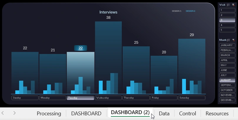
Add two text boxes to create a menu for switching between hot and cool design styles of the weekly sales chart. To make the text boxes interactive, you need to set links for each box to the corresponding sheet. To do this, right-click on the text box and select the "Link" option from the context menu. In the window that appears, specify the sheet and cell address of the link path within the Excel document. It's better to specify links to cell C3 to hide the Excel cursor behind the visualization block when switching between hot and cool dashboard designs.
Enable the weekly bars again and proceed to test the interactive weekly sales chart in both hot and cool data visualization designs.
Weekly Chart for Excel Reports
The result is a very stylish design in two versions: cool and hot colors for the intraday bars.
Everything works well. At the bottom, you can download the ready-made template of the interactive weekly chart. Fill in your sales data on the data sheet and use the visualization block for your dashboards, presentations, or business data analysis. This is a very useful chart template and is often used in practice. It is convenient to work with and analyze the current situation on two time periods simultaneously: within the week and within the day. This is the main competitive advantage of a combined chart capable of making your reports and presentations ergonomic.
Interesting fact! More than 80% of investments during the decision-making process used presentations with data visualization.

