Download weekly line Chart in Excel for dashboard
We will create a data visualization object for the HR dashboard from two blocks. The first block is for final indicators, and the second is for a detailed analysis of the weekly performance dynamics.
Creating a Visualization for Weekly Summary Data
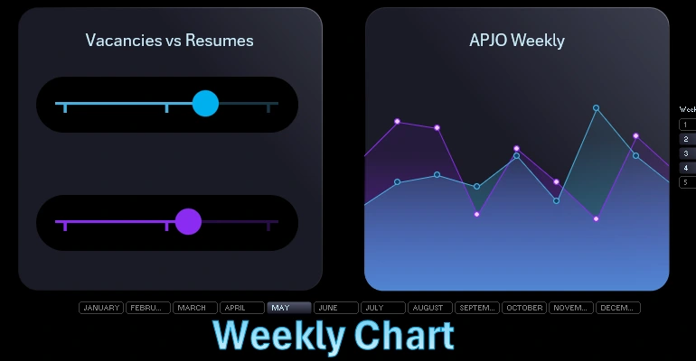
First, we create a table with initial values for the first block of final indicators of the ratio of job openings and resumes.
Creating a Histogram Template with Weekly Summaries
The table consists of three columns. The first is the initial values, the second column is the offset for decorative chart design, and the third column is the remainder of 100%.

Based on the initial table, we create a visualization template from a horizontal histogram. If necessary, switch columns and rows.
Disable all unnecessary elements on the histogram and make the background transparent to get a complete template for further creativity.
Create two oval shapes to fill the middle part of the histogram.
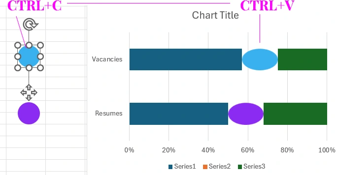
Copy each oval and paste it into the middle part of the histogram to use the shape as a fill for the central part.
Make the first left part a transparent color, and fill the third right part with black with a 30% semi-transparent background. Adjust the column widths in the histogram data series settings.
Creating the Design for Background Chart Elements
On a separate "DASHBOARD" sheet, create a rectangle shape with rounded corners. Set the height to 5.7 inches and the width to 6.4 inches. Give the rectangle a gradient fill for the background and border lines. The color codes and positions are shown on the screen.
Create the next rectangle with rounded corners and set the rounding to the maximum possible. The fill color is black. Thus, we use the dark background to highlight the scales of our future chart in a progress bar style.
Copy the black rounded rectangle.

We will construct the indicator progression scale from simple rectangles. Three small vertical rectangles symbolize the divisions on the progression scale. Group all four rectangles into one group of objects. Copy the group for the second column of the horizontal histogram.
Combining the Histogram Template and Decorative Shapes
Transfer the progress chart template from the horizontal histogram to the "DASHBOARD" sheet. Overlay the template on the scales and align all objects relative to each other in a logical arrangement according to the design. Also, optimize the histogram sizes for the position of the decorative objects of the progression chart.
Adjust the column widths to the sizes and spacing of the objects if necessary.
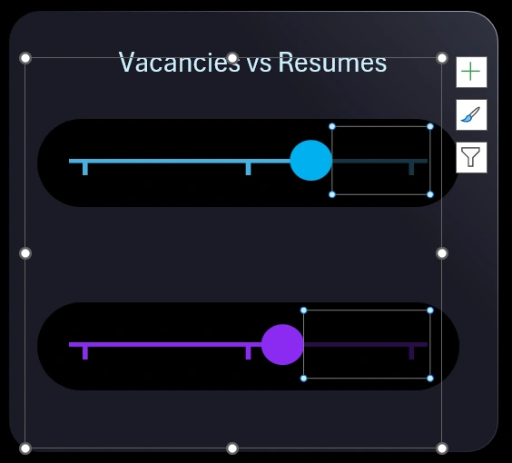
To organize the template sizes more conveniently, change one value to the minimum of 0%, and the other to the maximum of 100%. Also, don't forget to adjust the offset size by changing the size of the central part of the histogram columns.
For a clearer adjustment of the central part offset, link to the cell on the "DASHBOARD" sheet and optimize the offset size from there to fit the design geometry. After positioning and adjusting all objects on the dashboard, return the initial values in the table. Add a text label linked to the table title and format the appearance of the label.
Example of How to Create a Weekly Line Chart in Excel
Let's create a table for a weekly chart. This chart will allow us to analyze the dynamics of indicator changes over one week, selected from the database.
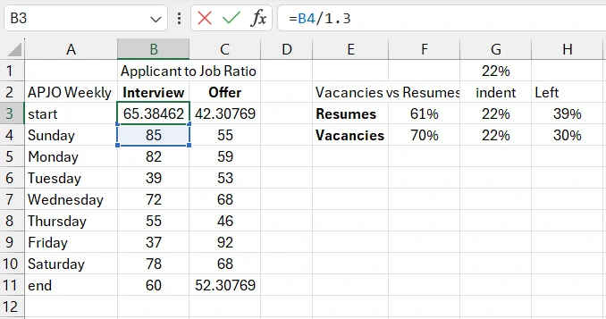
There are two columns for two types of values, and the first column starts not from the first day of the week, but from the START value. The chart will extend beyond the block, so we will need 2 additional values: one at the very beginning and one at the very end. As a result, each column of the initial table for the weekly chart will contain not 7, but 9 values.
First, we fill the table with random values for example purposes.
The first and last values in the columns of the initial table are formulas to draw a line on the chart that extends beyond the block's boundaries at the beginning.
Creating a Weekly Chart Template in Excel
Select the range of columns with values from B2 to C11 and create an area chart. Add two more data series, again referring to these two columns of the value table.
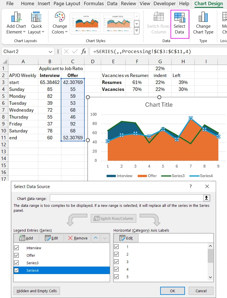
For the two added data series, change the chart type to a line chart with markers.
Customizing the Design of the Weekly Chart
We need a new block for the dynamics chart. Copy the block on the dashboard sheet and slightly change the gradient fill color so that the two blocks look different.
Move the combined chart to the dashboard sheet and place it above the block so that its first and last values extend beyond the block's boundaries, adjusting the chart size accordingly.
Style the chart with stylish but corresponding gradient colors for the areas and lines, as well as marker colors for the graphs.
To visually cut off the part of the chart that extends beyond the block's boundaries, create a mask effect. Use the shape editor in PowerPoint for this.
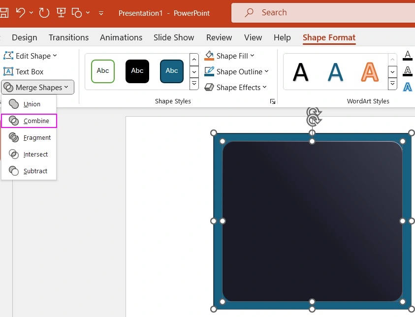
Copy the block shape into PowerPoint. We need its exact dimensions. Overlay the block with a rectangle slightly larger than the block. Select both shapes, align them to the center, and use the "Combine" tool to subtract the block shape from the rectangle. This results in a new shape with a block-shaped hole in the center. The hole is the same size as the block.
Copy the created mask shape from PowerPoint to Excel and carefully overlay it on the block. Align the mask and enjoy the beautiful result.

Add a text label linked to the name of the initial table for the weekly HR performance dynamics analysis chart.
Developing Control Elements for Weekly Data Selection
Connect the charts to the database. On the "Data" sheet, select the entire table from A1 to H366 and name the range "mydata". Next, create a pivot table for this range. When creating the pivot table, specify "mydata" as the data source and place the pivot table on the "Control" sheet in cell A3.
Build the pivot table in the constructor. The "Rows" field contains values from the "Day" column. The "Values" field contains data from all value columns.
We need another pivot table to select values from the database based on conditions. Select and copy the previously created pivot table to cell A15. In the constructor of the second pivot table, change the values in the "Rows" field to "Month".
Based on the pivot tables, create slicers. We will use them to control the dashboard. We need 2 slicers for the "Day" and "Month" columns.
Set up the slicer connection parameters to the pivot tables. The "Day" slicer should be connected only to the first pivot table. The "Month" slicer should be connected to all pivot tables.
Style the slicer panels to fit harmoniously into the dashboard design. Use the slicer style settings wizard for this.
Link the initial data cells for the charts to the pivot table values using formulas. Pivot tables manage the selection of values from the databases based on conditions, and the slicers control the pivot tables. Charts read the pivot table values through formulas.
Presenting Data Visualization Using the Weekly Chart
Check the dashboard functionality under data selection control using slicers.
In this example, we learned how to create a constructive design for data visualization of both summary and dynamic values. Both blocks can be added as a single element to dashboards for presenting HR performance indicators.

