Dynamic Gauge Chart in Excel for Dashboard UI Design
The speedometer gauge chart in Excel is one of the most effective ways to visually demonstrate performance level, progress, or achievement of KPI goals. The Speedometer Chart helps turn numbers into visual data that is quick and easy to interpret at a glance. Use the ready-made template that automatically updates when data changes in Excel.
Template of a beautiful customized chart in Excel
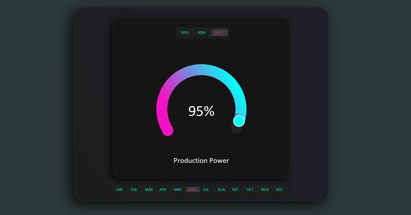
Interactive features are implemented using pivot tables and slicer buttons. The speedometer gauge is built like a constructor from a standard donut chart visualization block and Excel shapes. A proper color palette also greatly helps convey aesthetics in the UI design. Watch the step-by-step video where the entire assembly process is shown in full:
- All formulas for building visualization in Excel.
- Create a pie chart as a base template for development.
- Add a second data series to create cursors.
- Create and customize the speedometer chart design using shapes.
- Add control elements.
- Presentation of the interactive speedometer chart capabilities in Excel.
The speedometer gauge chart template is designed for use on Excel dashboards:
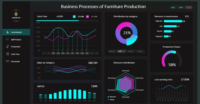
Excel dashboard for small business management
Well-designed data visualization instantly fits into the dashboard layout. It interactively displays performance trends and progress toward goals, making your dashboards more practical and visually appealing.


Data Visualization Charts for Interactive Report Creation in Excel.
Dashboard Templates