Excel Dashboard for Tracking Monthly CO2 Emissions
Most bakery owners are convinced that switching from gas to electricity means a sharp reduction in CO2 emissions. Data visualization of CO2 emission metrics shows that this is true — but not the whole truth. Electric ovens still generate emissions — through biological processes inside the chamber when heating yeast dough, and through indirect emissions from a diesel generator during power outages. An Excel dashboard makes this invisible part of the equation visible: month-by-month CO2 dynamics broken down by source — no oversimplifications, no blind spots.
Managing CO2 Emission Metrics Monitoring in Excel
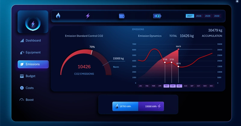
The Excel bakery dashboard gives users a sufficient level of awareness for managing the business. An interactive analysis of monthly CO2 emission dynamics that accounts for gas or electric equipment being switched off. When gas is removed from the report, the indicator drops sharply — but does not reach zero, as biological and indirect emission sources remain active.
Yeast at 50°C and the emergency generator: two CO2 sources nobody thinks about when buying an electric oven — and how the dashboard accounts for them. We recommend reviewing the full Excel bakery management report:

An Example of How to Increase Bakery Profit by +100% in Excel
Dynamic CO2 emissions analysis on a dashboard is not an environmental formality — it's a practical production management tool. It shows that when gas is removed, the bulk of emissions goes with it, but zero is unachievable as long as the ovens are running and a diesel backup is on the grid. Understanding this structure helps set realistic carbon footprint reduction targets, choose cleaner electricity sources, and explain to investors or regulators why the metric will never reach zero — and why that is perfectly normal for an active production facility.
 Download the CO2 Emissions Tracking Dashboard in Excel
Data Visualization Charts for Interactive Report Creation in Excel.
Dashboard Templates