Excel Template for Visualizing Brand Marketing Strategy
An effective marketing strategy requires a clear structure and visual analysis. Without data visualization, it's difficult to track channel performance, reach dynamics, and changes in audience behavior. For this, use Excel as a universal analytical tool with functions for building interactive data visualizations and reports.
Assistant for Developing Marketing Strategies in Excel
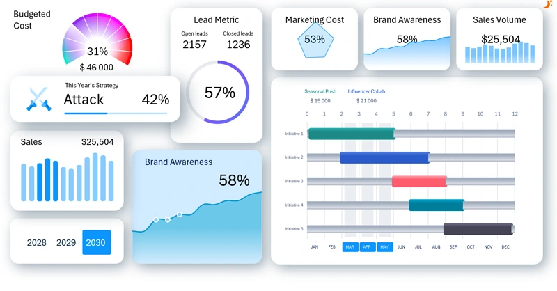
This template example clearly shows how Excel can be used to create a dashboard that displays all key brand strategy metrics in a convenient and understandable format. To see how realistic it is to build such impressive dashboards in Excel, watch the following video, which covers:
- Layout blocks for data visualization on the dashboard.
- An example of how to create complex gradient fills in Excel.
- How to build a complex gradient with different color fill angles in Excel.
- A two-layer speedometer chart for analyzing budget spending progress.
- A simple donut chart for analyzing lead-to-sale conversion.
- How to quickly build a progress bar chart in Excel.
- Processing raw expense and sales data.
- Building pivot tables for dynamic and statistical data updates on the dashboard.
- Filling a Gantt chart using dynamic formulas to extract data from source tables.
- Creating a transition table for proper Gantt chart structure in Excel.
- How to build a visually appealing project manager in Excel.
- A table to finalize the Gantt chart design settings.
- Adding an interactive bar chart to enhance usability in the Gantt chart design.
- Adding dynamic labels for a functional project manager design.
- Setting up control button blocks to manage data on the Excel dashboard.
- Creating formulas to connect all visualizations to the source data.
- Slider for infographic icons to display selected business strategies.
- Supporting interactive bar chart for analyzing sales volumes.
- Supporting line chart showing brand awareness growth dynamics.
- Source data for the radar chart and its miniature version in the KPI card.
- Setting up a functional design for the dashboard’s KPI cards.
- Creating the first screen layout to visualize expenses by marketing initiatives.
- How to create a custom control element for a non-standard Excel dashboard design.
- Designing the second dashboard screen to analyze brand awareness levels.
- The sales volume screen and how to build an interactive bar chart with rounded column corners in Excel.
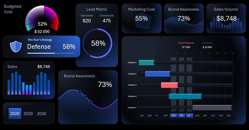
- Presentation of both light and dark versions of the dashboard for analyzing marketing metrics in Excel.
Principles of practical use and workflows for the interactive project manager:
Excel Capabilities for Visualizing a Marketing Strategy
Visualizing your strategy helps you not only track current results but also make more informed marketing decisions. With an Excel dashboard, you’ll have a flexible tool to adjust strategies on time and drive sustainable brand growth.
Download the Marketing Strategy Visualization Template in Excel 

Data Visualization Charts for Interactive Report Creation in Excel.
Dashboard Templates