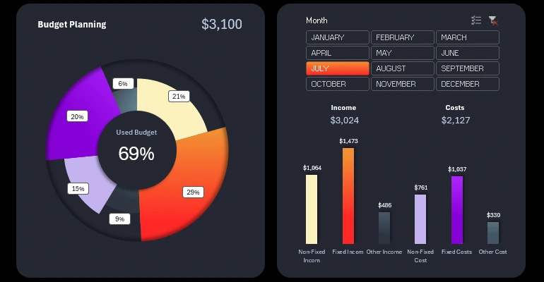
Multi-Level Donut Chart in Excel Template
In Excel reports, it's often necessary to visualize complex data in a clear and understandable way. By watching this video, you'll learn how to create a multi-level pie chart in Excel step by step!
Build a Multi-Level Donut Chart in Excel
In this tutorial, you'll learn:
- Creating shapes for the visualization base.
- Setting up formulas to process the source data.
- How to create a multi-level pie chart template.
- Designing the color palette for the chart.
- Working with shapes for unique data visualization design.
- Adding interactive buttons to control the dynamic pie chart in Excel.
- Completing the presentation with an additional bar chart for final comparison.
This video example will help you master the technique of creating nested charts to present multiple types of similar data, enhancing analysis and reporting with Excel's interactive features.
This is another tutorial in the series on developing a dashboard for analyzing personal income and expense flows in Excel.

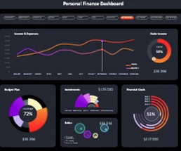
Excel Dashboard Templates for Business

Data Visualization Charts for Interactive Report Creation in Excel.
Dashboard Templates