How to Create Speedometer Chart in Excel for Dashboard
The speedometer chart, also known as Gauge Charts, is often used in dashboards to visualize key performance indicators (KPIs) and overall performance metrics. For example, it can be used to show the fear and greed index of the stock, bond, or cryptocurrency markets. A speedometer chart allows users to quickly understand where the current metric stands in relation to the set goal. It helps the user instantly determine if the metric is in the low, normal, warning, or critical range.
Example of Creating a Beautiful Gauge Chart in Excel
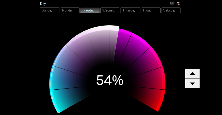
We create a speedometer chart with a game design in Excel. In cell A2, we enter the initial value for General Productivity, for example, 35%. In cell B2, we enter the formula to calculate the remainder from 100%, resulting in 65%.

We will need one more value of 50% for the chart design in the speedometer style. This is for the bottom part.
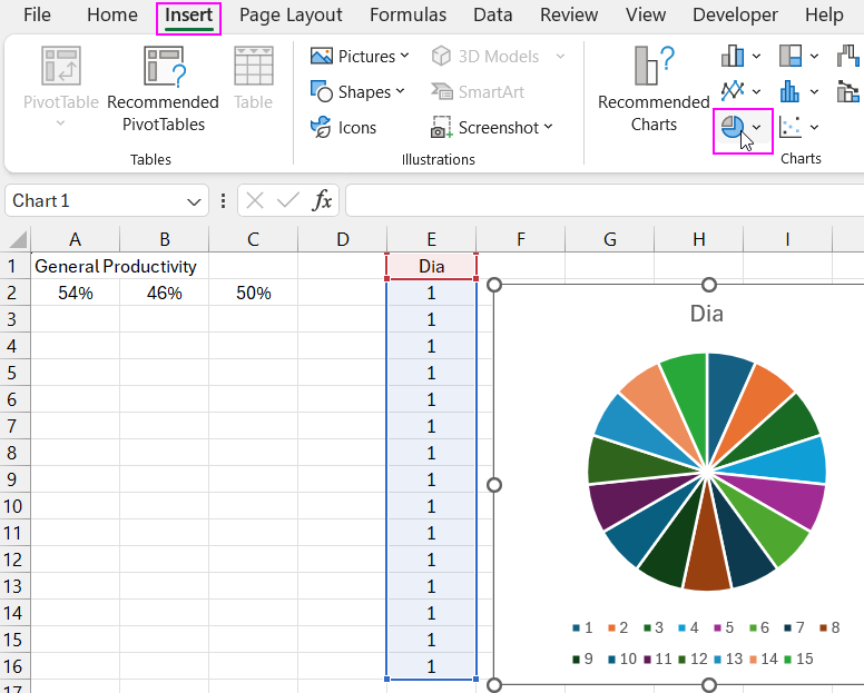
We create a table for a new data series, which we will use in the design as the speedometer scale. A total of 15 identical values, with 10 for the speedometer scale and 5 for the bottom part of the chart. We select the cell range and create a chart in Excel.
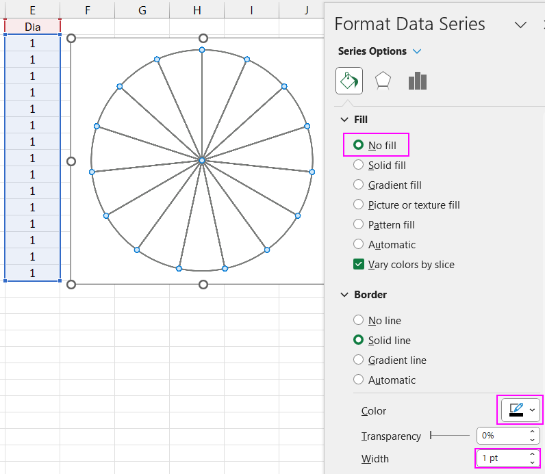
We remove all unnecessary elements and make the background transparent, leaving only the outlines for the scale.
We add a new data series from the first three initial values. We open the tool to change the chart type to place the data series on different chart axes: primary and secondary. The secondary axis should have the second data series to bring it to the foreground.
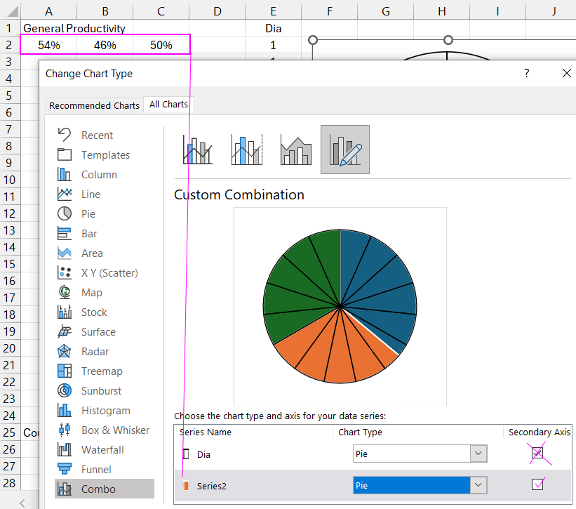
We rotate the chart 240 degrees clockwise. We make the first sector transparent, the second black, and the last white gradient. Pay attention to the gradient white settings with transparency elements.
To demonstrate the gradient fill of the chart sector, we temporarily make the background black. We remove the outlines in two sectors.
Decorating the Speedometer Scale with a Combined Color Gradient
We create an oval shape to design the speedometer scale using a mix of semi-transparent shapes with different colors. Each shape is designed with a semi-transparent radial gradient at different angles.
We copy the shape while holding down the "Control" key on the keyboard. We change the gradient color and its angle. We overlay the semi-transparent shapes and align them to the center.
Experiment with gradient colors to achieve the best result. Note that maintaining the order of the color with transparent fill is important. This affects the radial gradient style. The layering order of the colored shapes also impacts the final result.
We add a third oval shape with a magenta color for a semi-transparent gradient at a different angle and overlay it on the top layer (it's important to maintain the order).
The last oval, red color, top layer.
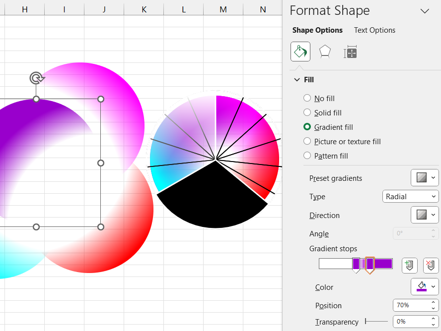
We group all the ovals. We make the chart background transparent. We change the order of the shapes and the chart so that the chart is in the foreground and the shapes are underneath.
We create a new worksheet with a black background. We transfer the chart and shapes to the new sheet. We change the sizes and optimize the positions of the objects on the Excel worksheet. We add a new oval with a black radial semi-transparent gradient fill color and remove the outline. Note that the gradient style is centered.
We add a label for the current values of the speedometer chart. Note that when the label shape is selected, we specify a reference to the initial value in the formula bar. Only then do we format the object.
Adding Interactive Elements to Control the Chart
Let's create data for a future counter that will control the speedometer. Therefore, now cell A5 will contain the initial value, and cell A2 will have a formula to convert the initial values into percentages, as the form control element - the counter - works only with whole numbers.
From the developer menu tab, choose to insert a counter control element and draw it as a square on a new sheet.
Right-click to open the context menu and specify the minimum and maximum values and the reference to the chart's initial data in the counter settings parameters. Now we can control the chart. We have made the speedometer chart interactive.
We will add another useful control element to enhance and expand the chart's interactive capabilities. For this, we will create another new data sheet.
On the new sheet, create a table with different initial data for one week. The first column will be the day of the week number, the second will be the day name, and the third will contain different values for each day.
Based on the initial table, create a pivot table and place it in cell A15 on the same sheet. Fill in the field parameters accordingly when creating the pivot table.
Create a formula to extract values from the initial table based on the conditions in the pivot table for the future named range. All references in the arguments should be absolute since we will use the formula in the named range later.
Based on the pivot table, create a control element for the pivot table and the chart. To do this, create a slicer from the insert menu. Make sure the Excel cursor is within the pivot table range so it is active when creating the slicer.
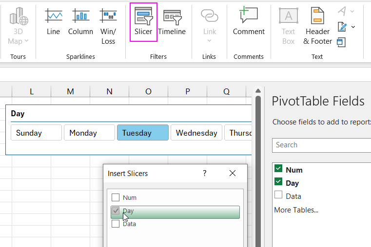
Check the boxes to select which data to use for the slicer button labels. Verify the formula's functionality.
Go to the "Formulas" menu tab to create a named range. Name it "WeekDay." In the reference box, insert the formula to extract values from the initial table (all references in the formula arguments should be absolute).
In the counter settings, change the reference to the named range "WeekDay." Also, change the initial chart value in cell A5 on the first worksheet "Processing" to reference the named range "WeekDay."
Move the slicer and design its appearance. Slicers are styled using templates in the Slicer tab. Therefore, you need to duplicate the existing template to get a copy, modify it, and set it as the used template for the slicer.
Now we can control the same initial data using two control elements. Use the slicer for quick changes to the chart and the counter for fine-tuning and adjusting values during the presentation.

