How to Create Weekly Line Chart in Excel for Dashboard
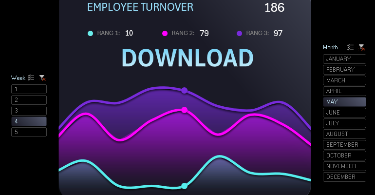
An example of creating a weekly Line Chart in Excel with graphic design and interactive features. In this video tutorial, we will learn how to create an interactive line chart in Excel. In this example, we will consider using a rubber plastic effect on a line chart for data presentation and visualization.
Developing Data Visualization with Graphic Design in Excel
We will start by preparing the data and building a table with the initial values for the weekly chart. To create an original graphic design in Excel, we will need two additional values at the beginning and the end of the weekly chart. Therefore, the row numbering consists of nine numbers in the first column instead of seven. The second column contains row headers: Start, abbreviated day names, End.
Next, there are three columns with initial values. The largest values are in Rang1, and the chart values will be constructed in ascending order. Therefore, the first column is called Rang3.
We will fill the table with random initial values for example purposes. In the first column, there are the smallest random values, in the second column, average values, and in the third column, Rang1, the largest random values. We use the RANDBETWEEN function with different parameters in the arguments for different columns according to rank.
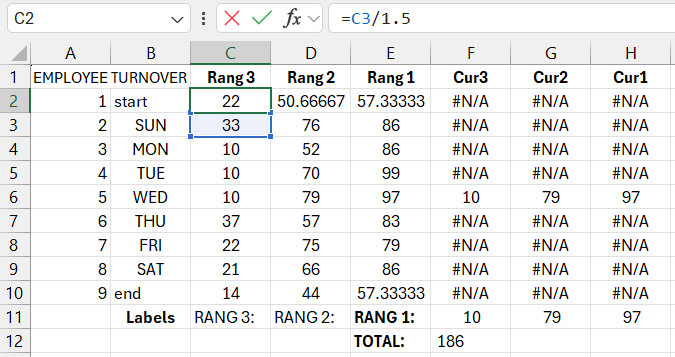
We temporarily fill the rows with the Start and End headers with simple formulas to obtain approximately similar closest values.
The next three columns are selective values for creating three cursors on three interactive line charts. Later, the values in these columns will contain logical formulas. For now, we will fill them with the NA function, and in the row where the day of the week is "Wednesday," we will specify references to the values from the rank columns on Wednesday.
Creating a Weekly Data Presentation Template
Select the range of the table B1:H10 and create an area chart. Insert – Charts – 2D Area.
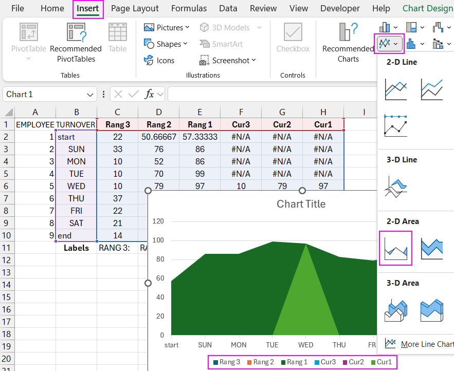
As you can see in the chart legend labels, we have six data series. We need three more series. Use the Select Data tool and add three more data series with the names Line 3, 2, 1 and references to the ranges of columns Rang 3, 2, 1, respectively.
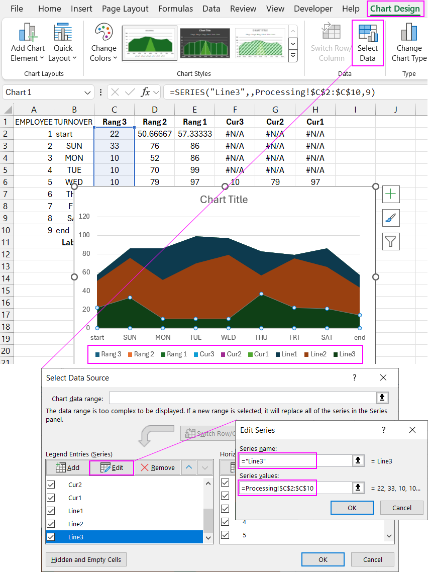
We now have nine data series.
For the three Lines series, change the chart type to 2D Line.
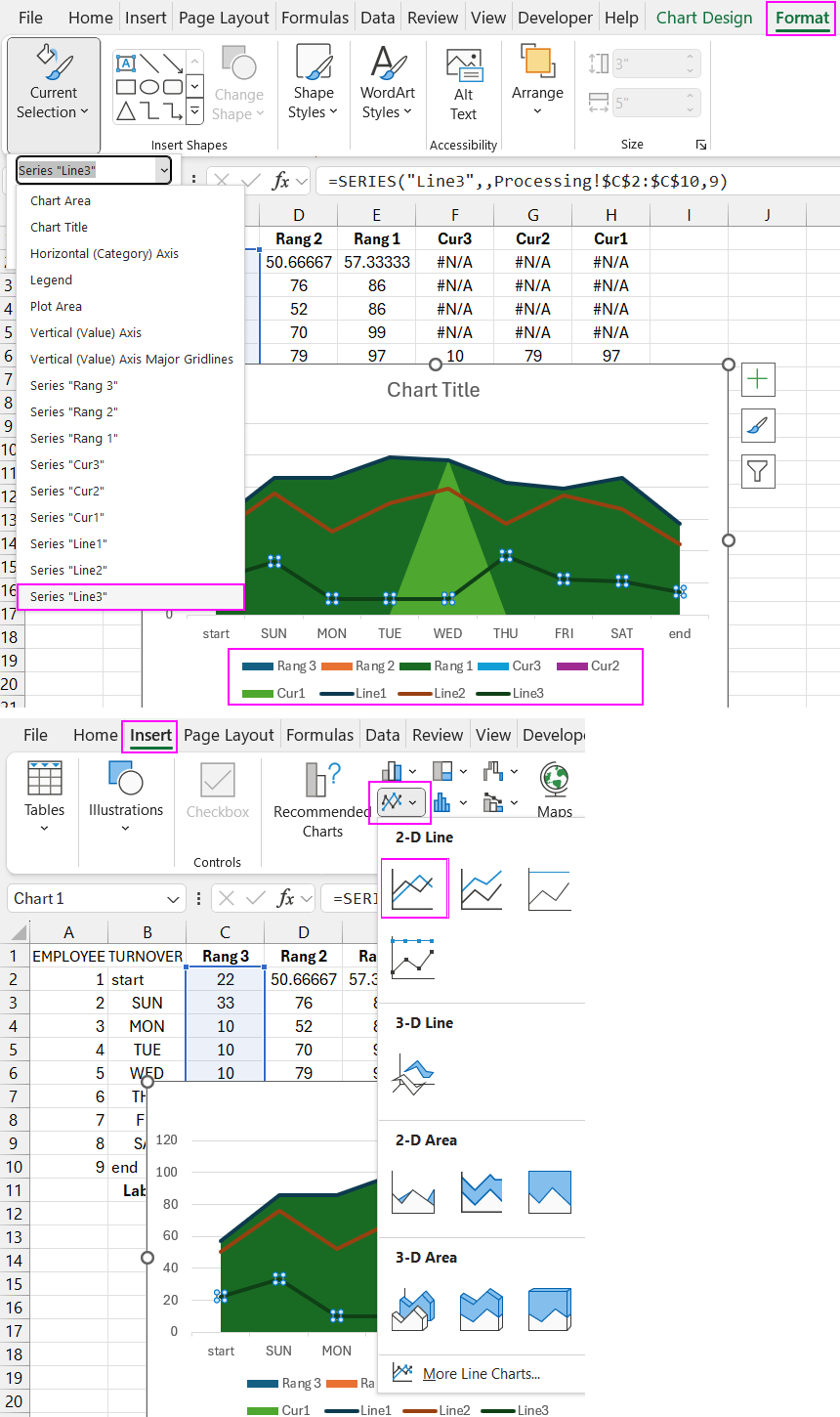
Similarly, for the three Cursors series, change the chart type to Scatter.
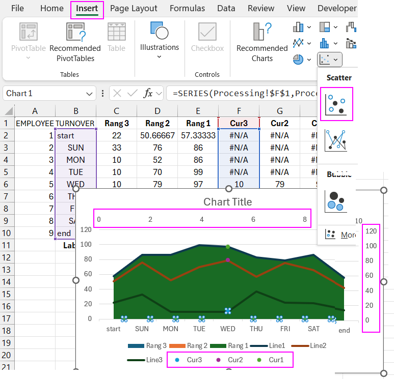
Additional vertical and horizontal axes have been added by default. We need to remove them. To do this, use the change chart type tool. In the window that appears, select the last option at the bottom of the left menu, "Combo." In the far right column, "Secondary Axis," uncheck all the boxes for all data series and click the "OK" button to confirm.
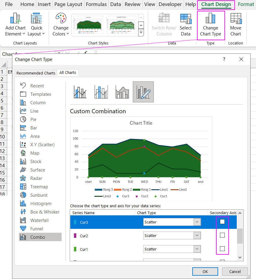
As a result, we have disabled all additional axes.
Now we need to remove the unnecessary markers at the 0 mark on the Y-axis from all Scatter Charts. Use the "Select Data" tool for this. In the window that appears, click the "Hidden and Empty Cells" button in the bottom left corner. In the additional window, uncheck the "Show #N/A as an empty cell" option.
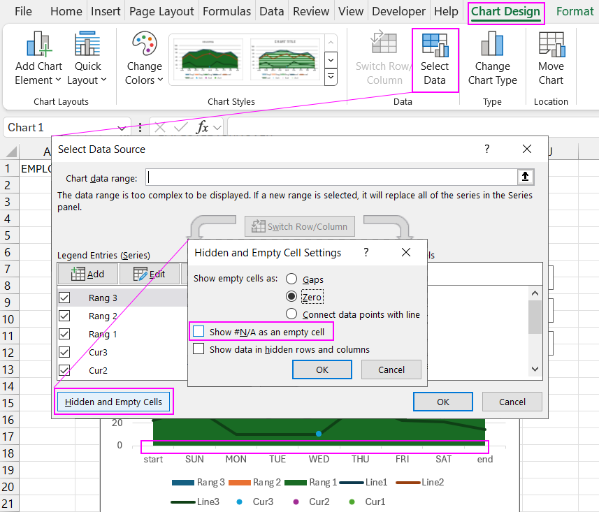
As a result, the combined chart displays markers only for cursors with values. That is, three markers in the "Wednesday" range according to the data in the source table. If the data changes, the chart will dynamically update the visualization. But we will discuss this later during the creation of interactive functions.
As you can see in the legend labels, we have nine data series represented in three chart types: Line, Area, and Scatter.
Creating a Graphic Design for a Weekly Line Chart
On a separate sheet, create the base for the graphic design of the weekly line chart.
Create a panel using a rounded rectangle with a gradient fill for the background and border.
Move the combined weekly chart to the new sheet and overlay it on the panel shape. Optimize its position and size. It's important to have the width and bottom edges of the chart slightly extend beyond the rectangle's borders.
Create a graphic design for the chart with a rubber plastic effect. First, adjust the layer order of the Rang data series. Apply a gradient fill with semi-transparent colors to each area of the chart. It's important that the colors are different.
Next, select the line charts and adjust the line parameters: color, line thickness, and enable the "Smoothed line" option.
Note! We now encounter a minor issue. Excel's Area Chart does not have a smoothing option. To hide imperfections—gaps between the smoothed curve and the area chart—we partially address this with line thickness and significantly by applying a shadow overlay. Due to the dark background and the shadow cast by the smoothed curve, unwanted gaps between different chart types are effectively concealed. To enhance the shadow effect, reduce the transparency to 35% in the settings.
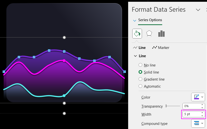
Perform similar actions and settings for the other curved lines.
The mask effect is often used in graphic design. Create a mask shape in PowerPoint, as the shape editor there has advanced capabilities. First, copy the panel shape from Excel, which is a rounded rectangle, to PowerPoint. Then, overlay another rectangle shape with slightly larger dimensions in the center. Select both shapes and choose the "Merge Shapes" - "Combine" tool in the editor.
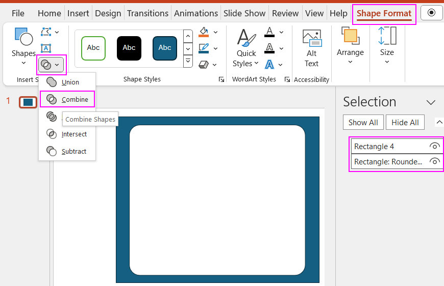
We have a new shape with a hole created from the merge. Copy the mask shape back to Excel and overlay it on the chart, aligning it so the hole is exactly over the rounded rectangle. As a result, the parts of the chart extending beyond the boundaries will be hidden.
Adding Interactive Buttons for Dashboard Control
Create a pivot table in Excel based on the database sheet table. Configure the fields in the table designer. In the rows, include abbreviated day names, and in the values field, the Rang columns. Copy the pivot table and create slicer buttons from it. We will use these as control elements for the weekly line chart with graphic design.
There should be three slicers. The first, "Month," and the second, "Week," should be connected only to the second pivot table. The third slicer, "Day," should be connected to the first pivot table only.
Create a design for the appearance of the buttons and slicer panels by duplicating and modifying existing templates.
Use the GETPIVOTDATA function to connect data from the pivot table to the source table in the Rang column range. In the Cursor column range, use a logical formula that checks which days of the week are used for data selection, showing the cursor on the chart for those days. If a day is not selected, the logical formula returns the NA function.
Move the slicer buttons onto the chart. Choose their positions, set their sizes, and adjust parameters. Then test the interactive functions of the weekly chart with graphic design.
Add formulas for data labels on the chart, summing values for the selected days of the week for the three indicators. Calculate the total sum for the selected period.
Create TextBox objects to add labels to the visualization. In each TextBox, use the formula bar to reference the cell containing the source of the corresponding data.
Presenting the Weekly Line Chart
This is another example of how you can enhance a dashboard with graphic design visualization. Excel offers us quite a wide range of design capabilities. Note that everything we do is without using macros. All interactivity is implemented with standard tools: formulas, functions, pivot tables, data slicers, chart templates, shapes, and more.

