DOWNLOAD Design a Doughnut Chart with Percentages in Excel
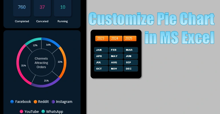
The doughnut chart is a great tool for visualizing data shares and distributions. In this tutorial, we’ll show you how to customize a doughnut chart design in Excel. Learn to add percentages to chart sectors and choose the best presentation style. By following these instructions, you’ll be able to quickly and easily create your own customized charts with a more functional and attractive design.
Personalize Your Doughnut Chart with Dynamic Design

Watch this video to the end to learn how to personalize your chart with a fresh design. Discover how to change the gradient fill colors of segments, fonts, and data slice styles as control elements. You’ll also learn how to add percentage labels to the chart segments.
In this data visualization tutorial in Excel, you’ll learn to:
- Create a visualization panel template.
- Build smart and pivot tables based on source data.
- Use dynamic sampling formulas for charts from pivot tables.
- Calculate percentages for chart segments.
- Create a pie chart template with percentages in Excel.
- Customize a doughnut chart into a functional design with percentages.
- Choose a color scheme for chart segments.
- Add percentage labels to a pie chart.
- Create a readable legend from formulas and shapes.
- Display total values.
- Create a control panel using data slicers.
- Test the template and resolve potential errors.
This template is part of a multifunctional mini CRM dashboard in Excel.

Now, look at data distribution visualization in Excel from a new perspective. This will help you create more informative and presentable reports with interactive capabilities.

