How to make Waffle Chart in Excel for Grid Dashboard
We present to you 3 methods for creating a Grid Chart in Excel. Step by step from simple to complex. The first example is creating a waffle chart using the mask principle.
First Method: MASK for Creating a Grid Chart in Excel

D2 is the cell with the initial value. In cell E2, there's a formula to calculate the remainder from 100% after subtracting the initial value.
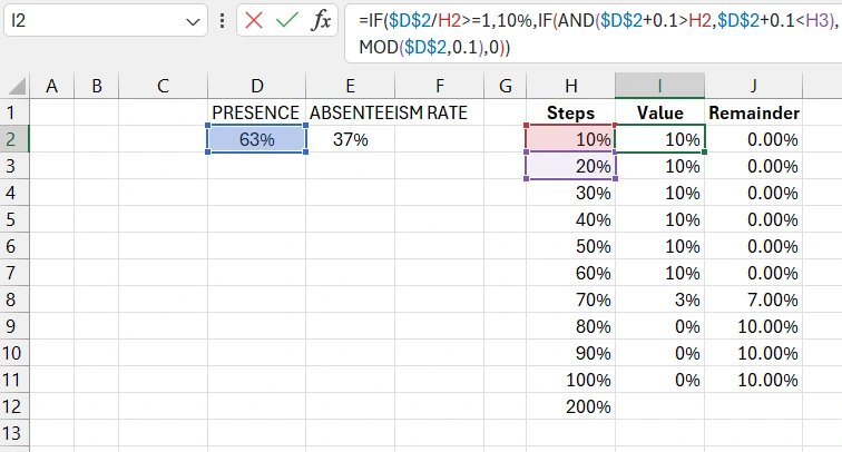
We create a table to build the logical structure of a Waffle Chart from a linear horizontal bar chart in Excel. The first column is steps. The second column contains a formula with logic to transform the horizontal bar chart into a Grid Chart.
The third column is a formula to calculate the remainder of the unfilled part of the Grid Chart, from the initial value to 100% completion. To build the horizontal bar chart, we use only the last two columns, Value and Remainder, in the range I1:J11. We set fixed minimum and maximum values for the horizontal X-axis in the range from 0% to 100%.
Open PowerPoint to create complex vector shapes. The shape editor in PowerPoint is more advanced compared to MS Excel.
Make an icon in the shape of a person by assembling it from rectangles like a constructor. Select all shapes and merge them into one complete figure. Create an entire army of person icons, 100 figures in a 10 by 10 grid. Combine all copies into one figure.
Create another figure in the shape of a rectangle with rounded corners. Overlay the figure with person icons onto the rectangle. Select the rectangle first, then the person icons figure, to subtract the person shapes from the rectangle. As a result, you get a perforated figure in PowerPoint, which cannot be done in Excel. This object will function as a mask.
Color the mask with stylish gradient colors. Transfer the perforated rectangle figure to a new Excel sheet. Transfer the previously created bar chart there as well.
Adjust the size and decorate the bars of the horizontal bar chart with colors.
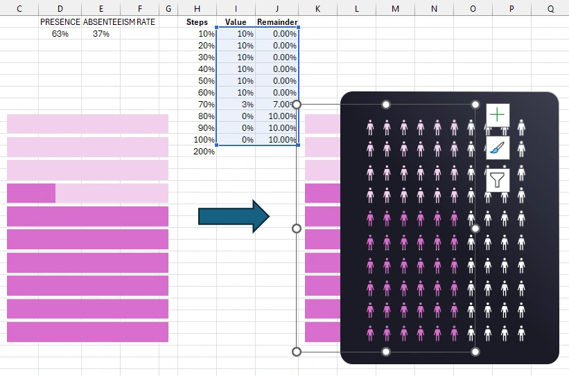
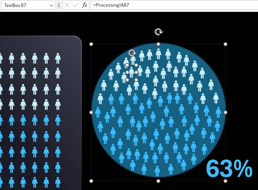
Overlay the rectangle with person-shaped holes onto the bar chart to get the popular "mask" effect. This is a very popular method in graphic design that can also be applied in Excel thanks to PowerPoint.
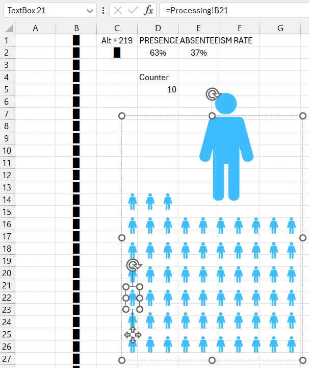
Add a control element for the Waffle Chart. First, select the cell for the initial counter values. Connect to the initial counter value through a formula that converts the value in reverse order.
In the developer tab, from the "Insert" section, choose the form control tool - scroll bar. In the settings parameters, set the minimum and maximum values, and specify the reference to the counter's initial values.
Check the Grid Chart's functionality.
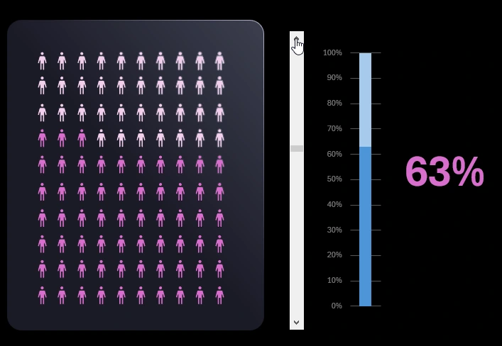
Add a TextBox shape for labeling, and in the formula bar, reference the cell with the initial values for the chart. Based on the initial chart values, create a vertical bar chart for an informative composition of the Grid Chart data visualization presentation.
Pixel Art Method for Building a Waffle Chart in Excel
Creating a waffle chart using the pixel art method is significantly more complex. However, it offers more capabilities. For example, the pixel art method allows for creating waffle charts in the shape of an oval, triangle, or even a star.
Copy the previously created person icon figure from PowerPoint into Excel and adjust the height and width proportions. Add a transparent rectangle shape with the respective proportions and group everything into one group.
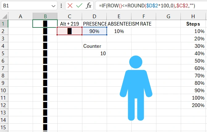
In cell C2, specify the special rectangle symbol using the alt code entered with the key combination Alt+219 (the number is entered on the numeric keypad according to the alt code input rules).
Create a TextBox object and in the formula bar, link it to cell C2, where the special rectangle symbol is located. This will be used as the source of values for the TextBox during setup and testing.
Copy the group of figures with the person icon to use as the background image for the special symbol in the TextBox. To do this, in the TextBox formatting options, in the Text Options section, use the image from the clipboard as the fill. Adjust the font size. Now, if cell C2 contains the special symbol, this will be the content for the TextBox, and if cell C2 is empty, the TextBox will also be empty. Check this functionality.
Prepare the range of initial values A1:B100 with special symbols for the future 200 copies of the TextBox. 100 copies for positive values and 100 for negative values.
Each time you change the source link for the TextBox element, you need to reformat the text. Fortunately, you can select all 100 objects at once and apply text formatting with image fill from the clipboard to all of them simultaneously. Also, set the font size.
Move the TextBox to a new sheet, check the formula bar link to the cell, it should be an external link to another sheet "Processing." If you need to change the link, format the text in the TextBox accordingly. Arrange the army of 100 TextBox copies into a rectangle with 10 by 10 dimensions.
Create a rectangle with rounded corners with dimensions as in the previous example. Also, copy the shape format of the rounded rectangle from the previous example.
Place the rectangle in the background under the 100 TextBox copies with person figures. Now, change the link of each TextBox element to its individual cell while maintaining the sequence. For the bottom TextBox in the left corner of the legion, specify the link to cell A1, and for the top object in the right corner, specify the link to cell A100.
Group the entire legion of TextBoxes into one group and copy it. Make a copy of the figures and change the color of the person for the new text fill with the special symbol via the clipboard.
Ungroup the copy to change the source value links and format them. Similarly, maintain the correct sequence in the links. For the bottom TextBox in the left corner of the legion, specify the link to cell B1, and for the top one in the right corner, specify the link to cell B100.
Combine the two legions of TextBoxes with person figures and overlay one on top of the other. In the range A1:B100 of the initial values for the two legions of TextBoxes, change the special symbol values to formulas with substitution logic.
Copy the control element, infographic, and current value label from the previous example. At first glance, the result of the pixel art method is no different from the previous "mask" example. But now it's time to present the advantages of the pixel art method for creating waffle charts with complex shapes.
Copy the group of the legion of TextBoxes to create a future alternative waffle chart. And we will need to fill the range of initial values with the special rectangle symbol again.
Ungroup the copy and place an oval shape underneath it. Rearrange all the TextBox objects with person figures along the contour of the oval, ensuring their group position resembles an oval. Try not to distort the sequence too much, keeping initial links at the bottom and final links at the top for the initial values.
Afterwards, group the TextBox legion in the shape of an oval and temporarily hide the new group from view so that it doesn't interfere with creating a similar oval with different color person figures.
Copy the group again, but with a different color, and repeat the same actions to create another oval from the TextBox objects. Overlay and center the two groups accordingly.
Place a copy of the rectangle in the background under the round groups. Test the functionality of the two forms of the waffle chart.

This way, you can create waffle charts of different shapes and complexities: triangle, star, polygon, and more. But in the next example, we'll look at how to effectively use the pixel method not for shape variations but for waffle chart filling methods.
Different Methods of Filling the Waffle Chart Grid
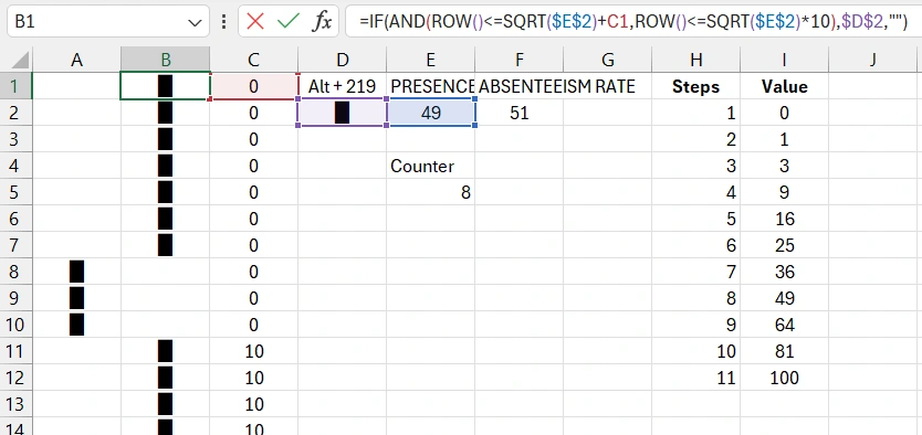
Simultaneously copy two sheets. To do this, select them while holding the Control key on the keyboard and drag their tabs to a new location. Then, on the sheet with the initial data "Processing 2," create a new table of initial values.
We will need a sequence of natural numbers' integer square roots: 1, 4, 9, 16, 25, 36, 49, 64, 81, and 100. Note that in the example, cell H4 intentionally contains an error - the number 3 instead of 4, to show that the chart's functionality is not disrupted if one of the numbers is not an integer square root.
Add a column with formulas in the range C1:C100. The formula is used as an intermediate in the logical chain of calculating all formulas for demonstration purposes.
The cell range of initial data for all TextBox legions will now contain different formulas. Fill the range A1:B100 with new formulas.
Change the minimum and maximum values in the scroll bar parameter settings, check the link.
Test the functionality of the new method! Now the waffle chart area fills in a specific way. In the left example, filling starts from the corner, while in the right example, it is random. These filling styles can be customized using different formulas. For instance, in the shape of a heart or even with text. The pixel method is more complex but offers a wide range of creative possibilities.


Data Visualization Charts for Interactive Report Creation in Excel.
Dashboard Templates