Interactive logistics route Map Chart visualization in Excel
A route map is a central analytical component in logistics management. Visualizing supply chains with a Map Chart enables rapid assessment of transportation geography, fleet utilization, and route profitability. Below is a scenario for designing a route map chart in Excel for a logistics department based in New York, operating three trucks, three drivers, and a route network across eight major U.S. cities.
Map Chart design scenario in Excel for a logistics department
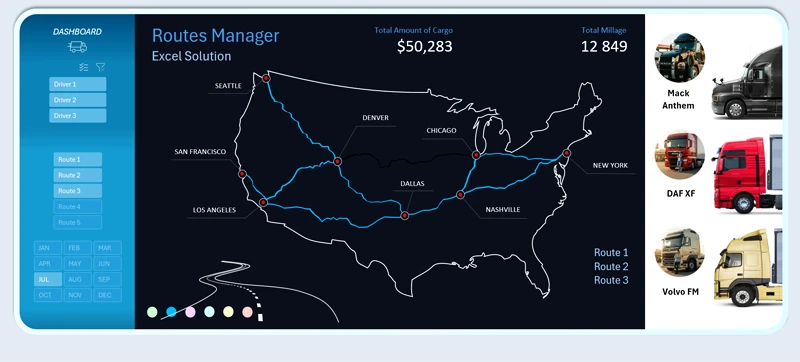
An interactive U.S. map with curved route lines visualizing truck movements between key cities.
First, define the base logistics structure. Routes will be built through a nationwide city network across the United States.
Route cities:
- New York
- Chicago
- Nashville
- Dallas
- Denver
- Los Angeles
- San Francisco
- Seattle
The technical specification requires:
1. Dashboard center — Interactive USA Map Chart
- Display of all logistics routes.
- Geographic anchoring to key cities.
- Visualization of curved route lines between points.
2. Segmentation across three analytical dimensions:
- Driver data (workload, number of trips, efficiency).
- Truck technical characteristics (mileage, capacity, operating costs).
- Route attributes (distance, complexity, usage frequency).
3. Full interactivity implemented without macros
All logic must operate using standard Excel tools, including:
- formulas and structured tables;
- dynamic ranges;
- slicers and dropdown lists;
- conditional formatting;
- analysis parameter selectors.
When selecting a specific driver or route, the map automatically displays the corresponding trajectory. Additionally, route line colors can be adjusted for comparative analysis.
Functional capabilities of the Map Chart for managerial analytics
The map serves a managerial—not decorative—function:
- Identifies overloaded routes.
- Enables driver performance comparison.
- Supports territorial coverage density analysis.
- Acts as a strategic planning tool for expansion.
This report provides management with the ability to model network development and make informed decisions regarding expansion into new U.S. cities with optimized budget allocation.
The route map chart can be integrated into comprehensive logistics dashboards. For example, explore how to build an interactive logistics KPI map chart in Excel for practical dashboard implementation:

How to build a logistics KPI dashboard in Excel
An interactive Excel Map Chart is a strategic visual management tool for logistics, offering several advantages:
- Centralized visualization of routes across the United States.
- Segmentation by key operational parameters.
- Full interactivity without macros, ensuring a secure, flexible, and scalable analytical solution.
The flexibility of this template allows you to modify and optimize it independently—without programming skills—to meet your specific operational requirements. It can serve as a practical alternative to expensive logistics software solutions.
This model enables a logistics department not only to monitor current transportation operations but also to develop data-driven growth strategies, ensuring sustainable expansion of the company’s transportation network.
 Download the interactive route map chart in Excel
Data Visualization Charts for Interactive Report Creation in Excel.
Dashboard Templates