New Radar Chart Design for Data Distribution in Excel
In a traditional company, KPIs are a pressure tool, and MoM is a monthly stress test for management. In a teal organization, both metrics work differently — without a culture of pressure or the relentless pursuit of endless growth. Not as a whip, but as a compass! The radar chart for analyzing data distribution across departments in Excel translates this philosophy into a visual language. It reveals where the imbalance is hidden within the payroll structure, which department is growing with intention, and which is simply creating the appearance of momentum.
Radar Chart Structure with a Stylish Design
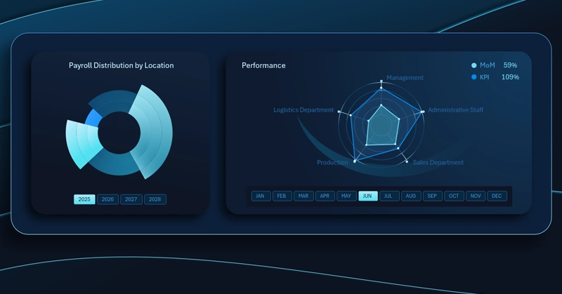
Excel radar chart: each axis represents a separate company department, and the polygon covers KPI growth and MoM metrics simultaneously. The shape of the figure clearly identifies departments with leading momentum and areas of stagnation within the expense structure.
Growth for the sake of growth is not the goal here — the goal is to see the real picture and move in the right direction.
Notice how effectively an interactive radar chart can be used within the overall data visualization of an Excel dashboard:

Excel Dashboard for a Teal Organization
A Radar chart for comparing the growth distribution of two metrics across departments is the visual embodiment of the teal principle: see honestly, move intentionally. An asymmetric shape on the chart is not a reason to penalize underperforming departments — it's an invitation to a conversation about the underlying causes. Endless MoM+ has never been a sign of a healthy business on its own — what matters far more is that every growth rate is appropriate to its role within the overall strategy. An Excel dashboard makes this picture visible, and therefore manageable. The more clearly we see the goal, the closer we get to it.
 Download the Radar Chart Template for Data Distribution in Excel

Data Visualization Charts for Interactive Report Creation in Excel.
Dashboard Templates