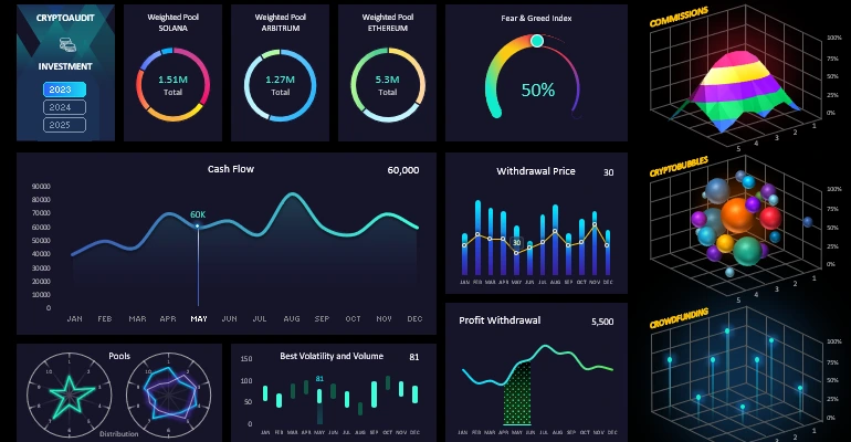
Speedometer Chart for KPI metrics on an Excel dashboard
The speedometer chart is an effective tool for displaying key KPI metrics on Excel dashboards. It shows how current results compare to targets and makes data analysis quick and clear. Using shapes and standard charts, you can build a custom data visualization with a unique design.
Speedometer Chart Template for KPI in Excel

The KPI speedometer chart in Excel is used as a visual control tool on an interactive dashboard. In this tutorial, we will show how to create this chart for your reports and presentations. From the video tutorial, you will learn step by step how to:
- Create a donut chart template for customization.
- Add a data series and configure standard settings.
- Create a design base using Excel shapes.
- Make a beautiful background for the chart with a fake gradient effect.
- Create a mask effect to overlay the background.
- Add additional shapes to decorate the design.
- Add control elements for the progress chart.
- Enjoy the impressive design of the customized chart in Excel.
This data visualization can be effectively used for presentations. For example:
Beautiful dashboard design for analyzing investment portfolios in Excel
Using the speedometer chart in Excel helps quickly assess KPI progress and make informed decisions. This tool makes dashboards more informative and convenient for visual data analysis, increasing efficiency in tracking metrics.


Data Visualization Charts for Interactive Report Creation in Excel.
Dashboard Templates