Templates of Interactive Excel Charts with Beautiful Design
Standard charts in Excel are informative, but they often lack interactivity and visual appeal for a more enjoyable user experience. Interactive charts with stylish design solve these issues. They allow real-time data control while maintaining a modern and attractive look.
Interactive Charts in Excel with Appealing Design for Dashboards
Interactive charts with elegant design turn Excel into a powerful visualization tool for presentations. At the end of this article, you can download a ready-made template with chart designs for Excel. This material also includes a video tutorial showing how to create such charts using standard Excel tools without macros. As a result, you’ll learn and discover more:
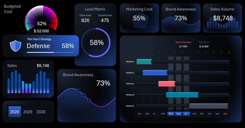
- Minimalist grid design for a simple Excel dashboard.
- Populate tables with formulas for dynamic charts.
- Prepare source data for Excel pivot tables.
- Create a pivot table using a named range as the data source.
- Set up value fields in pivot tables.
- Use the dynamic GETPIVOTDATA formula to pull data from pivot tables on the fly.
- Stylish design for radar charts in Excel.
- Add and configure dashboard control buttons using pivot table slicers.
- Expand dashboard interactivity by creating custom control elements.
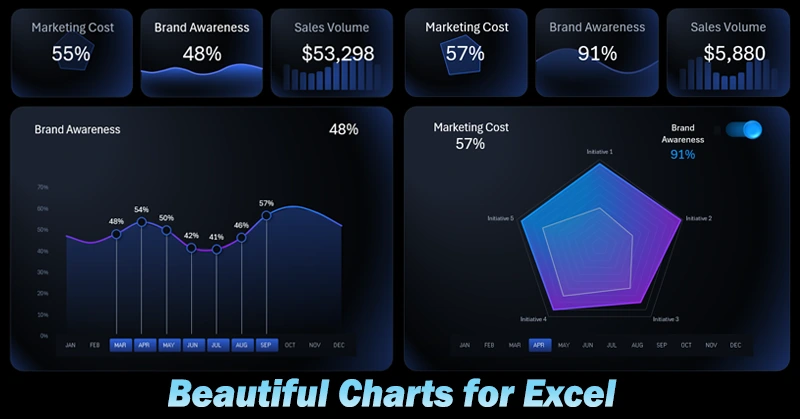
- How to create a functional KPI card design with sparklines in Excel.
- Infographic for brand awareness metrics in the dashboard header.
- Infographic for analyzing sales volume.
- Brand awareness screen – quickly build a new dashboard screen using a template.
- Stylish and functional line chart with smooth curves and data label cursors.
- Sales volume screen – interactive data visualization features in Excel.
- How to make a beautiful bar chart with rounded column corners in Excel.
- How to switch between dashboard screens without using macros in Excel.
- Quickly develop a light mode version of the dashboard design using a template.
- How to create a toggle button for switching between dark and light dashboard themes in Excel.
- Presentation of a simple yet visually stunning dashboard in Excel.
Example of impactful use of interactive charts in an Excel dashboard template:
Interactive Presentation of Marketing Strategy in Excel.
Sometimes adding a few design touches to chart visuals can significantly enhance how data is presented. Beautiful charts easily engage the audience and improve the quality of analytics. This approach is especially useful for presentations of simple, low-function dashboards.


Data Visualization Charts for Interactive Report Creation in Excel.
Dashboard Templates