How to do a Regression and Correlation analysis in Excel
Regression and correlation analysis – there are statistical methods. There are the most common ways to show the dependence of some parameter from one or more independent variables.
Lover on the specific practical examples, we consider these two are very popular analysis among economists. And give an example of the receiving the results when they are combined.
Regression analysis in Excel
It shows the influence of some values (independent, substantive ones) on the dependent variable. For example, it depends on the number of economically active population from the number of enterprises, the value of wages and other parameters. Or: how to influence foreign investment, energy prices, etc. on the level of GDP.
The analysis result allows you to prioritize. And based on the main factors you may to predict, to plan the development of priorities areas, to make to the management decisions.
Regression is:
- the linear (у = а + bx);
- the parabolic (y = a + bx + cx2);
- the exponential (y = a * exp(bx));
- the power (y = a*x^b);
- the hyperbolic (y = b/x + a);
- the logarithmic (y = b * 1n(x) + a);
- the exponential (y = a * b^x).
Consider the example to the construction of a regression model in Excel and the interpretation of the results. Consider the linear regression type.
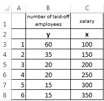
The task. On 6 enterprises was analyzed the average monthly salary and the number of employees who retired. It is necessary to determine the dependence of the number of employees who retired from the average salary.
The linear regression model is as follows:
У = а0 + а1х1 +…+акхк.
Where a – are the regression coefficients, x – the influencing variables, k – the number of factors.
In our example as Y serves the indicator of employees who retired. The influence factor – is the wage (x).
In Excel, there are built-in features with which you can calculate the parameters of the linear regression model. But faster it will make the add-on «analysis package».
Activate the powerful analytical tool:
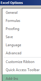
- Push the button «FILE»-«Options»-«Add-Ins».
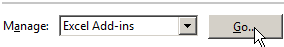
- Below the drop-down list in the «Manage:» field is the inscription «Excel Add-Ins» (if it is not, click on the checkbox to the right and select). And click the «Go» button. Hit.
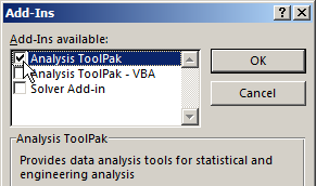
- The list of available add-ins. Select the «Analysis ToolPak» and click OK.
After activating the superstructure will be available on the «DATA» tab.
We direct regression analysis now.
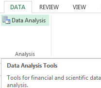
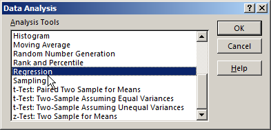
- Open the «Data Analysis» tool menu. Select the «Regression».
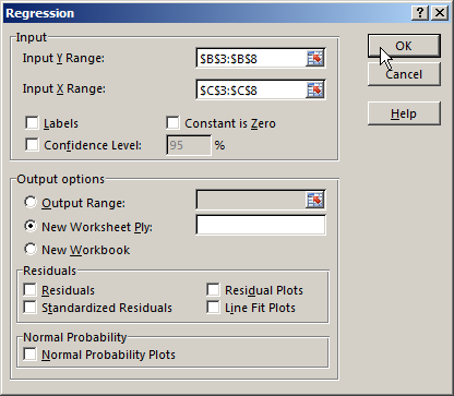
- Open the menu for selecting the input values and output parameters (which display the result). In the fields for the specify range of the input data, which describes the options (Y) and influence the factor (X). The rest can not fill.
- After you click OK, the program will display the calculations on a new page (you can choose the interval to be displayed on the current page or assign to the output to a new book).
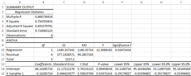
Firstly of all pay attention to the R-squared and the ratios.
R-square – is the coefficient of the determination. In our example – there is 0. 755, or 75. 5%. This means that the model parameters estimated at 75. 5% explains the addiction between the parameters whixh are studied. The higher the coefficient of determination, the better is the model. Good - above 0. 8. Bad - less than 0. 5 (such an analysis can hardly be considered reasonable). In our example – is «not bad».
64. 1428 ratio shows how will be Y, if all the variables in the model will be equal to 0. That is, the value of the analyzed parameter is influenced by other factors, which has not been described in the model.
-0. 16285 ratio shows the weight of the variable X to Y. That is, the average monthly salary in the range of the model affects the number of resignations from the weight -0. 16285 (this is a small effect). The sign «-» indicates to a negative effect: the higher the salary, the less dismissed. That is true.
Correlation analys in Excel
The correlation analysis helps to establish whether there is between the indices in one or two samples of the connection. For example, the time between the time machine and repair costs, equipment costs and operation duration, height and weight of children, etc.
If there is the connection is available, whether the increment of one the increase parameter (positive correlation) or the decreasing (negative) of the other one. The correlation analysis helps to the analyst to determine whether it is possible for the value of one indicator to predict the potential value of the other one.
The correlation coefficient is denoted by r. It ranges from +1 to -1. The classification of correlations for different areas will be different. If the value of the coefficient is 0 linear dependence between samples does not exist.
Consider how with helping Excel tools to find the correlation coefficient.
To find the paired coefficients applied CORREL function.
The task: To determine whether there is the interrelation between the operating time of the lathe and the costing of its maintenance.
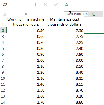
Put the cursor in any cell and click the fx button.
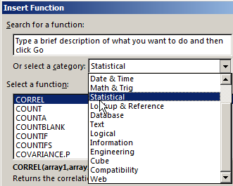
- In «Statistics» category select to the function =CORREL().
- The argument «Array 1» – is the first range of the values - while the machine: A2: A14.
- The argument «Array 2» – is the second range of values - the cost of repairs: B2: B14. Click OK.
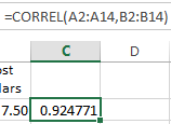
To determine the type of connection, it is necessary to see the absolute number of the coefficient (each a scale has for each field).
Note. For the correlation analysis of several parameters (more 2) it is more convenient to use the «Data Analysis» (add-on «Analysis Package»). In the list you need to choose and mark correlation array. That`s all. These coefficients are appeared in the correlation matrix.
The regression analysis
In practice, these two techniques are often used together.
The example:
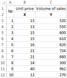
- Build to the correlation field: «INSERT» - «Charts» - «Scatter» (enables to compare pairs). The value range – there are all the numeric dates in the table.
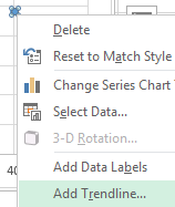
- Click with the left mouse button on any point on the chart. Then right. In the menu, select «Add Trendline».
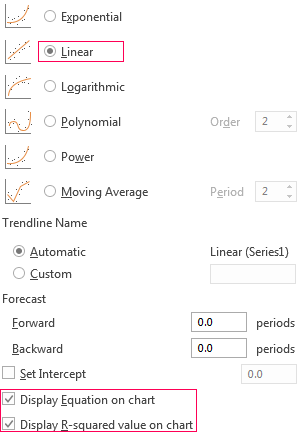
- Assign the parameters for the line. Type – is «Linear». Below – «Display equation on chart» and «Display R-squared value on chart».
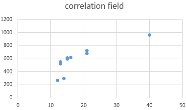
Done:
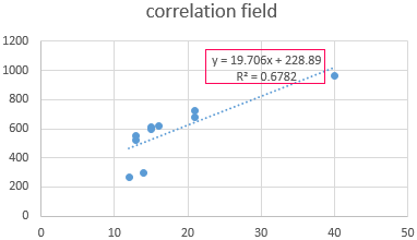
They are now visible and regression analysis dates.

Data Visualization Charts for Interactive Report Creation in Excel.
Dashboard Templates