Drawing of charts and diagrams in Excel
Taxes are better calculated on the basis of information from the tables. And for the presentation of the company's achievements it is better to use charts and diagrams.
The graphs are well suited for analyzing of relative data. For example, the forecast of sales growth dynamics or the assessment of the overall trend of growth in the capacity of the enterprise.
How to build a chart in Excel?
The fastest way to build a chart in Excel – is to create graphs by template:
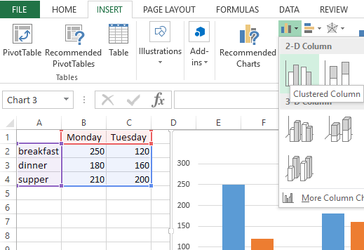
- The range of the cells A1:C4. You need to fill it with values as shown in the figure:
- Select the range A1:C4 and choose the tool on the «INSERT» tab – «Insert Column Chart» – «Clustered Column».
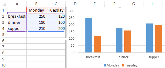
- Click on the graph to activate it and call the additional menu «CHART TOOLS». There are also three tool tabs available: «DESIGN» and «FORMAT».
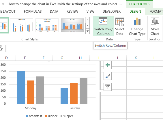
- To change the axes in the graph, select to the «Constructor» tab, and on it the «Switch Row/Column» tool. Thus, you change the values in the graph: rows per columns.
- Click on any cell to deselect the chart and thus to deactivate its setting mode.
Now you can work in the normal mode.
How to build a chart on the table in Excel?
Now we are constructing the diagram according to the data of the Excel table, which must be signed with the title:
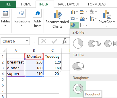
- Select the A1:B4 range in the source table.
- Select «INSERT» – «Insert Pie or Doughnut». From the group of different chart types, select the «Doughnut».
- Sign the title of your chart. To do this, make a double-click on the title with the left mouse button and enter the text as shown in the picture:
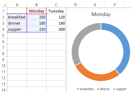
After you sign a new title, click on any cell to deactivate the chart settings and go to normal mode.
Diagrams and charts in Excel
How not to create a table, its data will be less readable than the graphical representation in diagrams and charts. For example, pay attention to the picture:
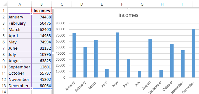
According to the table, you do not immediately to notice in what month the company's revenues were the highest, and in what the smallest ones. You can, of course, use the «Sorting» tool, but then the general idea of the seasonality of the firm's activity is lost.
Pay attention to the chart, which is built according to the same table. Here you do not have to blame your eyes to notice the months with the smallest and the largest indicator of the company's profitability. And the general presentation of the schedule allows you to track the seasonality of activity of sales, which bring more or less profit in certain periods of the year. The data recorded in the table, is perfectly suitable for detailed calculations and calculations. But the charts and the diagrams provide us with its indisputable advantages:
- improve to the readability of data;
- simplify the general orientation of large amounts of the data;
- allow you to create high-quality presentations of reports.

Data Visualization Charts for Interactive Report Creation in Excel.
Dashboard Templates