Percent charts in Excel: creation instruction
Suppose the user has data in absolute values. He needs to display the information on the chart. For the sake of clarity it is necessary to show the relative values of the data. For example, what percentage of the plan is made, how many goods sold, which part of the students coped with the task, what percentage of employees has a college education, etc.
Solving this task is not so difficult. But there are might be some difficulties without working skills in Excel when you have lack of experience. Let us consider in detail how to make an Interest chart in Excel.
Pie chart Interest
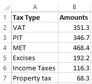
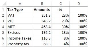
We construct a pie chart with the percentage assignment. For example take an official tax analyst "Income tax types in the consolidated budget for 2015":
Select the entire table including the names of the columns. On the "INSERT" tab in the "Charts" group choose a simple “Pie”.
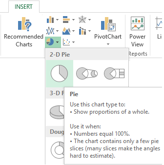
Diagram appears on the sheet after clicking on the tabs of the selected type of the form:
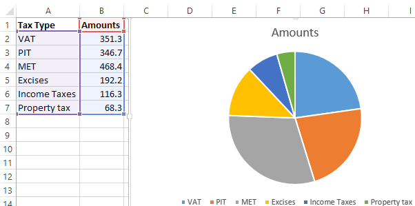
A separate segment of the circle is the share of each tax in the total revenues of the consolidated budget in 2015.
Now we show the percentage of taxes in the diagram. Click the right mouse button. In the dialog box select a task "Add Data Labels".
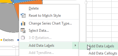
The values from the second column of the table will be on the parts of the circle:
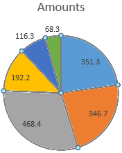
Once again right click on the chart and select the item "Format Data Labels":
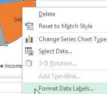
In the menu in the subgroup of "LABEL OPTIONS" you need to uncheck the "Value" and put the checkmark on "Percentage".
In the "NUMBER" subgroup change the common format on percentage. Remove the decimal digits and set the format code "0%".
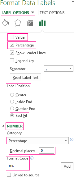
Put the "0.0%" in the “Format Code” field if you want to display percentages with a single decimal place. Set "0.00%" if you need two characters after the decimal point. And so on.
Default settings allow you to change the place of signatures on the chart. Possible options:
- "Center" - the signature will be displayed at the center of the segments;
- "Inside End" - the signature will appear from the inside circumference;
- "Outside End" - a signature will appear on the outside of the circle. When you select this diagram option pie will be slightly smaller but smaller data improves readability;
- "Best Fit" - option allows Excel to set the signature optimally.
In the menu in the subgroup of "TEXT OPTIONS" you can use the tool "Text direction" to change the direction of the signatures in the subgroup of "Vertical alignment". It also set the incline angle.
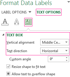
Choose a “horizontal” direction and position "Middle Center”.
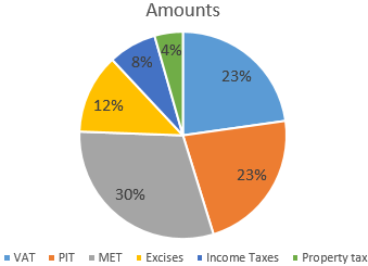
Pie chart with percentage is ready. The chart shows the percentage of income from taxation.
100% Stacked Column
Let’s add columns to the table:
- with a percent (the percentage contribution of each type of tax in the total amount);
- 100%.
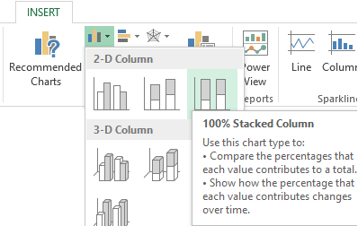
We click on any cell of the table. Go to the tab "INSERT". In the group of "Carts" choose "100% Stacked Column".
Automatically created a chart does not solve the problem. Therefore in "CHART TOOLS"-“DESIGN” tab in the "Data" group go to the "Select Data".
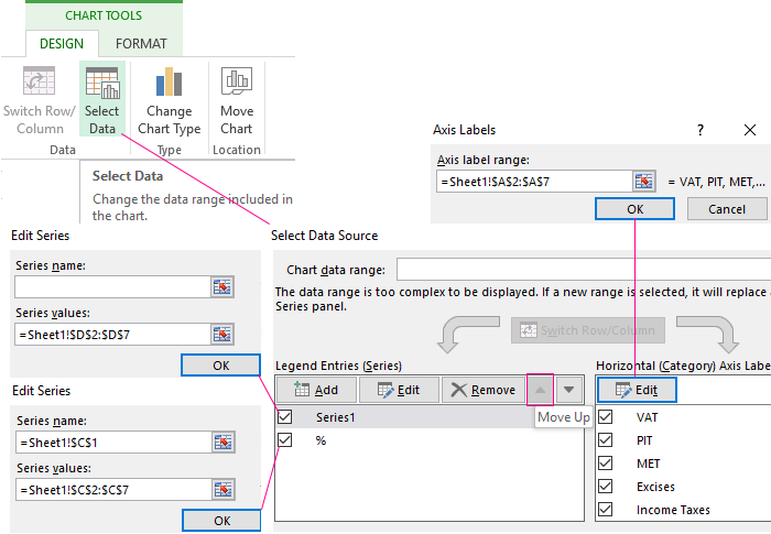
Change the order of rows Use the arrows to, so that percentage rates were at the bottom. Delete a number which indicates the absolute values. The title “Series1” should not be as sign of the horizontal axis.
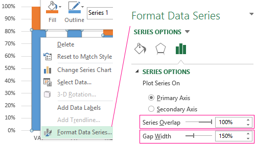
Select any column created charts. Click the right mouse button. In the dialog box select a task "Add Data Series".
We go to the tab "Format Data Series" in the menu that appears. We set the value 100% for the overlapping rows.
As a result of this work we get a chart like this:
Download Percent Charts example
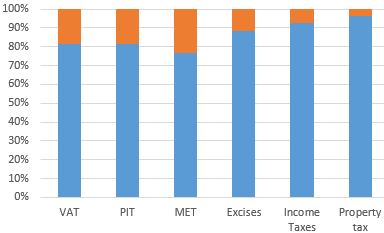
This chart gives understanding the percentage of taxes in the consolidated budget.
