GETPIVOTDATA for working with pivot tables in Excel
The GETPIVOTDATA function is designed for dynamically extracting data from a PivotTable. When data or even the structure of a PivotTable is updated or changed, the GETPIVOTDATA function automatically updates the values it returns. It's more than just a cell reference; this function has much more to offer. Let's explore its capabilities.
Preparing source data and a PivotTable for the example
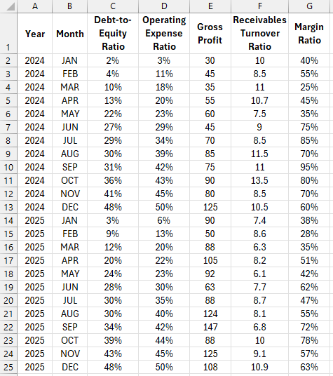
For this example, create a table with initial values of monthly financial indicators for a 2-year accounting period:
Based on this source data, we will build a PivotTable. To do this, select the cell range A1:G25 or simply place the Excel cursor within this range, and the source table will be automatically recognized. Then, choose the tool: Insert – Tables – PivotTable.
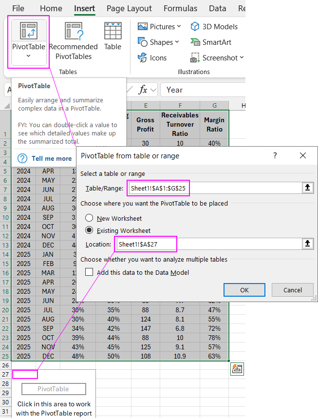
In the PivotTable creation and setup wizard, fill in the two fields as shown in the image above:
- “Table/Range:” – specify the data source reference here, Sheet1!$A$1:$G$25.
- In the options section, “Choose where you want the PivotTable to be placed,” activate the “Existing Worksheet” option, and in the “Location:” input field, specify the reference to cell A27 to place it on the current sheet.
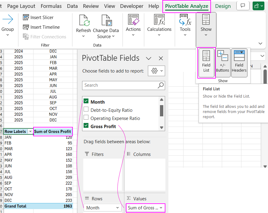
Configure the fields in the PivotTable builder so that the rows contain months, and the values show the gross profit indicator, as shown in the image below:
Example of using the GETPIVOTDATA function in Excel
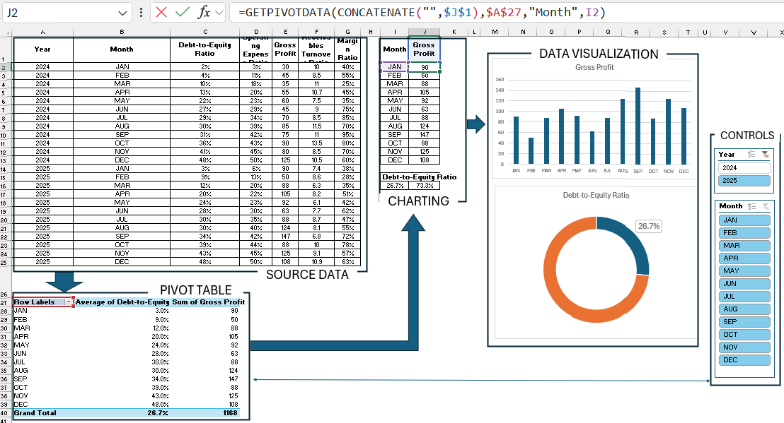
Next to the source data table in the cell range I1:J13, create a table to build a vertical bar chart. The row headers should be abbreviated month names, just like in the source table, and the column headers should match the source data.
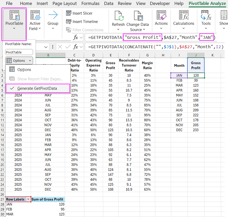
Then, fill the chart table with values from the PivotTable. To do this, enter an equals sign in cell J2 and point to the first value in the second column of the PivotTable (opposite the month JAN). As a result, a formula with pre-filled GETPIVOTDATA arguments will be automatically generated. The auto-generation function is enabled by default. You can check by selecting the option: PivotTable Analyze – PivotTable – Options - Generate GetPivotData. If the option is checked, it means auto-generation of the function is enabled.
We just need to slightly modify the arguments to automatically fill the entire column of the chart table. In the first argument, specify the name of the selected column in the PivotTable. Instead of the text string “Gross Profit,” use the CONCATENATE function, with its arguments being an absolute reference to the cell with the column header $J$1 and an empty string “”. This way, with the CONCATENATE function, we convert any value in cell $J$1 to a text data type. This is a requirement of the GETPIVOTDATA function; otherwise, it will not read the value and will return an error. In the last argument of the GETPIVOTDATA function, specify the row names. We don't need to convert the data to a text string type here; just provide a relative reference to the cell with the month name (for JAN – this is I2). Fill the entire column with the formula, and the chart table will automatically populate with values from the PivotTable.
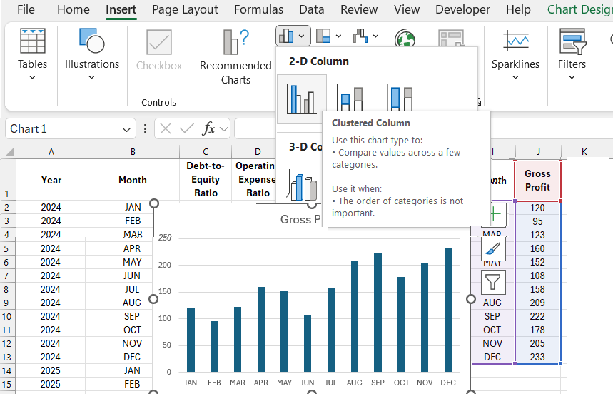
The chart table is ready, and we can now build a horizontal bar chart based on it.
GETPIVOTDATA for dynamic charts in Excel
Select the cell range of the chart table I1:J13, then choose the tool: Insert – Charts – 2-D Column – Clustered Column.
At this stage, the logical question arises: why not use regular cell references instead of the GETPIVOTDATA function? To give a complete answer with a clear example, we'll need to add a control element to the PivotTable.
Adding data visualization control buttons
We'll add the main advantage of PivotTables for data visualization and dashboard development – data slicers. Move the Excel cursor to the PivotTable area A27:B40 and select the tool: Insert – Filters – Slicer.
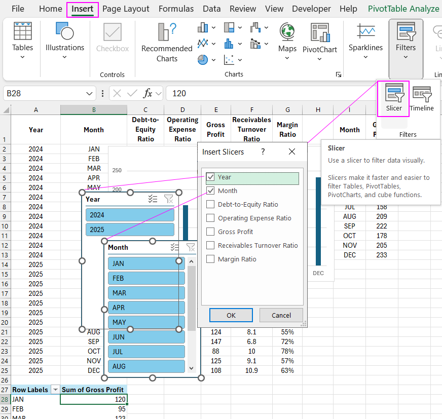
Now we can filter the PivotTable data and manage data visualization on the chart.
Advantages of using the GETPIVOTDATA function
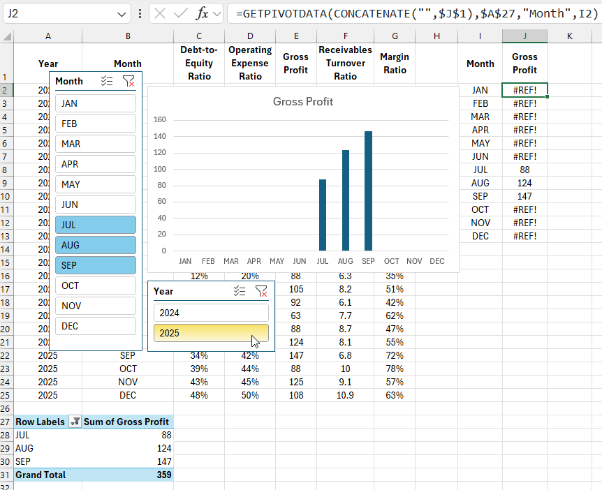
Note! If we had used regular cell references instead of the GETPIVOTDATA function, we wouldn't have been able to display the correct visualization structure on the chart because the PivotTable structure has changed significantly. Now it only has 3 rows, and the months are selected only from the third quarter.
The PivotTable structure can be changed not only vertically by rows but also horizontally by columns. In the PivotTable builder, edit and configure the fields as shown in the image below:
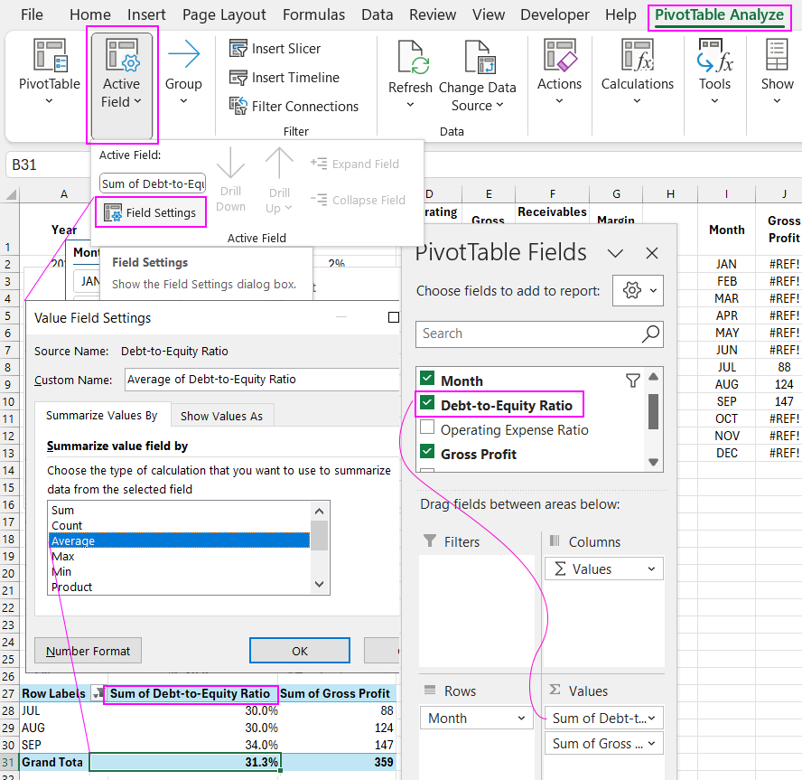
In the final value for the new column “Debt-to-Equity Ratio,” change the calculation operation from Sum to Average, as this column displays percentage values.
Extracting final values from the PivotTable
Now let's create a new mini-table for the chart with two rows and two columns. This time, we'll refer to the final value of the new column in the PivotTable in the row with the Grand Total header.
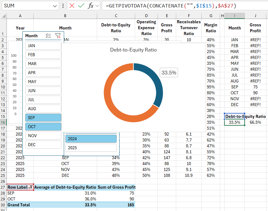
Now, only two months are selected, and the PivotTable structure has also changed both horizontally and vertically because we've added another column. The location of the final values on the sheet has also changed. If we had used cell references in the chart tables instead of the GETPIVOTDATA function, we would have had to change the reference addresses after editing the PivotTable in the builder. We would also have had to create smart formulas to catch the cell location with the final value when the number of selected months changes. It is much more efficient to use the GETPIVOTDATA function, but if desired, for special cases, you can use regular references as you like. Excel doesn't limit us. In most cases, it is recommended to extract data from a PivotTable using the standard GETPIVOTDATA function.
Presentation of the function in a ready-made example
Workflow of dashboards using the GETPIVOTDATA function:
The diagram simplistically shows the stages of transforming source information into interactive data visualization in Excel.
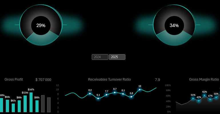
For practice and to fully understand the material, we recommend viewing the GETPIVOTDATA function in action in a dashboard template with interactive visualization of key financial indicators:
Download the example of using the GETPIVOTDATA function in Excel 
You can now study a ready-made example using the Excel dashboard template. This will make it easier for you to learn how to create interactive dashboards with data slicer controls for PivotTables on your own.

Data Visualization Charts for Interactive Report Creation in Excel.
Dashboard Templates