How to create Pivot Table from multiple sheets in Excel
A Pivot Table is used to quickly analyze a large amount of data. It allows you to combine information from different tables and sheets and calculate the overall result. This universal analytical tool significantly expands the capabilities of the Excel program.
You can generate new totals for using original parameters by changing rows and columns in places. You can filter the data by showing different elements. And also you can clearly detail the area.
Pivot Table in Excel
For an example we use the sale of goods table in different trading branches.
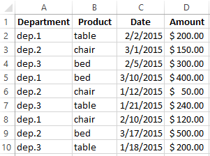
You can see from the table what, when and what amount was sold in departments. You will have to calculate manually using calculator to find the amount of sales for each department. Or you can make another Excel spreadsheet where you can show the totals using formulas. These methods of analyzing information are unproductive. It's easy to mistake using such approaches.
The most rational solution is to create a Pivot Table in Excel:
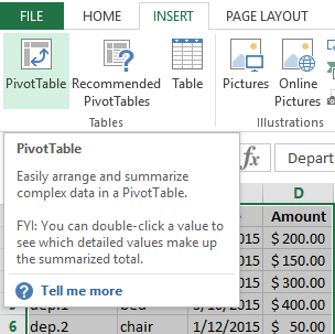
- Highlight A1 cell so that Excel knows what information he should use.
- In the “INSERT” menu, select the “Pivot Table”.
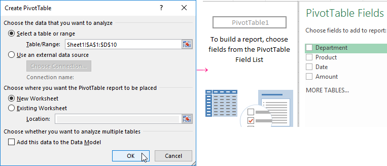
- The "Create PivotTable" menu opens where we select the range and specify the location. The range field will be filled in automatically since we have set the cursor in the data cell. If the cursor is in an empty cell you need to set the range manually. The PivotTable can be made on the same sheet or on the other. Do not forget to specify a place for data if you want the summary data to be on an existing page. The following form appears on the page:
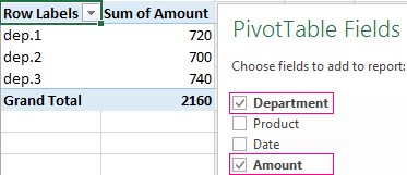
- We will create a table that will show the amount of sales by department. We select the column names that we need in the list of fields in the summary table. We get results for each department.
It’s simple, fast and high-quality.
Important nuances:
- The first line of the specified range must be filled.
- Each column should have its own header in the basic table because it's become easier to set up a summary report.
- You can use the Access tables, SQL Server, etc. as a source of information in Excel.
How to make a Pivot Table from multiple tables?
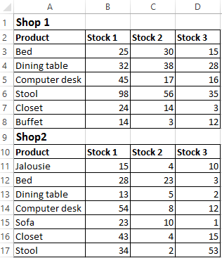
You need often to create summary reports from multiple tables. There are a couple of tablets with information. We need to combine them into one common table. Let’s imagine that we have stock leftovers in two stores.
The order of creating a Pivot Table from several sheets is the same.
Create a report using the PivotTable Wizard:
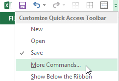
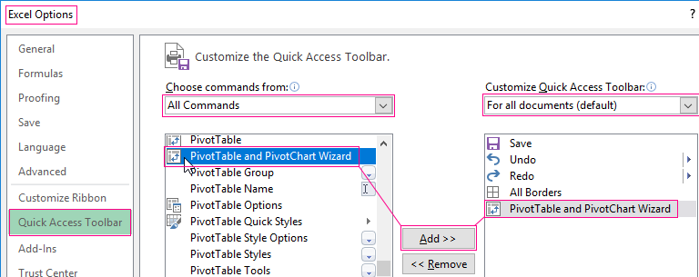
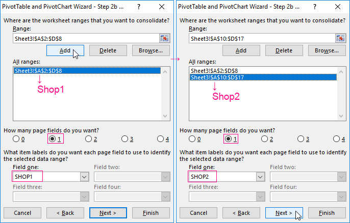
- Call the "PivotTable and PivotChart Wizard" menu. To do this click the Quick Access Toolbar button and click on "More Commands". Here on the "Options" tab we find the "PivotTable and PivotChart Wizard". Add the tool to the Quick Access Toolbar. After this do next:
- We put the cursor on the first table and click on the "Wizard" tool. The window opens and we set right there check-mark that we want to create a table in "Multiple consolidation ranges". It means that we need to combine several places with information. The report type is the "PivotTable", "Next".
- The next step is to create fields. “I will create the page fields”-"Next".
- We set the range of data which helps us compile a consolidated report. We select the first data range together with the header - "Add". Set the second range together with the names of the columns - "Add" again.
- Now select the first range in the list. We put the tick at the field number one. This is the first pivot report field. Give him the name "SHOP1". Then we select the second range of data and again enter new name of the field is "SHOP2". Click "Next"-“Finish”.
- Choose the place for the summary table. You can do it on an existing sheet or a new one. It is better to choose a new sheet so that there are no overlaps and displacements. At us it turned out so:
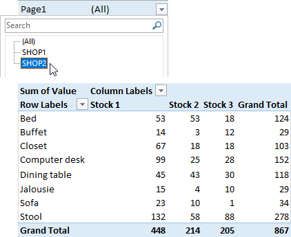
As you can see, just a few clicks you can create complex reports from several sheets or tables of different amounts of information.
How to work with Pivot tables in Excel
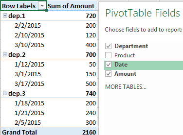
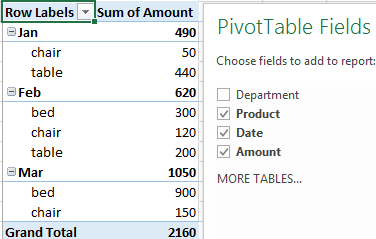
Let's start with the simplest: adding and removing columns. For example, consider the sales Pivot Table for different departments (see above).
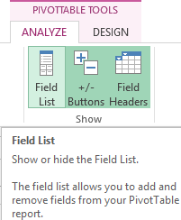
We had a task pane where we selected the columns in the fields list. You can see it to the right of the summary table. Just click on the plate if it disappeared.
Add one more field to the summary table to make a report. To do this, check the box next to "Date" (or next to "Product"). The report immediately changes. A sales dynamic appears by day in each department.
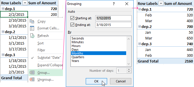
Group the data in the report by months. Make right-click on the "Date" field to do this. Click "Group". We choose "Months". The result is a summary table of this type:
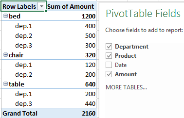
If you want to change parameters in the summary table, you should just uncheck ticks next to the existing rows fields and set them in other fields. We will make a report which based on the goods names, but not on departments.
That is what happens if we remove the “Date” and add a "Department":
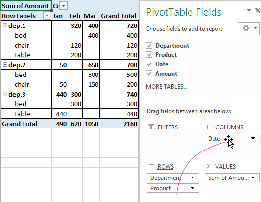
But this report can be done if you drag fields between different areas:
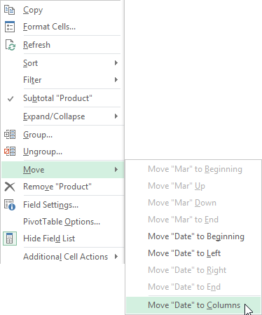
If you want the line name to become the column name, so than select this name and click on the pop-up menu. Click "Move Date to Columns". In this way we move the date into columns.
We put the field "Department" afore the names of goods using the menu section "Move to Beginning".
Let’s show details for a particular product. For the example we will use the second summary table where the stock leftovers are displayed. Highlight the cell. Right-click - "Expand/Collapse" - “Expand” - “Amount” - “OK”.
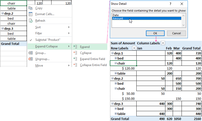
Select the data field that you want to display in the menu that opens.
A tab with report parameters becomes available when we click on the summary table. With its help you can change titles and data sources and also group information.
Checking the correctness of bills
It is easy to check how well the service providers charge the rent using Excel spreadsheets. Another positive aspect is saving. If we monitor gas and energy expenses each month, we will be able to find a reserve for saving money to be able to meet a bills on apartment.
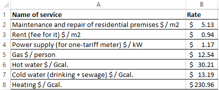
At the beginning we propose you to compile a summary table of tariffs for all utility bills. The data will be different for different cities.
For example, we made a tariffs summary table:
For educational purposes take a family of 4 people who live in 60 square meters’ apartment. You need to create tables for calculation for each month to monitor utility payments.
The first column = the first column in the summary table. The second one is the formula for calculating with the next syntax:
= counter reading *rate / meter living area * number of persons
For easement we recommend you to make an in-between column. You will record there all the meter readings (variable component).
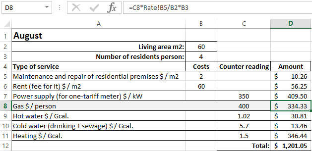
Our formulas refer to the sheet where the summary data with tariffs is located.
Download multiple examples of pivot table
You can also add housing benefits to the formulas if they are applied in the calculation of utility payments. You should request all the information on charges in the accounting department of your service organization. Just change the data in the cells when tariffs change.

Data Visualization Charts for Interactive Report Creation in Excel.
Dashboard Templates