5 beautiful ideas for creating interactive infographics Excel
We present to your attention a collection of components for the design of standard charts. How to go beyond the standard capabilities? Use these cool cliparts and beautiful ideas for inspiration to create original dashboards with infographic elements in Excel. In this example, we will present templates with infographics on the topic of cosmetics and perfumery.
An example of how to make a beautiful interactive infographic in Excel
The capabilities of the built-in vector shape editor in Microsoft Excel are very good. This fact has been repeatedly confirmed by the Japanese artist Tatsuo Horiuchi with his paintings of masterpieces drawn in Excel:
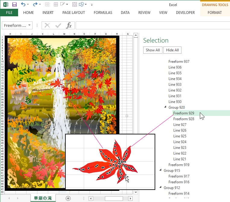


One of the excellent results of Excel artist Tatsuo Horiuchi can be downloaded at the end of the article.
As you can see, the Excel program is intended not only for cold analytical calculations, but is also able to warm the user with the rays of art. Well, let's try to test our creative powers on Excel, we need to develop this topic. In addition, we will come up with targeted practical applications for our infographic art.
Examples of designing charts as interactive infographics in Excel
In all examples, assembled components from vector shapes will be used for decoration as cliparts for diagram elements. Infographic theme - cosmetics and perfumery.
Example idea 1. Bar chart of multi-colored cosmetic or perfume bottles:
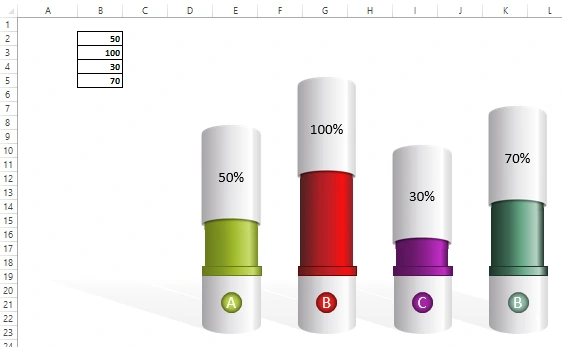
The initial data for the graph is filled in the range of cells B2: B5. A very interesting component that can be successfully used in dynamic presentations.
Example idea 2. Displaying margin indicators for comparative analysis on two lipsticks (red and purple):
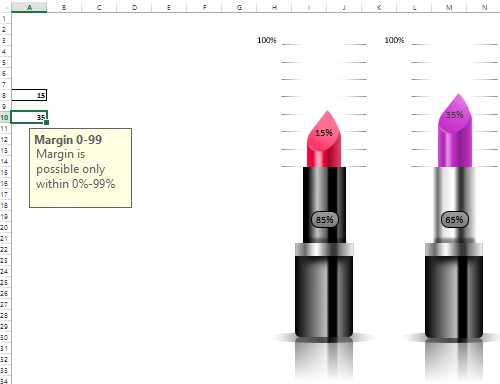
An original idea to present margin indicators in Excel for companies working in the field of cosmetics. The margin values for the chart are entered in cells A8 and A10. In both cells there is protection for checking the verification of entered values. It can be any number only in the range from 0 to 99. After all, the margin cannot be equal to 100% or more, since it (as opposed to the markup) is a share in the price of the product. Also, the control of the values entered into the cell allows us to keep the appearance of the chart from distortions when using anomalous values. In a word, so as not to spoil the integrity of the "picture".
Example idea 3. Bar chart for the presentation of indicators for products from the perfumery series:
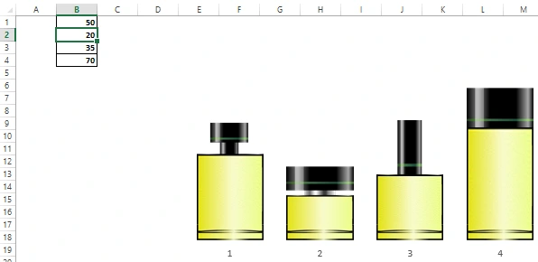
It can be as one chart with columns different in appearance, or 4 different charts with the same columns. The original values are populated in a range of four cells B1: B4.
Example idea 4. Perfume bottle with packaging:
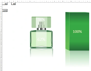
Here is a combination of charts 2 in 1. The bottle of perfume itself and its cap accordingly change in size when the initial values change. In this case, the ratio of the "golden ratio" 62/38 is displayed. If the parameters change, then the dimensions of the components of the infographic will be resized dependently in the correct proportion. Packaging functions like a traditional bar chart. This component for infographics is good for interactive presentations of various perfume indicators.
Example idea 5. Two perfume bottles:
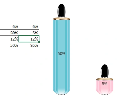
Bar chart for comparative analysis and presentation. For example, to compare the number of sales of men's and women's perfumes.
 Download beautiful examples of interactive infographics in Excel
Download painting by artist Tatsuo Horiuchi in Excel file
All components for the design of the diagrams of the above presented examples are located on the "Resources" sheet. Feel free to use them in your infographic presentations.
All shapes in groups of components can be drawn using standard MS Excel tools. But I still recommend using MS PowerPoint. It will help you achieve the results you want faster, as PowerPoint has a lot of useful auxiliary little things that Excel lacks. These two programs are from the same Microsoft developer and are included in the same MS Office software package. Therefore, they perfectly exchange vector shapes without losing quality. It is worth noting that Excel also supports special insertion of vector charts from external editors of other software companies. For example, Adobe Illustrator or Corel DRAW. They can also be converted to shapes directly in Excel and used to design charts.

Data Visualization Charts for Interactive Report Creation in Excel.
Dashboard Templates