Comparative analysis of sales charts in Excel Download
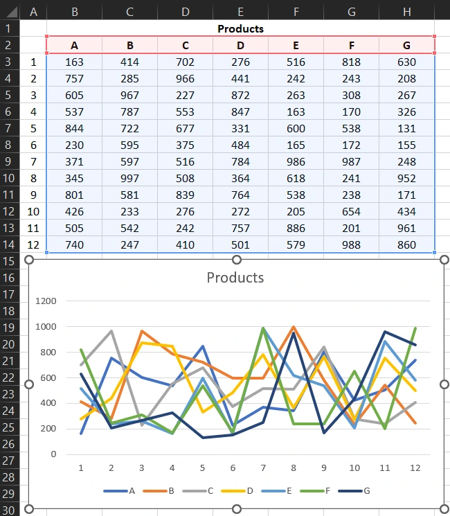
Creating a chart consisting of many data series, we often fall into the trap of spaghetti-type charts. Consider a way to represent multiple data series on a chart using interactive data visualization. The presented solution allows you to move the analyzed data to the fore, thus exposing them against the background of other indicators. In this case, it becomes possible to conveniently compare them with other data series by visual analysis.
Chart for visual analysis of comparison by two indicators in Excel
In our example, we are comparing the sales of two products against the background of the remaining supply. To do this, we create a line chart from the table below:
And then set the same color (for example, gray) for all its series, slightly reducing the thickness of the line of the chart.
To do this, we make the following changes for each dataline format. To do this, left-click on one of the lines to select it and select the tool:
- "Chart Design" - "Format" - "Current Selection" - "Format Selection".
- In the additional window that appears to the right of the "Format Data Series" chart, go to the "Fill and Line" tab and in the "LINE" tool select:

- option - "Solid line";
- color - White, Background 3, darker tint 25%;
- width - 1.5 pt
The main gridlines for the vertical value axis can be deleted by selecting them and pressing the Delete key on your keyboard. In the same way, you can delete the legend of the chart and the vertical axis of its values.
Interactive Excel Spaghetti Plot Template
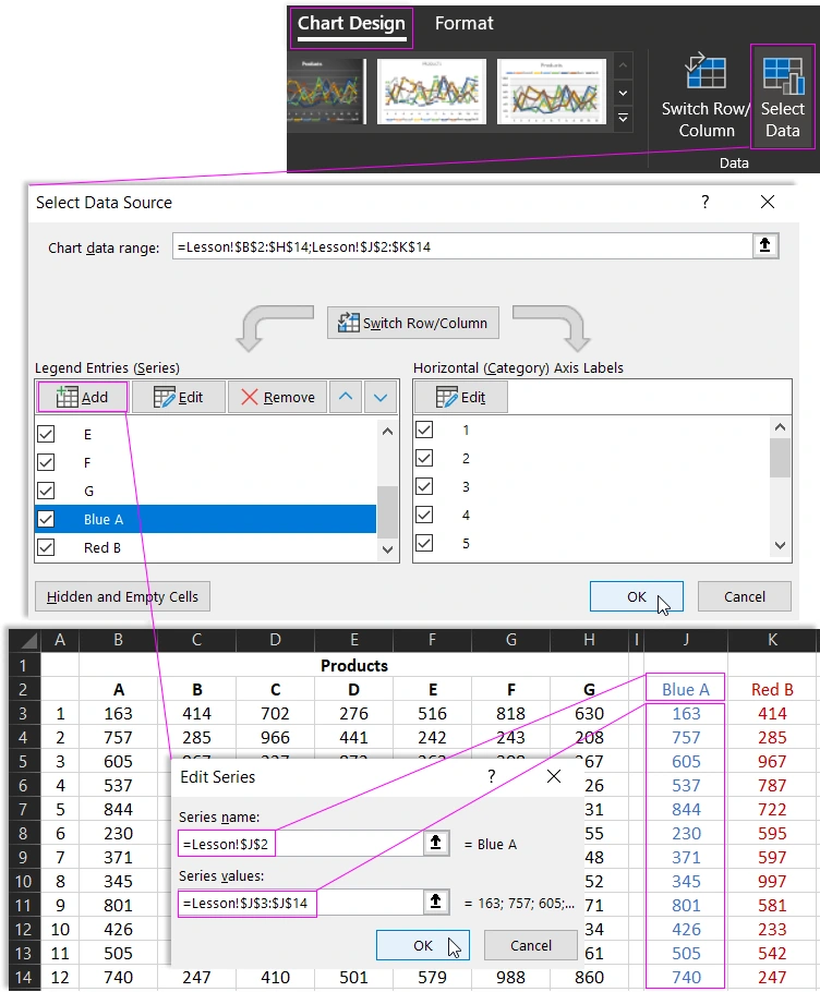
Next, next to the graph on the "SPAGHETTI Plot" sheet, we create two drop-down lists that originate from the product column headings. The fields selected in the lists will allow us to select and highlight two data series on the chart. To do this, select the tool "DATA" - "Data Tools" - "Data validation". In the Validate Input Values dialog that appears, on the Options tab, in the "Allow": options section, select the "List" option. And in the "Source:" input field, specify a link that leads to a range of cells of the table column headers $B$2:$H$2:
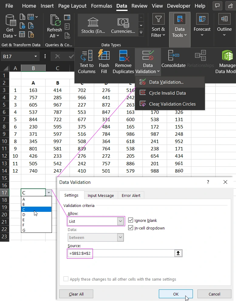
Repeat the same steps to create the second dropdown list.
Selection of two groups of values per Chart
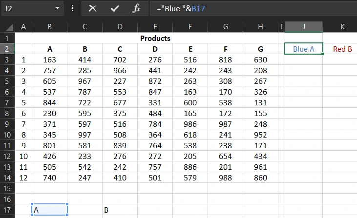
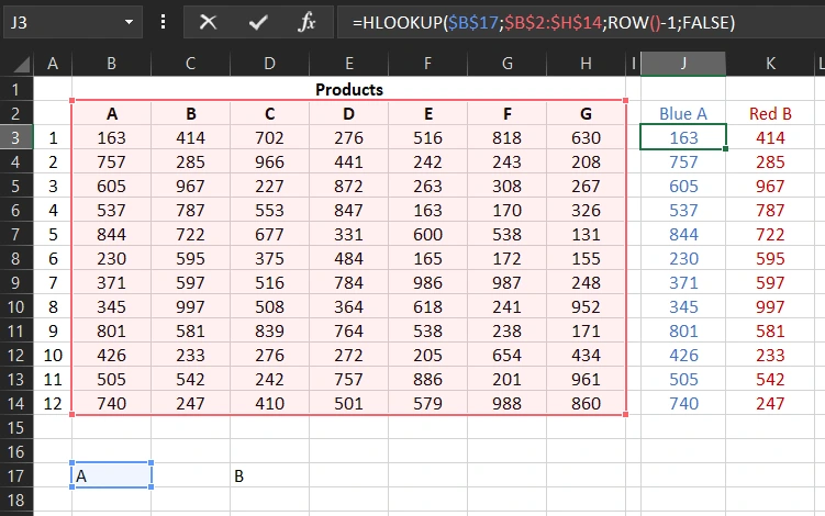
In the cells next to the table on the "Lesson" sheet, we use functions such as HLOOKUP. Thus, we create two additional columns from which we will extract data depending on the option selected in the drop-down list.
We use formulas in the column headings:
- For line data in blue, the formula in cell J2 on the Data sheet is: ="Blue "&B17
- For the red line data, the formula in cell K2 is: ="Red "&D17
Formulas in column cells for the blue line:
We will now add two new data series (blue and red) to the chart, which will appear in place of their gray counterparts. To do this, select the chart by clicking on it with the mouse and select the tool: "Chart Design" - "Select Data". And in the appeared dialog box "Select Data Source" in the left section "Legend Entries (Series)" click on the "Add" button and specify the range of cells of the value column for the blue line, and then do the same for the red line:
As a result, we will get a spaghetti-type graph with two lines of values exposed for comparison when visually analyzing data by indicators.
Informative labels of values with analysis of the dynamics of change
You can also add value labels to the graph, thanks to which we will know how sales have changed over the analyzed period. To display the final indicators on the chart with a change in percentage for visual dynamics, on the second sheet we will create two more columns with formulas:
- J17 - cell reference: =J3.
- K17 - cell reference: =K3.
- J28 - formula: =J14&"|"&TEXT((J14/J3-1);"+0%;-0%;0%").
- K28 - formula: =K14&"|"&TEXT((K14/K3-1);"+0%;-0%;0%").
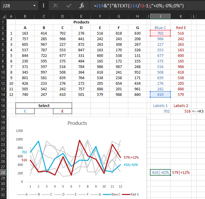
As a result, we have the initial values for the data labels on the chart. In cells J28 and K28, we calculated the difference between the first and last indicator as a percentage for the competitive group of compared products. Now let's add data labels to the chart that will display values from the same columns. First, select the blue line and select the tool: "Chart Design" - "Chart Layouts" - "Add Chart Element" - "Data Labels" - "Right" and select them all by clicking once on any label. But for now, we only need the last indicator at this stage of formatting. Therefore, with one click, click on any signature, and they will all be selected as shown in the figure above.
Next, select "Chart Design" - "FORMAT" - "Current Fragment" - "Format Selection". In the additional window "Format Data Labels" from the "Labels Options" section, check the first option "Value From Cells":
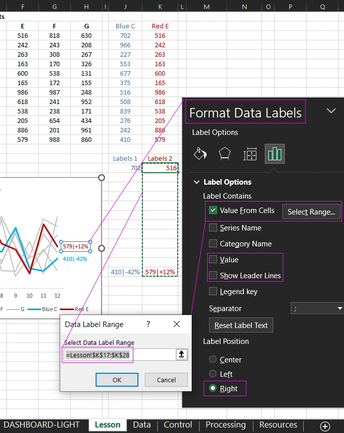
In the "Data label range" window that appears, specify a link to the range of the label column for the blue line on the second sheet, that is: =Lesson!$K$17:$K$28. After that, uncheck all other checkboxes from this section of options.
It remains only to left-align the first caption. To do this, select only the first signature by left-clicking on it. After right-clicking on it, we call the context menu from which we select the option: “Data Label Format” - “Signature parameters” - “Label position” - “Right”. Then change the font color for both labels to blue. Select them and select: "HOME" - "Font" - "Text Color" - "Blue".
We perform a similar action for the red line, only there we indicate the corresponding link to the data range of labels for the red line: =Lesson!$J$17:$J$28. As a result, we get the final version of the spaghetti chart with the exposure of the two viewed histories of the change in indicators for comparison.
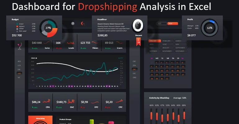
Comparative analysis of sales charts for Dropshipping
Based on the basic principles of this example, you can create spectacular visualizations for dashboards. For example, to analyze key indicators in dropshipping business model.
Dropshipping is a retail fulfillment method where a store doesn't keep the products it sells in stock. Instead, when a store sells a product using the dropshipping model, it purchases the item from a third-party supplier, who then ships it directly to the customer. The store owner never sees or handles the product.
The primary advantage of dropshipping is that it eliminates the need for the retailer to purchase inventory upfront, which can be a significant financial risk. It also allows the retailer to offer a wider variety of products without having to worry about managing inventory, packaging, and shipping.
However, there are also several drawbacks to dropshipping. The profit margins can be lower than traditional retail models, as the retailer is essentially acting as a middleman and must pay a markup to the supplier. Additionally, since the retailer is not in control of the shipping process, there may be issues with shipping times or product quality that can negatively impact the customer experience.
 Download Example and Dashboard for Dropshipping Analysis in Excel
Agree that such an interactive chart is much more convenient not only for a comparative analysis of data simultaneously for 7 types of products over a period of 12 months.

Data Visualization Charts for Interactive Report Creation in Excel.
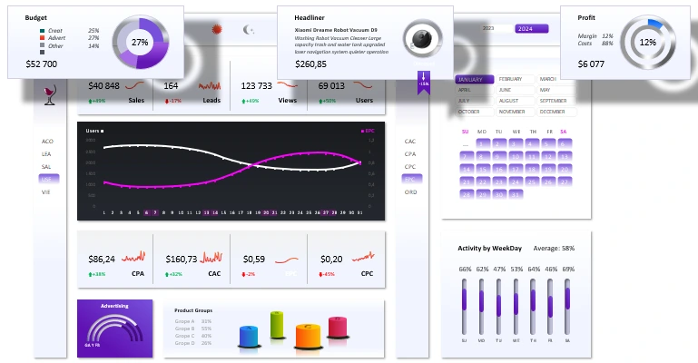
Dashboard Templates