Comparative analysis of sales by day of the week in Excel
An example of a visual comparative analysis of sales with the distribution of dynamics by days of the week. You can download the dashboard at the end of the article at the link. But first, let's look at the principle of operation and the rules for filling out a template with data visualization to analyze the implementation of weekly sales plans for a year.
Dashboard for visual analysis of weekly sales in Excel
Let's simulate a situation to analyze an example. In the Excel program, it is necessary to present a report for a visual analysis of the visualization of data on the effectiveness of the work of 3 top sales managers. The effectiveness will be analyzed simultaneously according to several main and secondary criteria. The main criteria are an analysis of the fulfillment of 4 plans by managers:
- Money sales plan.
- Product sales plan in pieces.
- A plan to attract new customers.
- Customer receivables settlement plan.
Secondary criteria for analyzing the effectiveness of managers are:
- Comparative analysis of sales for the current and the previous week.
- Comparison of indicators of weekly income and expenses by distribution by days of the week.
- The activity and popularity of the best-selling products (divided into 4 basic commodity groups A, B, C and D).
- Customer service coverage.
- The manager's budget spending level for the week.
- Share of success in total sales.
- Distribution of weekly sales by daily shares:
- basic expenses;
- markup or margin;
- other expenses.
To compile such a dashboard of medium complexity, it is necessary to prepare and carefully process the initial data. On the “Data” worksheet, a large table with a large number of columns is filled with initial values:
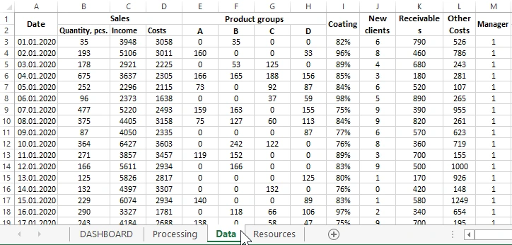
List of incoming data table columns:
- Date - Date of the day the sales plans were fulfilled.
- Quantity, pcs. - The total quantity of goods sold in pieces.
- Income - General income from goods sold.
- Costs - Major implementation costs.
- A - Quantity of goods sold in group A.
- B - Goods sold group B in pieces.
- C - Sold items of group C in pcs.
- D - The number of goods sold in group D.
- Coating - The percentage of customer service coverage.
- New clients - The number of attracted new clients.
- Receivables - Amount of receivables repaid.
- Other Costs - Miscellaneous associated budgetary costs.
- Manager - The serial number of the top manager (in this example 1-3).
The entire table is fully processed and segmented into separate intermediate tables using complex data selection formulas. The whole process of processing the initial indicators takes place on the "Processing" sheet:
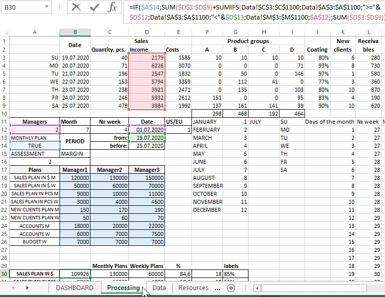
In the range of cells highlighted in color B18:D26, fill in the values of the table for all the set types of plans for each manager. This sheet contains all tables on the basis of which a graphical representation of data visualization for an interactive dashboard is built. Next, we will consider the graphic part of the template on the "DASBOARD" sheet and the principles of interacting with it using controls.
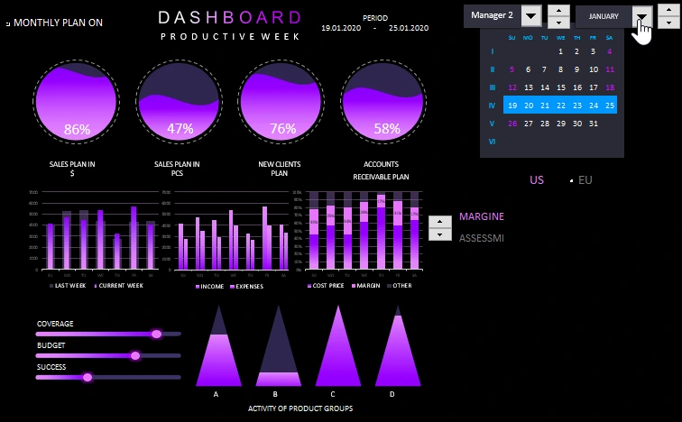
Interactive presentation of sales by day of the week on a dashboard in Excel
Dashboard for comparative analysis of sales with distribution by days of the week in Excel consists of 5 main blocks.
The first block is a calendar with controls:
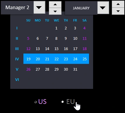
Here the user controls a number of functions for working with visual analysis of weekly comparison of indicators. List of dashboard controls on the block with an interactive calendar:
- Drop-down list for switching between managers.
- Counter for selecting the week number for the current month. In fact, it is a cursor control. With the help of the cursor, the number of the week in the currently selected month is highlighted in Roman numerals and the date of the selected week in the month in Arabic numerals.
- Drop-down list to select the name of the month.
- Counter for easy switching between the months of the current year.
- Calendar format switch for American standard (when the week starts from Sunday) and European style (the first day of the week is Monday).
When you switch the calendar formatting style switch, the labels of the days of the week are changed, and the highlighting of weekends is also redrawn.
The second block "SALES PLANS" - general indicators of plan fulfillment as the main analysis criteria. The block consists of 4 diagrams with signatures of the execution of each plan as a percentage for the current manager as of the selected week:
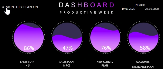
As you can see in the upper right corner the analysis dates of the selected period of a certain week number in the month are highlighted. This signature is very convenient when you need to print a specific situation in a report.
In the upper left corner there is a button "MONTHLY PLAN ON" toggled between display modes of the percentage completion of plans. If it is active in this case, the charts display the values of the monthly sales plan as of the current week. If this display mode is disabled, then the percentages of the weekly plans are displayed.
As mentioned above, the values of monthly and weekly plans for each manager are filled in and set on the "Processing" sheet.
The third block with charts of distribution of managers' sales efficiency indicators by days of the week:
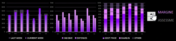
The first histogram displays values for a comparative analysis of sales for the current (colored narrow bars) and the previous (gray, transparent, wide bars) week.
The second chart compares income levels in pairs - the first column and total expenses (main + different) - the second column in the pair.
The third chart shows the distribution of the levels of three shares in the total sales amount for each day of the week:
- The main costs are the lower tier.
- Markup (or margin) - medium level, pink.
- Other expenses - upper level, transparent gray.
To the right of this chart, there is a switch with a counter between the display modes of values at the middle level: markup or margin. All mid-level values have data labels. Formulas for calculating markups and margins are located on the Processing sheet.
When you change the calendar format style with the "US/EU" switch, the labels of the days of the week of the X axis, as well as the values on all three charts, are updated accordingly and automatically. That is, depending on the selected mode, the first day of the selected week number begins on Sunday as in the United States or on Monday as in the European Union.
The fourth block is designed to display indicators for three independent and auxiliary criteria:

- COVERAGE - the level of coverage of the client base when servicing the manager this week.
- BUDGET - the level of budget expenditures planned for the current manager for the current week.
- SUCCESS - the level of sales success of the selected, current manager in relation to the overall total indicators for all three managers.
And the last fifth block is used to graphically represent the most actively sold product groups by the selected manager for the current week:

All together, the blocks are harmoniously combined in one beautiful and functional overall picture of the weekly sales dashboard:
 Download comparative analysis of sales by day of the week in Excel
The analysis template is completely open and available for public use. It does not contain macros, all interactive functionality is implemented using formulas. If desired, the user can use their original values, as well as change and customize the template for their specific needs. For example, add more managers, use data history for several years, or set different sales plans for each month / week. Use freely, develop and enjoy the results.

Data Visualization Charts for Interactive Report Creation in Excel.
Dashboard Templates