Energy reporting dashboard free download example in Excel
We bring to your attention a consolidated dashboard of the expense of finance for electricity and gas at the bakery (Dashboard Energy style). This dashboard is intended for visual analysis of summary data for several reports. In this version of the dashboard, not only the summary data is visualized, but also the values of indicators separately for each report. You can download a working BETA version of the energy dashboard at the end of the article.
Download dashboard energy and reports in Excel
For a good example, as always, we simulate a situation. Let's say we have our own bakery. This is an industrial type of business and the consumption of electricity or gas here occupies a large share in the total expenses. It consumes the bulk of energy, usually the production equipment of a bakery and bakery production line.
Categories of main equipment actively consuming energy at the bakery:
- Ovens, ovens and stoves.
- Heating and air conditioning.
- Dough mixers and mixers.
- Ventilation.
- Refrigeration equipment.
- Other (lightening lamps, gas burners, etc.).
The bakery is a mini-factory for serial baking of bread, which is organized in production facilities:
- Bakery.
- Kitchen.
- Washing.
- Stock.
- Shopping room.
Roughly looks like the technical structure of the model of our production, baking business. Next, we consider the principle of building a dashboard of energy costs and an example of its use.
Dashboard as a summary report on energy consumption in production
On the Dashboard homepage for a summary report with data visualization. It consists of six blocks:
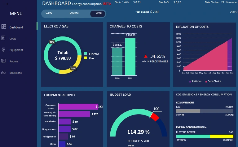
It is immediately worth noting that the initial values were taken for a two-year reporting period from 01.01.2018-31.12.2019. Using the capabilities of this dashboard, we can not only analyze the current situation, but also move through history to compare dynamic changes in energy costs of a business with previous periods.
To navigate through the history of statistics, use the drop-down list in the upper right corner. For example, let's move half a year ago, indicating the date of June 30th, 2019:
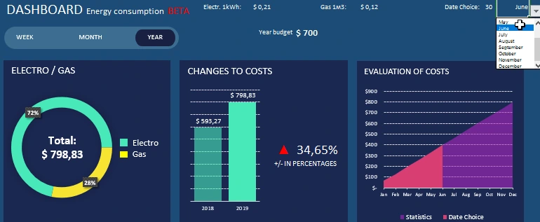
As a result, we immediately see the changes on the third block of the dashboard. In it, the graph shows the values of the whole statistics for comparison with the selected period.
There are no changes on the remaining blocks, since the “YEAR” mode is indicated in the options for choosing the melon segmentation period, and the year remained unchanged on the date of the specified period. Therefore, now we switch the period display mode to the second option “MONTH”. And for clarity, we indicate in the date of June 15th, 2019:
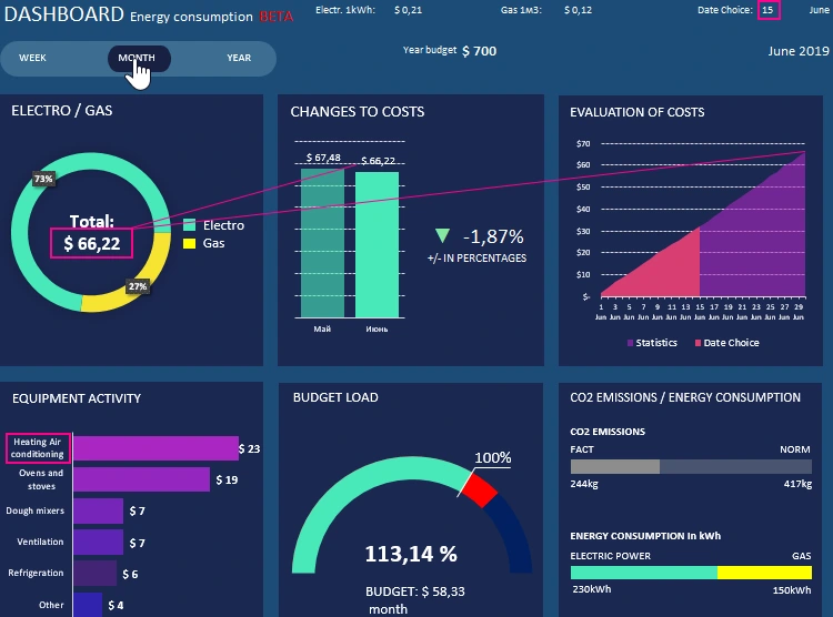
As a result, the information was updated on all 6 blocks:
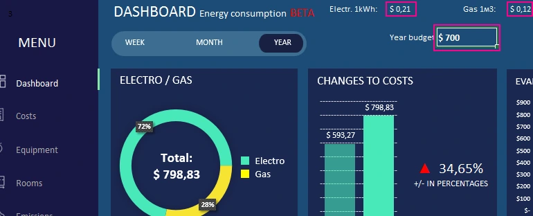
- In the first block, we see the total energy consumption for June 2019 with the separation by the shares of electricity and gas as a percentage.
- On the second block we see a comparison of the expenses of June with the previous month in May. We see that then expenses decreased by 1.87%.
- The third block displays the indicators of expenses as of June 15 in relation to the indicators of the whole month. It can be seen that in the second half of the month expenses increased markedly.
- The fourth block shows that in June, air conditioning and heating consumed more energy than equipment from the category of stoves, ovens and stoves. June was a hot month in weather, but cold in sales and production. For a bakery, this is not a season (low business activity).
- The fifth block shows us a 13.14% excess of the monthly energy expenditures planned by the budget for 1 month.
- Well and how without pollution control. In block six, CO2 emissions are below average. Preferably, electricity was used. Most likely, in the hot June, air conditioners and refrigeration equipment accounted for most of the energy costs of production.
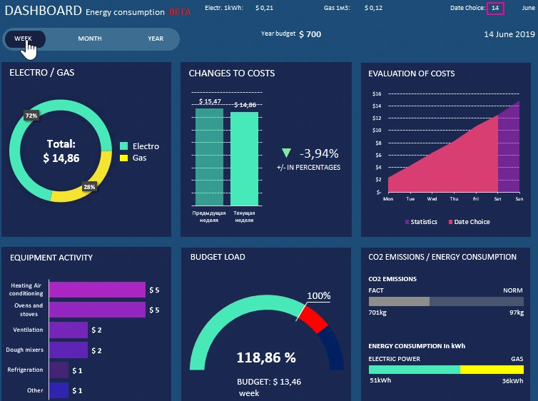
When switching to the "WEEK" mode, all the blocks on the dashboard automatically update their values on the charts and graphs, respectively:
Next, we consider the visualization of the report data on the basis of which the energy dashboard was compiled.
Data visualization for reporting total energy costs
Change the date to the original 12/31/2019 and in the dashboard menu we’ll go to the “Costs” option:
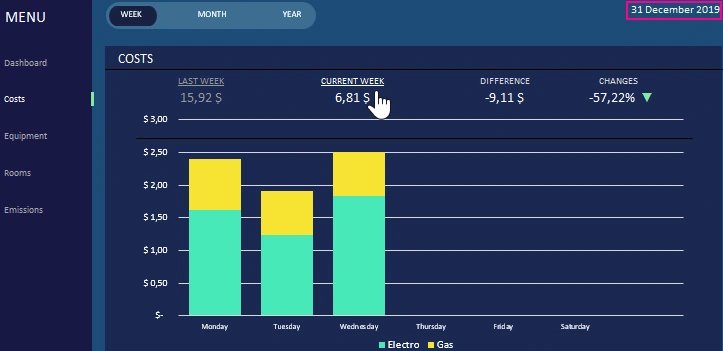
With the selected dashboard options, we see the current weekly total expenses for paying for the energy of the bakery. We still do not have data for Wednesday, Thursday, Friday, Saturday and Sunday for the current week. Therefore, such a large difference in the percentage change in expenditures is 72.68 compared to the previous week. In this report, to analyze the current Monday and Tuesday from the previous week, we can use the switch by clicking on the link "PAST WEEK":
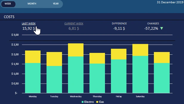
As a result, the schedule was rebuilt automatically - this is very convenient.
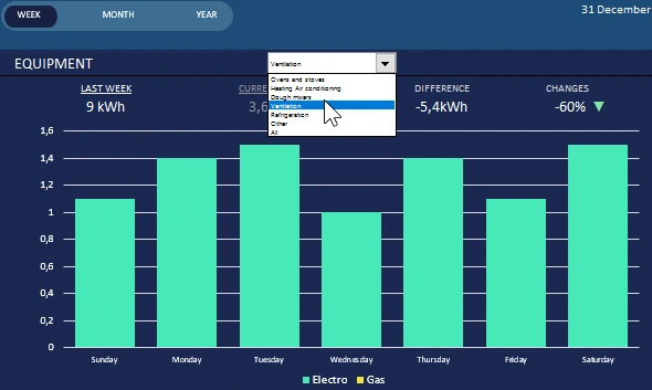
Equipment energy segmentation
The energy consumption report of production equipment is built on a similar principle, as are the costs:
The main difference is that the report data still has a drop-down list of device categories. Thanks to it, we are able to segment data and analyze energy expenditures in detail for each equipment group.
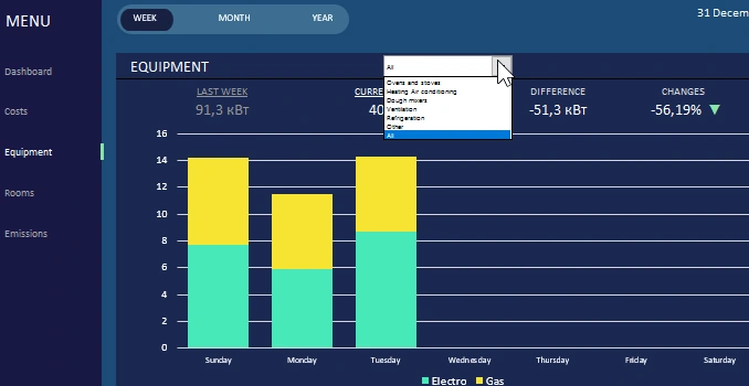
You can also switch between the current and previous periods. You can switch to the “MONTH” mode to analyze the monthly consumption:
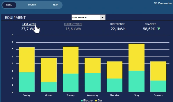
Segmenting this report by categories of manufacturing equipment is very important. Since not all devices use gas energy. For example, ventilation - as shown in the figure above.
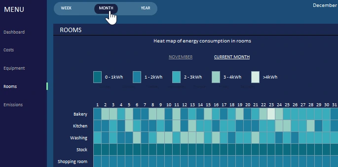
Heat map for visualizing energy consumption in rooms
For a visual analysis of the activity of energy consumption in the premises, a heat map is used:
It is very quick, easy and convenient to replace that of all the premises, the bakery is the busiest. Especially on December 23rd, 2019. As in previous reports, we can compare past time periods.
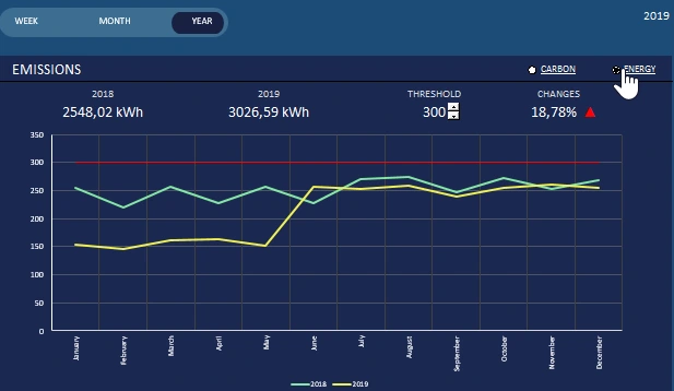
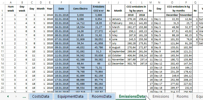
Visualization of data in the report on CO2 emissions
Equally important is the report for the analysis of CO2 emissions:
This report is significantly different from previous reports. There are no switching between previous periods, but they are immediately compared on the chart. This BETA version of the dashboard compares power consumption for the current and previous period. Indicators of changes in consumption dynamics in percent are displayed. You can also set a threshold for exceeding consumption.
But in this report, you can switch to CO2 emissions by selecting the “carbon” option in the upper right corner of the graph:
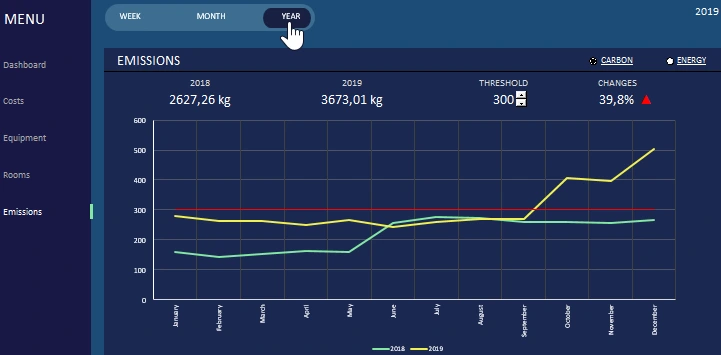
Just like in the whole dashboard, you can switch between accounting periods: week, month and year.
This dashboard can be used as a template for your indicators. To fill the cells with their initial data, the columns are highlighted in blue on the corresponding sheets. Each report, including the dashboard itself, is located on a separate Excel sheet. Each sheet of the report with data visualization has its own sheet of initial input data. The labels for these sheets are highlighted in blue. On these sheets we enter our data, and on the sheets with unmarked labels we analyze them. But to navigate the dashboard, you should use the menu so that all the necessary macros are involved.
Speaking of the dashboard structure, it is also important to mark the cells for entering parameters. In this BETA version of the dashboard of finance costs for bakery energy, the prices of electricity and gas, as well as the amount of the planned annual budget, are indicated on the main sheet:
 Download reports dashboard in Excel
For aesthetics, some standard Excel interface elements were hidden in the settings of this Excel workbook. They can all be turned on again by selecting the “FILE” - “Options” - “Advanced” options: 1 “Display” - “Show formula bar”; 2 “Display options for this workbook” - “Show sheet tabs”; 3 “Display options for this worksheet” - “Show row and column headings”.

Data Visualization Charts for Interactive Report Creation in Excel.
Dashboard Templates