Dashboard of sales funnel conversion in Excel free download
For example, consider how to make a dashboard in Excel to visualize sales funnel conversion data with interactive capabilities and dynamically changing information on charts and graphs.
An example of building a sales funnel conversion dashboard in Excel
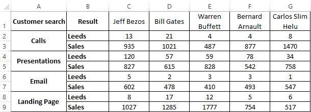
For example, simulate a situation. From the CRM system, 2 reports were exported in the Excel table format (in two tables) for subsequent visual analysis of the conversion and effectiveness of the sales funnel of the top 5 managers:
- Jeff Bezos.
- Bill Gates.
- Warren Buffett.
- Bernard Arnault.
- Carlos Slim Helu.
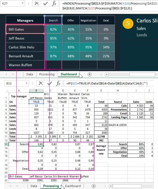
Looking ahead, it is worth paying attention to the fact that both reports are presented in tables with combined cells. Therefore, during their data processing, the OFFSET function will be used for sequential sampling of indicator values from tables through one row with even and odd numbers:
- The first report displays detailed information about the first stage of the Sales Search customer funnel. This report expresses the effectiveness in the results of the work of sales managers, therefore, indicators of the ratio of the number of leads (orders) to the amounts of closed transactions - sales are taken. All values of the Leads and Average Check indicators are segmented not only by managers, but also separately by source for searching and attracting customers:
- The second report is located in the table on the same sheet called “Data”. It provides general information on going through all stages of a sales funnel. Thanks to the dates, we can calculate how many days it took for each stage of the funnel starting from the start date of the advertising campaign project. But thanks to the visualization of data on the dashboard, we can clearly see this indicator and analyze it more efficiently and comfortably in order to draw the right conclusions for quickly making the right decision. Relative bounce rates are also presented here, which is important when analyzing the sales funnel conversion in Excel:
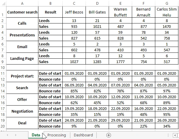
This report is very important in analyzing the sales funnel conversion, although not all analysts take it into account and this is sad.
Source data processing for visualization of indicators in charts
On the second sheet “Processing” of the dashboard are formulas with calculations. All names of indicators are taken from the first sheet “Data” using the links:
Thanks to spring links in processing the source data of the first sheet, you can use this dashboard as a template. It is enough to just change the names with the indicators in the source data, and the template will automatically update all the values on the main Dashboard sheet.
Next, we proceed directly to the analysis of the device of the dashboard itself and its visualization of the data initially presented in tabular form.
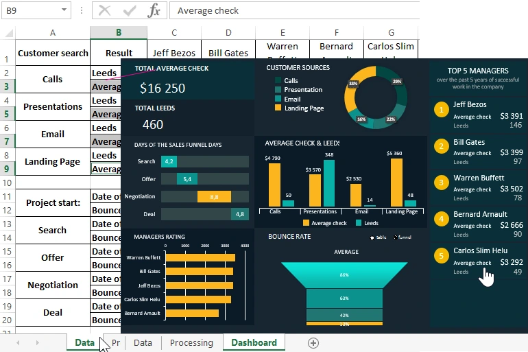
Creating a dashboard for analyzing customer conversions in leads and sales
Dashboard for analysis of sales funnel conversion by managers, consists of 7 + 1 blocks. Why learn +1 at the end of the visualization description. The dashboard has not only dynamic charts and graphs, but also interactive features. Thanks to them, we can individually exclude managers from the report in order to analyze how much the overall picture will change. Or see the same indicators for each manager individually to compare with the overall results of the work performed:
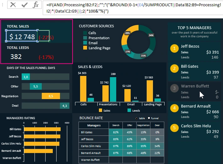
The first block in the upper left corner displays the total total sales figures and the total number of leads of all active managers (in this case, 4 as shown in the figure above). When one of the 5 managers is disabled, relative percentages are displayed next to the total absolute indicators of the report. They inform us of how much the total amount of sales or leads decreased as a percentage, after exclusion of one of the managers from the advertising company.
As can be seen from the formula indicated in the figure above, to calculate this indicator, the arguments are referenced by external links to both sheets:“Data” and “Processing”.
Analysis of the profitability of sources of customer acquisition in Excel
The second block, from the top to the middle, shows in the ring diagram what percentage of sales in money is each source of customer acquisition:
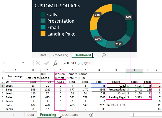
The data calculation formulas for this diagram are on the Processing sheet in the cell range H3:I6. According to this visualization, we immediately focus not only on which segment turned out to be the most profitable, but also how significant differences are in relation to other segments.
Also note that the third manager, Warren Buffett, now contains only zero values in the table, since it was turned off on the dashboard. This is indicated by the FALSE value in cell D3 in the row with the heading “Enabled”. This is the principle of the functioning of the dashboard interactivity when the user switches the buttons on the main sheet. And after that, the whole picture of the report plays from this table, because most of the formulas are linked by links. This is the right approach when creating a report template.
For aesthetics, the legend was built from figures and inscriptions with links to the corresponding names of the sources. External links in the inscriptions also contribute to the ability to use the dashboard as a template. It is enough to change the name of the source only on the “Data” sheet, and it will automatically change on all the corresponding signatures of the indicators of charts and dashboards.
Analysis of conversion dates at each stage of a sales funnel in Excel
The next block 3 “Stages of the sales funnel in days” shows how many days it took on average for each stage:
- Search for customers.
- Presentation of the proposal.
- Negotiating before concluding a deal.
- Closing a transaction is a fact of sale.
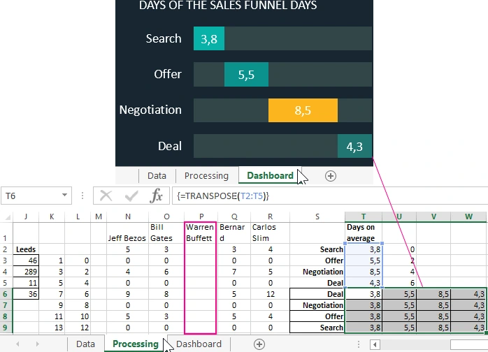
To construct this visualization, we used a normalized bar histogram with accumulation based on values from the T6:W9 range as shown in the figure above. Also note that the «Warren Buffett» column is empty in the cell range P2:P9. In this table N1:R9 are intermediate formulas for selecting the necessary values from the "Data" sheet. Further, in the range of cells T2:T5, using the OFFSET function, values are collected in one column selected through one row (with paired numbers). And after the range T2:T5 is transposed by the array function {CTRL + SHIFT + Enter} TRANSPOS to the range T6:W9, to build a normalized ruled histogram with accumulation.
Conversion of the number of leads to sales by managers
The 4th block in the "Sales and Leads" center displays the sales levels and the number of leads on different axes of the vertical Y axes. All levels are presented in pairs for each source of customer acquisition. Thus, we can analyze the relationship between the growth in the number of leads and the size of sales. It was possible to draw up such a schedule by superimposing two histograms with a grouping. On the top layer is a graph with a transparent background. Axis signatures and legend design are also built from figures and inscriptions for a more aesthetic look:
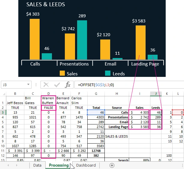
Values for graphics visualization are taken from the ranges I3:I6 and J3:J6 on the “Processing” sheet.
Dynamic chart of sales managers ranking
In the lower right corner is the 5th block “Rating of managers”. This is an ordinary bar chart with a grouping showing sales volumes for each manager. Its only feature is that it constantly sorts the signatures of the X axis and its indicators in descending order due to the use of the BIGGEST function in the source of its data on the “Processing” sheet:
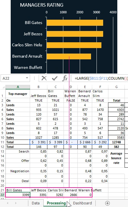
The data range for the bar graph is A21:E22. Two lines of this range are filled with two different formulas. Formulas should be considered first from the second line of this range of cells:
- The second line contains the formula from the combination of the LARGEST and COLUMN functions, which allow you to sort the value of the final row of the first table on this sheet in the range B11:F11:
- The first line contains a formula from a combination of the INDEX and SEARCH functions to select the names of managers from the first table according to the values of the second row of this range. Thus, the order of filling the cells of the first row with the names and surnames of managers is filled in accordance with the sorting in descending order of their sales volumes:
As a result, we get a histogram for dynamic visualization of ratings of sales managers, which changes the order of the displayed series in accordance with other changes in the report.
Bounce rate at all levels of the sales funnel for conversion analysis
Below the middle is the 6th block “Percentage of failures”. It is a smart table with a heatmap created using conditional cell formatting in Excel:
First, using the formula from external links and functions of the TRASP array, the row headers in the "Managers" column are filled with values from the cell range A21:E21 of the "Processing" sheet.
And then, on the basis of this data, all necessary values are selected from the range B13:F19 to fill in the tabular part.
Dynamic Sales Funnel in Excel
An important point! On this block there is a switch (Option Button) “Table / Funnel”. With it, we can activate and enable the hidden +1 block “Average indicator”. As a result, instead of the table of the sixth block, a sales funnel diagram will be displayed with averaged share size values at each funnel stage:
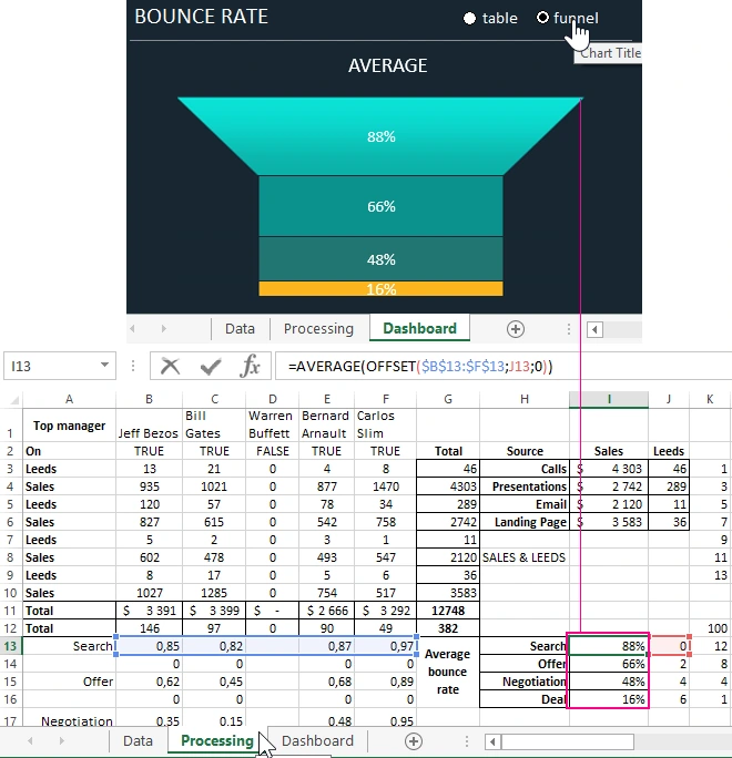
A sales funnel diagram is built from a combination of a normalized histogram with accumulation and figures drawn and combined in MS PowerPoint:

Just for each row of the histogram, you should copy the corresponding figure and paste it directly into the CTRL + V row. The figures are attached on the sheet "Processing" in the Excel file with an example of the template for this dashboard, which can be downloaded from the link at the end of the article.
To operate the switch and hide the sales funnel diagram, the following macro code is used:
Sub Voronka()
Dim list As Worksheet
Dim opt1 As Shape
Dim charvoronka As ChartObjects
Set list = Sheets("Dashboard")
Set manag1 = list.Shapes("Option Button 8")
If manag1.OLEFormat.Object.Value = 1 = True Then
list.ChartObjects("Diagram 32").Visible = msoFalse
Else
list.ChartObjects("Diagram 32").Visible = msoTrue
End If
End Sub
To add the switch itself, select the tool:“DEVELOPER” - “Controls” - “Paste” - “Switch”.
Interactive dashboard and chart management buttons
And finally, the seventh block of the “Top 5 Managers” is a dashboard control panel of 5 buttons:
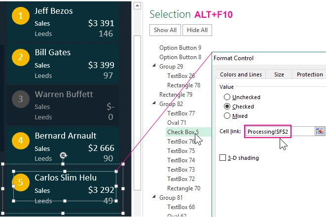
The buttons are composed of figures and inscriptions with external links to the corresponding values of the cells of the sheet "Processing". In addition to the figures, the design contains hidden (with a transparent background) controls "Check Box" (Check Box). Each element is assigned a macro code, which, when pressed, changes the font color of labels and shape fills. In addition, the properties of the flag settings indicate the connection with the cell of the first table on the "Processing" sheet where the flag sends the key value TRUE or FALSE.
The result is a stylish, functional and useful dashboard - a tool for visualizing important data that dynamically changes when interacting with a user:
 Free Download sales funnel conversion dashboard in Excel
This dashboard can be used as a template for your indicators. But not only indicators, but also names of names can be changed on the first sheet “Data” and as a result they will be changed on all other sheets.

Data Visualization Charts for Interactive Report Creation in Excel.
Dashboard Templates