Excel calendar template for data visualization download
An example of creating interactive elements for managing a calendar on a dashboard without using macros. To solve the problem, a slice of the pivot table will be used. But for this, you must first configure the source data by converting it to a suitable format.
Step-by-step instructions on how to make an interactive calendar in Excel
The interactive calendar is the most commonly used data visualization control on a dashboard. There is one interesting solution to make it comfortable to use. You can implement this task in just a few steps.
Step 1. Prepare initial data
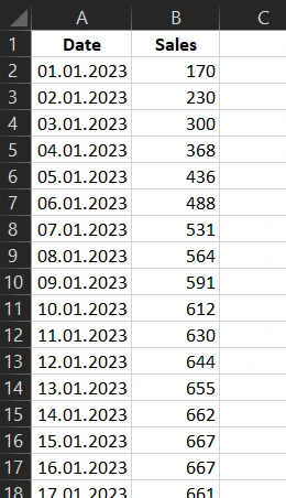
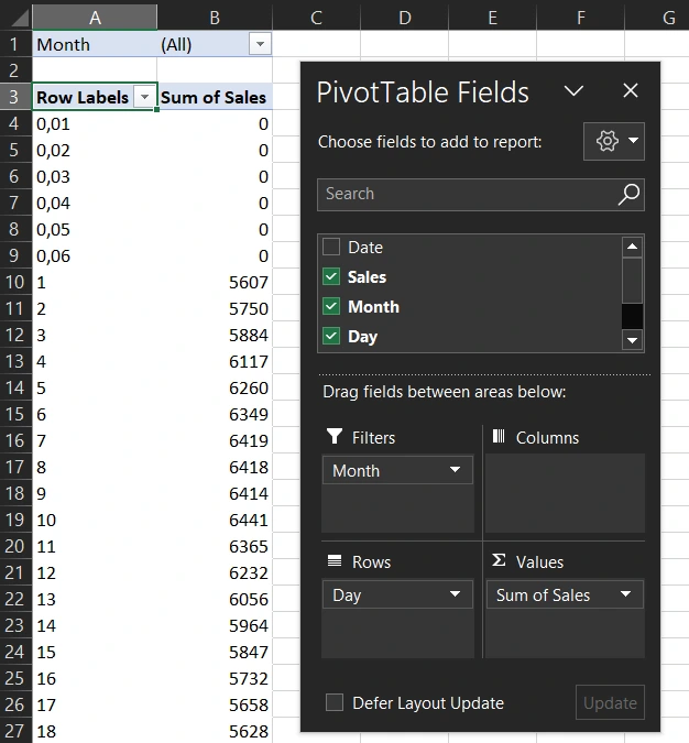
Let's say we have initial sales data for an accounting period of 1 year (2023):
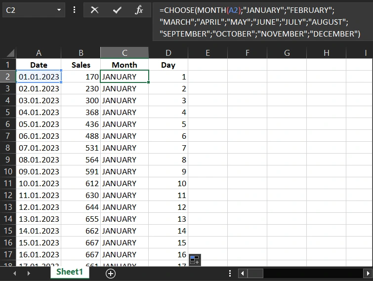
To label the buttons of the interactive calendar management interface, we will extract the corresponding months and days from the date in adjacent columns using Excel formulas.
For months:
For days:
Each column is a field for a pivot table. Based on the last two (with formulas), two slices will be built to switch between months and data selection for certain days and weeks. Also, the sample can be implemented quarterly, but more on that later ...
In order for the buttons for the slice of days to correspond to the calendar days of the week, you need to make gaps between the months of the corresponding sizes in the source data. The sizes of these gaps will be determined by the function for calculating the number of the day of the week:
In the second argument of the function, specify the parameter that determines the first day of the week - Sunday for the USA (1) or Monday for the European region (2). Depending on the calendar format:
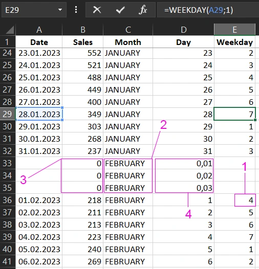
Description of the break device:
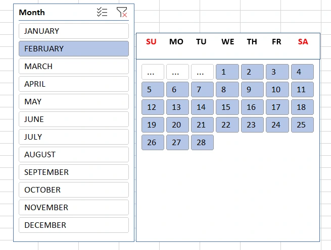
- The size of the gap is equal to the number of days in the week before the first day of the week of the month. That is, if the next month starts on the 4th day of the week, then the gap is 7-4=3 lines. As shown in this case in the figure.
- The gap in the month column is filled with the name of the next month.
- Cells in the sales column break must not be empty, they must be filled with the value 0.
- Blank cells after a break in the day column should be filled with numeric values less than 1, but in ascending order. This is important for sorting the buttons of the future slice by this field of the pivot table.
After we've formatted the source data with breaks and correctly filled in their empty cells, the last column "Weekday" can be deleted.
Step 2. Creating and setting up a pivot table based on source data
Select the cell range with source data A1:E404 and select the tool: Instert → Tables → PivotTables → From Table/Range.
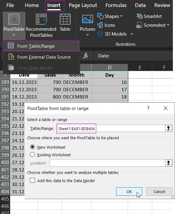
In the "PivotTable from table or range" window that appears, just click OK.
Next, we set up the fields of the pivot table according to the scheme as shown in the figure below:
- Filters → Month;
- Rows → Day;
- Values → Sales;
Step 3: Create and set up slicers in a pivot table
Now we create 2 slices directly: one for switching by months, and the other for sampling data by days. To do this, first select any cell in the pivot table range and select the tool - Insert → Filters → Slicer:
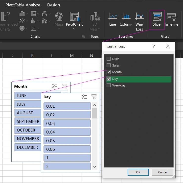
Check the Month and Day options, click OK.
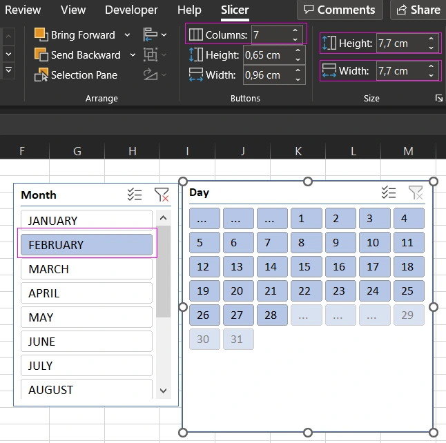
Now you need to first set up a slicer to select data by day. To do this, first click on the FEBRUARY button on the Month slice. And only then select the Day slice with a single left-click on the slice header and a new Slicer option will appear in the main menu at the very end. In the "Buttons" parameter section, in the "Columns" field, specify the value 7, since there are 7 days in one week. Then, in the "Size" section, set the parameters height 7.7 cm and slice width 7.7 cm.
Next, right-click on the slice Day and from the context menu that appears, select the option - Slicer Settings
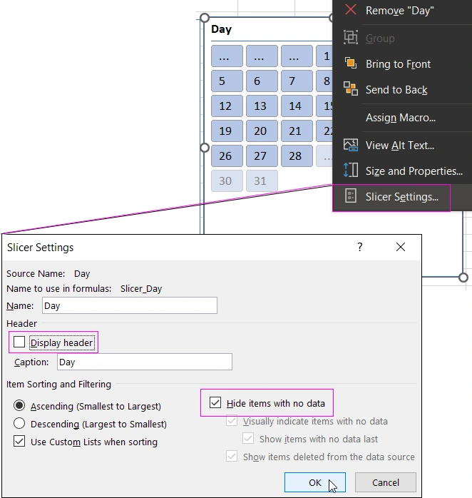
In the window that appears, uncheck the "Display header" option and check the "Hide items with no data" option.
Step 4: Designing the Calendar Control Panel
Now we need to nicely arrange the slices and label the days of the week for the calendar. To do this, add a text inscription by selecting the tool - Insert → Text → TextBox:
Interactive Excel Calendar Template - READY!
Now, when switching between months, the day buttons will automatically correspond to the labels of the days of the week. When you click on the buttons for the days and months of the calendar, the data in the pivot table will be filtered and grouped accordingly.
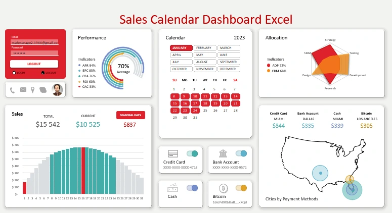
The style of the slicer appearance can also be configured in the tools section - Slicer Styles. As a result, you can create spectacular calendars for dashboards with interactive data visualization:
 Download Excel calendar dashboard template
If you set the number of button columns in the parameters for the Month slice to 3, then it will be convenient to segment the data by quarter. After all, each quarter consists of 3 months and starts from January, April, July, October. A puzzle was formed. Download the example file and see how effective this idea is. Very useful for Excel presentation developers.
Access password table for switching between dashboard users:
| Name | Password | |
| Alex | alex19XX@gmail.com | a12345 |
| Mark | markmanager2-19XX@gmail.com | m12345 |
| Elizabeth | elizabeth20XX@gmail.com | e12345 |
| Yuna | yuna19XX@gmail.com | y12345 |
| Administrator | admin | admin |

Data Visualization Charts for Interactive Report Creation in Excel.
Dashboard Templates