How to Create a Heat Map in Excel template free download
In the latest versions of Excel, there is already a standard tool for creating a Heat Map Chart. To do this, just select - Insert → Charts → Maps → Filled Map. But it has significant limitations: a connection to the Internet is required to update data, a strict structure of the source data table, etc. Using standard Excel tools, you can create your own custom Heat Map Chart for the US or Europe, as well as any other country, region, city without using macros and without restrictions.
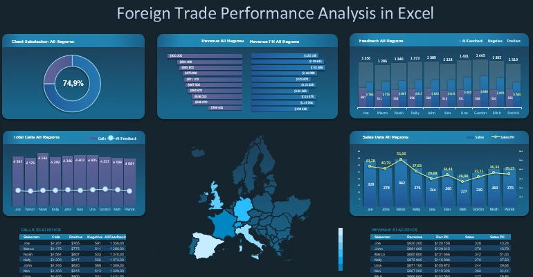
Foreign Trade Performance Analysis Europe in Excel
On any dashboard there is always a place for an interactive MapChart. After all, a dashboard is a visual report with the main function of orientation in various situations. And the basic values of any landmark are time and space. The goal of the dashboard user is always to get answers to 2 main questions:
- Where are we?
- In which direction should we move?
This is the whole essence of the philosophy of data visualization, as well as the value for closing the main need. It generates awareness, and in ancient Greece, a being with the highest degree of awareness was considered a deity. Plus, the user acquires motivation for action, efficient use of resources, etc. Therefore, it is so important to learn how to design maps for dashboards and any visual reports. If you understand the basic principles already at the first level, it becomes clear that this is not at all difficult.
The Benefits of Designing a Custom Heat Map Chart in Excel
The custom Heat Map Chart presented in this example will allow you to present data for analysis of non-standard maps. Presentation of internal strategies for plans to cover new territories in order to scale the sphere of influence of marketing and logistics. And you can also create visual analyzes for maps of fictional cities from computer games, meta-universes and virtual sandboxes. There are no restrictions in this template, customize any map easily and to suit your needs. Heat Map Charts always look presentable and fit harmoniously into any data visualization composition.
Let's look at an example of how to construct an interactive Heat Map Chart in Excel for the United States. The same principle can be applied to maps of EU countries and any other maps of territories, even fictional or from other planets.
Terms of Reference for developing a data visualization element in Excel
First of all, let's define the Terms of Reference for the developer of data visualization in Excel. After all, no wind will be fair to a sailboat without a goal.
According to the traditions of our site, we are simulating the situation. The regional company operates in 10 US states for a high standard of living:
- Connecticut
- California
- New York
- Pennsylvania
- Washington
- Massachusetts
- New Hampshire
- New Jersey
- Oregon
- Rhode Island
In each of these states, there are branches of the company with different sales performance indicators. They change monthly. You need to create an interactive heat map to expose the top 3 states in terms of best performing sales levels each month.
Excel Custom Heat Map Chart Example Step by Step
The whole process takes 3 stages, but one of them is very laborious. In any case, the end result repeatedly justifies the effort and time spent on development. It will be easier for the developer with each new map. Because with experience your skill level will increase, and the very definition of mastery is getting more results with less effort. In other words, the effectiveness of your effort investment depends on your skill level, which grows in proportion to the number of repetitions.
Step 1. Preparing initial data
Tables with source data look like this:
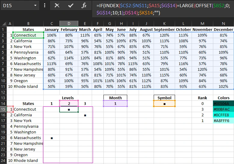
Cell range C15:E24 contain smart formula:
This formula makes a selection of 3 states with the highest rates in the current month from the upper table of initial data and marks them in the lower table with a black square symbol (■ - symbol code: Alt + 254) - respectively.
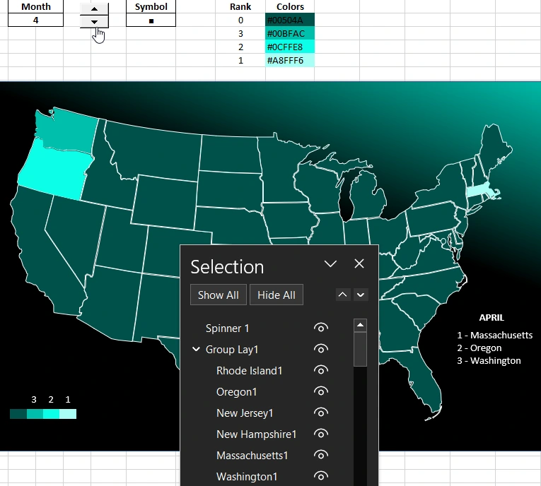
Now when you change the month number in cell G14, black square symbols will be automatically placed against the corresponding state names in the lower table. For example, when choosing the 1st month (January):
- in the C15:C24 range - Top 1 (Massachusetts - 113%);
- in the range D15:D24 - the second level state in terms of plan implementation (Connecticut - 106%);
- in C15:C24 - corresponding to the third level (California - 86%).
We have designed the mechanics of interactivity through automation using formulas. Next, we need to visualize the processes.
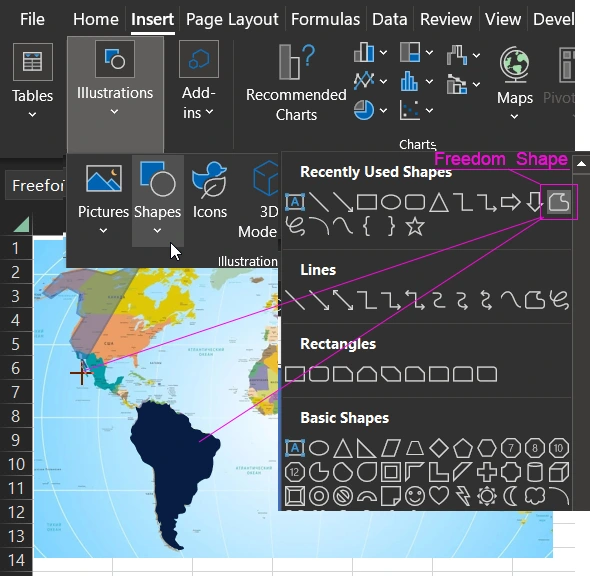
Step 2. Modeling vector shapes for the map
We need vector shapes for all the states. You can draw them yourself, as demonstrated in our previous examples, using the tool - Insert → Illustrations → Shapes → Freedom Shape:
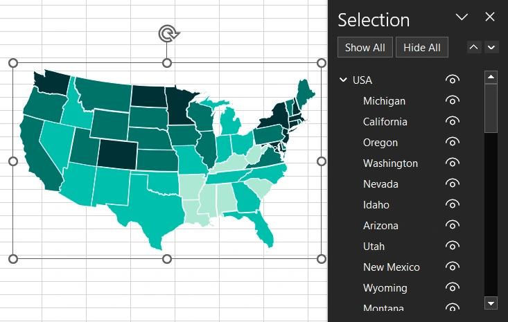
Or use ready-made shapes from our template, which can be downloaded at the end of the article:
Step 3. Merging source data and graphic shapes with connection to automation
Now we move on to the most important solution to this problem. The concept behind the idea of highlighting states on a map with different colors without the use of macros lies in complexity. That is, different levels will be with different colors on different layers superimposed in the same place on the map. Color codes are shown in the table above. At the lowest level there will be a map with all the states, and then the layers are superimposed in descending order of levels:
- Level 0 is the color of all states on the US map (code #00504A).
- Level 3 - color for highlighting the states of the 3rd level (code #00BFAC).
- Level 2 is the color for the second level (code #0CFFE8).
- Level 1 is the topmost layer for highlighting the Top 1 states by performance (code #A8FFF6).
But to automate highlighting, we can't just put the shapes on different layers. You will need a text field with a link to the corresponding cell of the state of the corresponding level. For example, to highlight the state of California at the third level, the text field must refer to the cell with the black square E16. To do this, select the tool - Insert → Text → TextBox:
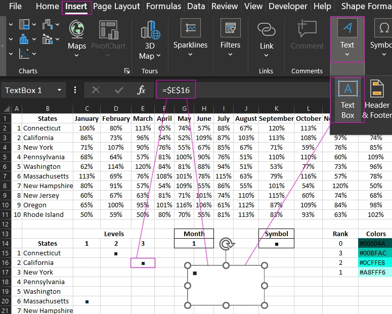
We do not enter a value in the TextBox, but simply select it by clicking on the frame with the left mouse button and immediately enter an absolute reference to the cell $E$16 in the Formula Bar. As a result, when changing the month number (the value of cell G14), we will have a black square symbol appear and hide in the TextBox.
Now we need to make sure that instead of the square symbol, the shape of the corresponding state (California) is displayed in the corresponding color level (level 3, code #00BFAC). To do this, we will use the fill with a picture from the Clipboard in the text format settings of the TextBox object. But this is later, and before that we will prepare the picture itself from the group of shapes and color it in the appropriate color.
In order for the picture on the black square symbol as a fill to be evenly spaced without distortion, you must initially observe the correct proportions of its dimensions and add a transparent square shape of the appropriate size to maintain the proportion. To do this, we need to draw a square measuring 6.05 cm - height and 3.05 cm - width. This is approximately 12 cells high and 1.5 columns wide

Place the state of California in the center of the rectangle shape, but offset down. And also reduce its size.
It is necessary to conditionally divide the rectangle into 4 parts in height and width. If you place a rectangle shape on the sheet as shown in the figure (12 cells - height and width 1.5 columns, but in the center of a whole column), as a result, the area we need will be the first 3 cells down from the center of the rectangle shape. For clarity, the figure above shows how they are circled in red - the boundaries of the range of cells R8:R10. The shape of the state of California, when reduced, should maintain the proportion of the height and width dimensions, for this, while shifting the corner handles, hold down the SHIFT key. In this example, the size of California turned out to be 1.44 cm - height and 0.84 cm width.
After arranging the shapes correctly and setting their sizes, they should be grouped into one group. To do this, select both shapes with a left mouse button click and select the tool in the new main menu item that appears - Shape Format → Arrange → Group. Or right-click on the previously selected two shapes to open the context menu, where you need to select the Group option:

Required! Copy the created group to the Clipboard after selecting it by clicking on it with the left mouse button and pressing the key combination CTRL+C.
Now we return to our TextBox object, select it and call the Shape Format settings by pressing the hot key combination CTRL + 1 (the number 1- should be pressed on the main keyboard, not on the accounting auxiliary numeric). And we perform a number of settings:
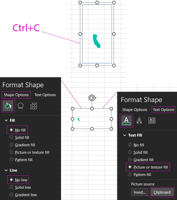
First, by selecting the tool from the auxiliary window that appears after pressing CTRL + 1 - Format Shape → Text Options → Text Fill → Picture or texture fill → Picture source → Clipboard. Therefore, the TextBox object now displays a small California shape instead of the black square symbol. To increase it, you just need to increase the font size (for example, up to 483 points - enter this value manually in the text size settings - Home → Font.) and align to the center.
Then we remove the background and border in the TextBox object. Select the CTRL+1 tool – Format Shape → Shape Options → No fill and No Line so that the text object has a transparent background and the map and other shapes in the background can be seen through it.
Now when you change the month number in cell G14, the state of California shape will appear or disappear with the color of the 3rd level, according to the value of cell E16. Let's overlay the TextBox object on the map. If the size of the map shape group is 11.75 cm high and 18.79 cm wide, then the font size of the State Shape Fill TextBox should be 483 points. The text must be center aligned. As a result, the sizes will match:
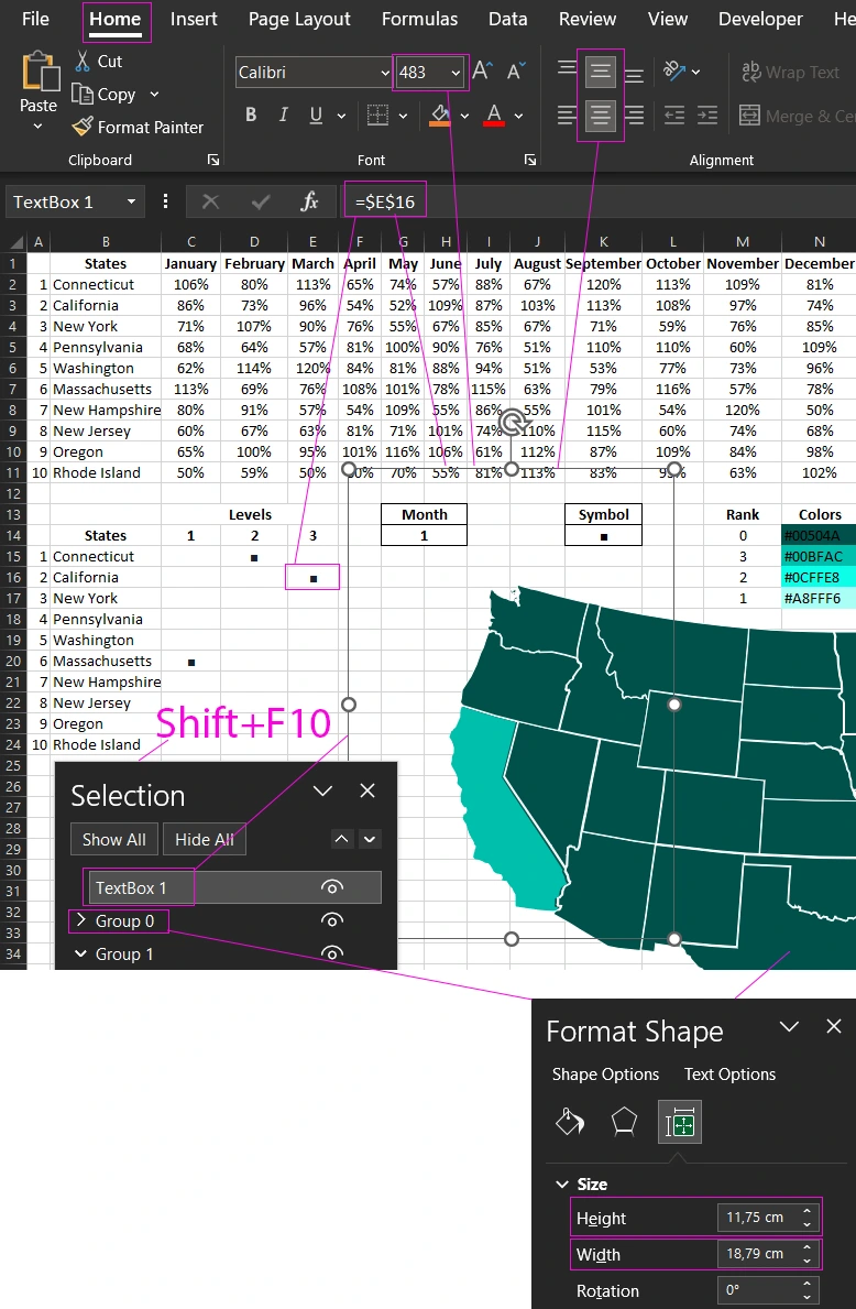
Given the dimensions of the main map created from a group of state shapes with a width of 11.75 cm high and 18.79 cm wide, below is a table of font sizes for each of the 10 states:
| States in the report | Font sizes in points |
| Connecticut | 53 |
| California | 483 |
| New York | 197 |
| Pennsylvania | 140 |
| Washington | 175 |
| Massachusetts | 110 |
| New Hampshire | 117 |
| New Jersey | 103 |
| Oregon | 228 |
| Rhode Island | 29 |
The most time-consuming process is choosing the right font sizes. This table will save you a lot of time.
According to the same principle, you should create all the shapes for highlighting the map with different colors for different levels. 10 states with 3 levels. As a result, you need to create 30 of the same TextBox objects with text fills with shapes and links to the corresponding cells in the lower table of the C15:E24 range. You should now have an interactive heatmap:
According to the same principle, you can create a map of Europe for an interactive dashboard as an important element of data visualization:
 Download US and EU Heatmap in Excel
Such maps can be created for any localization. It can be real countries, cities, regions. Or even fictional maps from computer games, meta-universes. As well as the planned coverage of territories. Their boundaries may be determined by internal corporate strategies that cannot be created by standard maps. But this example does not limit you in any way. It allows you to develop exclusive maps for data visualization for specific needs that are known only to specific customers. You don't need to use macros for this. All the automation of the interactive functions of the dashboard was implemented using standard Excel formulas.

Data Visualization Charts for Interactive Report Creation in Excel.
Dashboard Templates