How to make a beautiful Pie Chart for a dashboard in Excel
The design of standard Pie Charts in Excel is quite flexible using parameters. This allows us to present our reports at a higher level than what is offered by default. To show some of the possibilities for creative design in the Excel Chart Editor, here is a step-by-step example. So you can appreciate opportunities that you have not paid attention to before. You can create beautiful reports in Excel, and I'll show you that it's not difficult at all!
Create a beautiful Pie Chart in Excel step by step
It is worth noting right away that the possibilities of the chart designer in Excel are not unlimited, but they are essential not to use them. In some cases, imagination is needed for non-standard methods of constructing the desired visualization design for presentation. But the main advantage of tools for developing data visualization in Excel lies in the automated processing of table data. And this means that we can automate a large amount of work without the use of programming languages. The main function of programming is to automatically process the initial data and issue them in the desired form. The chart designer in Excel performs the same function to the best of its ability with a narrow specialization. But these opportunities are underestimated by users. See for yourself by downloading the template with a ready-made Excel dashboard example at the end of the article.
Step 1. Preparing tables for processing and presenting data in Pie Chart
The structure of the Pie Chart will consist of three shares. Therefore, the first table contains three columns with headers. In order not to waste time, immediately select the range of the table with the initial data B2: D3 and select the tool - Insert → Charts → Donut:
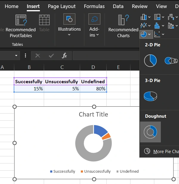
As a result, we got a Pie Chart with a default design, which already needs some work on at least the color scheme.
For further work, we need to clear the Pie Chart from auxiliary elements. We need a layout prototype, and from it we will create a new ready-made solution with a new design. To do this, select the diagram with the left mouse button and click on the plus button in the upper right corner of the object and disable all options in the drop-down menu that appears:
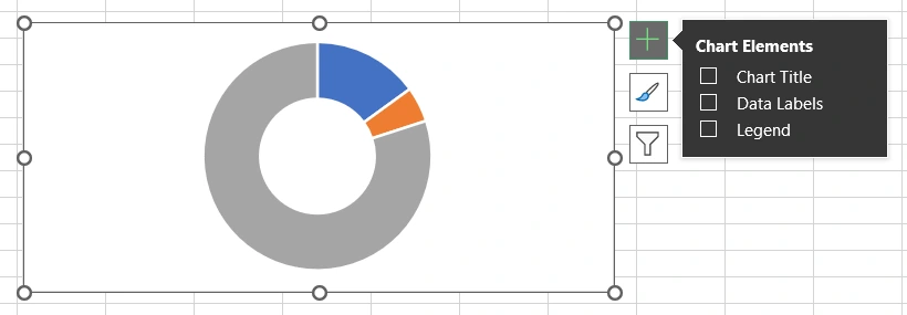
Now we have the source material as a template. It is convenient to work with him and we will sculpt a masterpiece out of him.
To demonstrate the possibilities of decorating a Pie Chart in Excel, let's complicate the visualization structures a bit. To do this, we need another table with additional data:
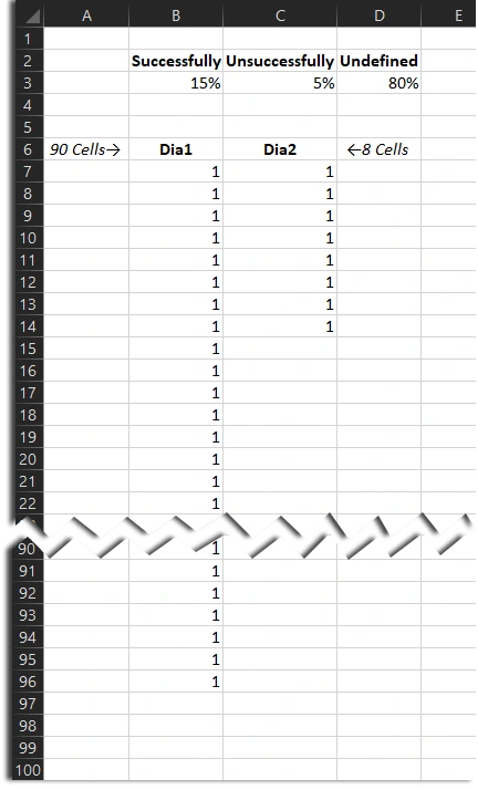
The first column contains 90 cells with the same values - so we get 90 segments of the same size. And the second column contains 8 identical values.
We will add each column separately using the constructor. To do this, select a chart and an additional option will appear in the main menu - Chart Design (this is the name of the visualization designer in Excel). And then select the tool for editing the source data - Data → Select Data. In the “Select Data Source” window that appears, add new data in the correct sequence as shown in the figure below:
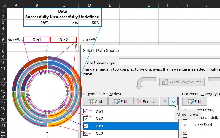
We need to arrange the order of the data series according to our design plan. Please note that we used the data from the Dia2 column 2 times. We arranged them so that the initial data of the first table was between two Dia2 series.
Step 2. Set up a combo chart type in Excel
Now let's make the Dia1 data series on the main axis, and all the rest on the secondary axis. To do this, select the tool – Chart Design → Type → Change Chart Type. In the soldered window, in the left list of the pen, select the “Combo” type and in the right block, define the settings as shown in the figure below:
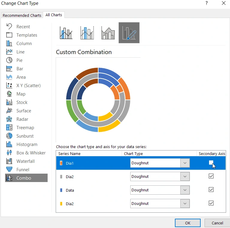
Our row Dia1 has not disappeared. It is on the first layer. We use the secondary axis and now the Pie Chart has two layers:
- On the first bottom layer is the main axis with the values Dia1.
- On the second top layer there is an auxiliary axis with the values of the other series: Dia2, Data and again Dia2.
In the next step, we will see all the layers and series.
Step 3: Customize the Render Color Scheme
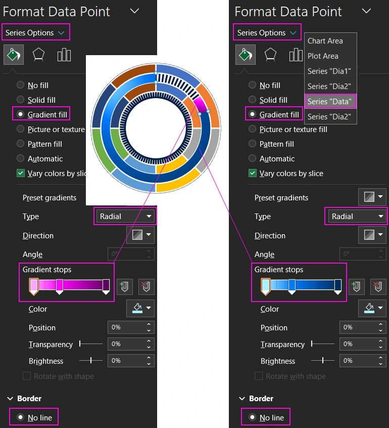
The hardest part is over, everything is beautifully decorated with a color scheme. But first of all we will display Dia1 on the bottom layer. To do this, let's make one part of the data transparent. Click the left mouse button on the "Successfully" share and press the hot key combination (CTRL + 1). In the “Format Data Point” settings block that appears, select the Fill & Line button and check the “No fill” option in the Fill menu:
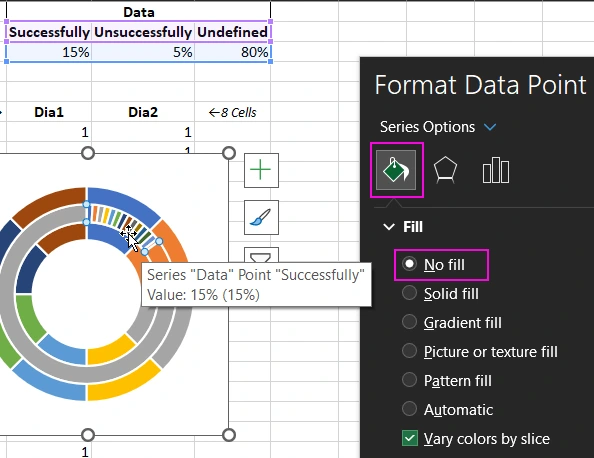
Now "Successfully" on the second layer has a transparent background, and through it we can see the first layer, where the beats of Dia1 are.
To access the first layer of the main axis and Dia1, use the "Series Options" menu and adjust its fill and outline colors:
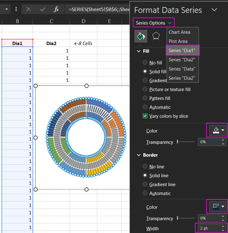
Let's fill with white and set the outline to dark blue #071D42.
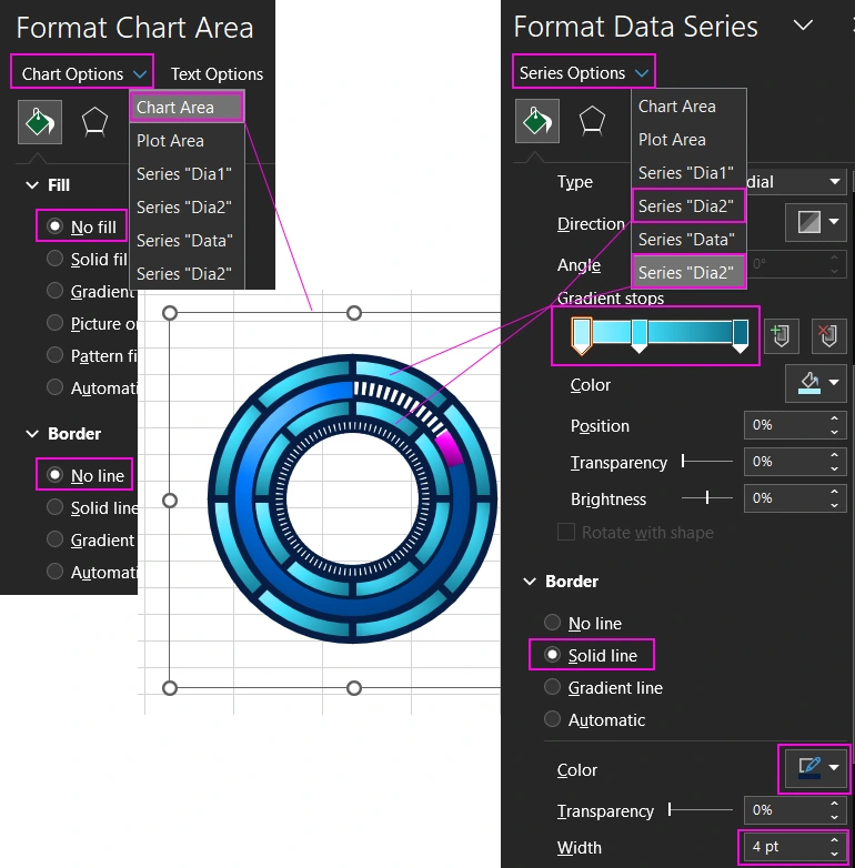
There is another way to see Dia1 on the first bottom layer below the secondary axis layer. To do this, change the inner diameter of the donut in the settings. Since we have 2 layers of bagels, now for each of them you can set your own diameter and, accordingly, the thickness.
We will use the “Series Options” option again, but this time we will click on the third button with the icon of the schematic Bar Chart as shown in the picture:
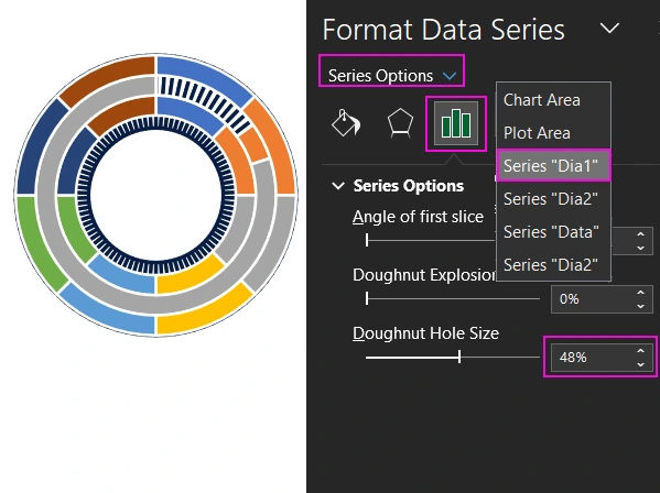
As a result, we see a part of Dia1 in the inner diameter of the donut, since now they are different:
- The bagel on the bottom layer has a hole diameter of 48%.
- The bagel on the top layer has a larger inside diameter of 57%.
Next, we'll continue setting up the color scheme for the middle Data row. Let's color them with gradient fills as in the picture:
Result:
- Successfully share - transparent color;
- Unsuccessfully share - pink radial gradient;
- Undefined proportion - blue radial gradient.
It remains only to color all the Dia2 series in a turquoise gradient and make a transparent background for the visualization block:
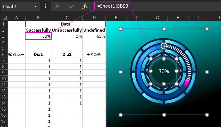
Thanks to the transparent background, we will decorate the background with a rectangle shape with a color gradient from black to turquoise. And in the foreground, add a circle shape with a link to the value instead of the inscription:
Now changing the value in cell B3 will change the size of the share and the value of the label in the center of the circle shape.
A simplified method for decorating standard Pie Charts in Excel
If this example turned out to be too complicated for you, here is another short example of how to quickly and easily create a beautiful Pie Chart in Excel. Select the cell range B2:D3 again, but this time select a different type - Insert → Charts → 2D Pie. As in the first example, you need to clear the diagram from auxiliary elements. Change the colors of the beats and set a transparent background and place the background shape. But at the end, just put an oval in the center with a radial gradient type of two colors in the foreground:
- The same color as the background (black in this example).
- Semi-transparent color close to the edges (73% transparency in this example):
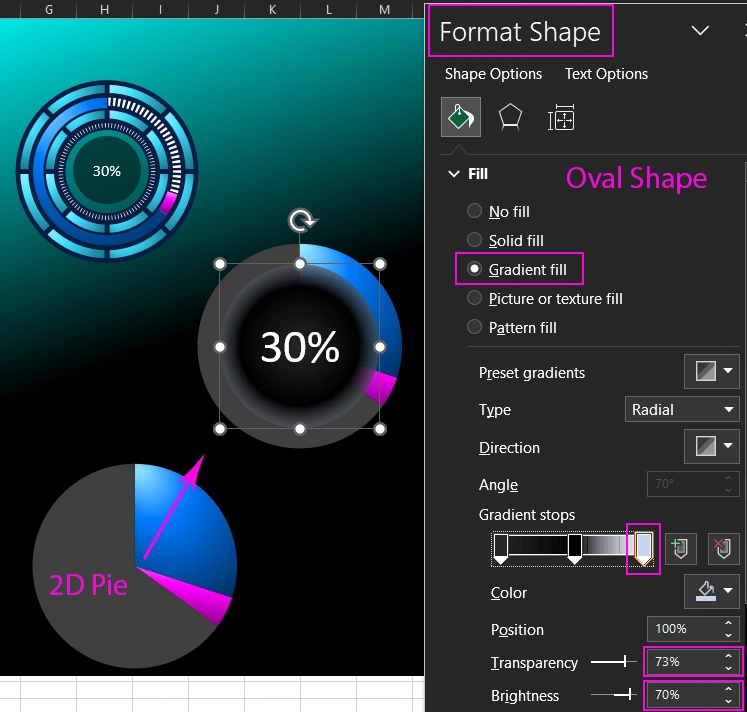
Overlaying an oval with a translucent gradient fill around the edges now creates a tunnel effect. Everything ingenious is simple. Play with your imagination and the possibilities of Excel for the presentation of data visualization will seem much wider than at first glance. And then, through simple combinations with colors and shapes, you can create stylish dashboards with a futuristic design for a call center presentation, etc.:

 Download a dashboard with examples of beautiful Pie Charts in Excel
Thanks to Excel, these dashboards have a big plus - interactive features. They can be implemented without programming or macros. It is enough to use the constructor and its settings. You can also expand the functionality using formulas, functions, pivot tables and controls in the developer section.

Data Visualization Charts for Interactive Report Creation in Excel.
Dashboard Templates