How to make Pie Chart more than 100 percent in Excel
To create a Pie Chart with a visual presentation of indicators over 100% in Excel, you can use a non-standard solution. Let's build our custom Pie Chart from scratch.
Creating a Pie Chart over 100% or 200% in Excel
Often there is a need to present the overfulfillment of the plan on the data visualization of the Excel dashboard, for example:
For a visual example, we simulate the situation and draw up a technical task.
We have 3 initial values:
- Actual sales (cell F2).
- Established sales plan (cell G2).
- Calculation of sales plan fulfillment (in cell G3, calculation formula: =F2/G2).
Visualization of data on the implementation of the sales plan will be performed according to two scenarios:
- The fact of successful sales – overfulfillment of the plan by more than 100 percent. Visualization scenario for Pie Chart: a fragment of the percent overfulfillment of the plan is presented by the effect of a separate layer superimposed on a filled chart in 100% in the form of a spiral.
- Weak sales indicator – failure to fulfill the plan as a result. Plan completion rate = less than 100 percent. The appearance of the chart is “blank” and consists of only one fragment with the size of the total share of the unfulfilled plan.
Taking into account scenarios for visualizing data in formulas, we will use logical functions to check whether the sales plan has been overfulfilled or not.
Developing a Pie Chart greater than 100 percent step by step
First, let's make the background of the chart in the style of a custom shape - a 360-degree "spiral" for the first scenario. We fill a column of 360 cells with formulas as initial values.
Column number 1
Fill the cell range A3:A362 with the formula:
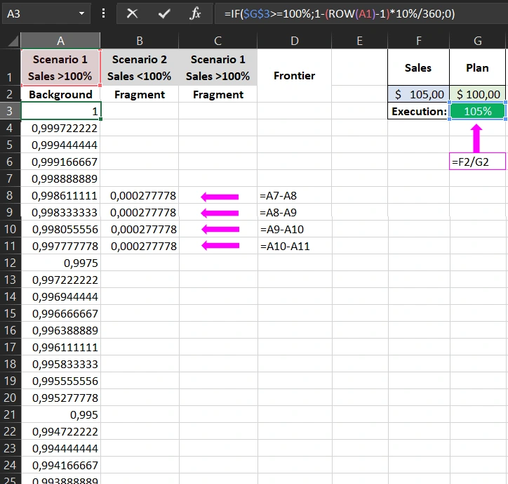
This formula fills in radius size values with decreasing (-10%/360) distance from the center. This is the data for the next 360 radii, the length of each is less than 0.000277778 of the previous one (if the length of the very first radius is = 1). Thus, we will draw with the formula not a circle, but a spiral for the background of the future Pie Chart.
Column 2
In the range of cells B3:B362, a formula will be used with the output of values under the condition of the second scenario (failure to fulfill the sales plan <100%), otherwise the value is 0:
Because the value of cell G3 is greater than 100 percent - (105%), the formula returns a value - 0.
Column 3
The range of cells C3:C362 is filled with a formula to represent the size of the percent overfulfillment of the plan:
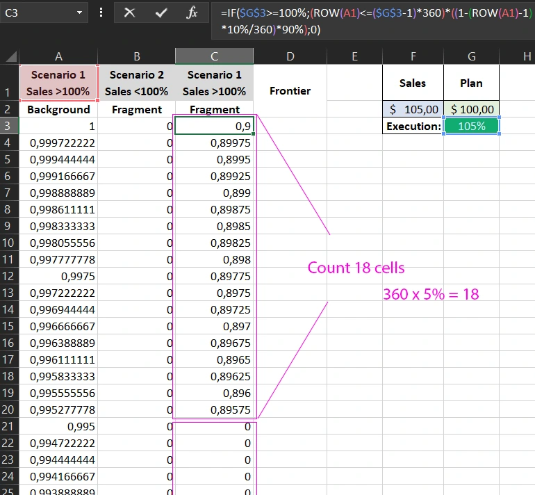
Pay attention! The formula filled in only 18 cells with values - this is the share of the overfulfilled plan (5%). If we want to show a 5% fill percentage on a 360 degree circle, we need to expose the backlight with an 18 degree color. That is, 360 * 5% = 18. We checked the result - the formulas work like clockwork!
Column 4
The last column in the range D3:D362 will have the formula for the milestone (where the sales plan level crosses at 100%) in the chart:
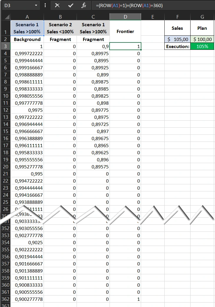
In the fourth column, it would be possible not to use a formula, but to fill all the cells with the value 0 except the first (where the value is 1) and the 360th (the value is also 1). But if you need to use nominal ranges in the chart, then you need this formula. It is only important to clarify that it should be entered in the nominal range as an array formula through the hot key combination (CTRL + SHIFT + ENTER). But in this example, we do not use a nominal range and enter it as a regular formula, for a demo of the possibility and prospects to expand the functionality.
Chart Design
We have constructed all the initial data for the chart. It remains to select the range A3:D362 and create a Pie Chart using the tool - Insert → Charts → Radar → Filled Radar:
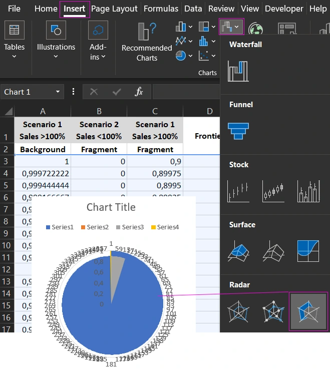
Next, we make settings for the Pie Chart and decorate with beautiful colors and shapes.
Design for Scenario 1
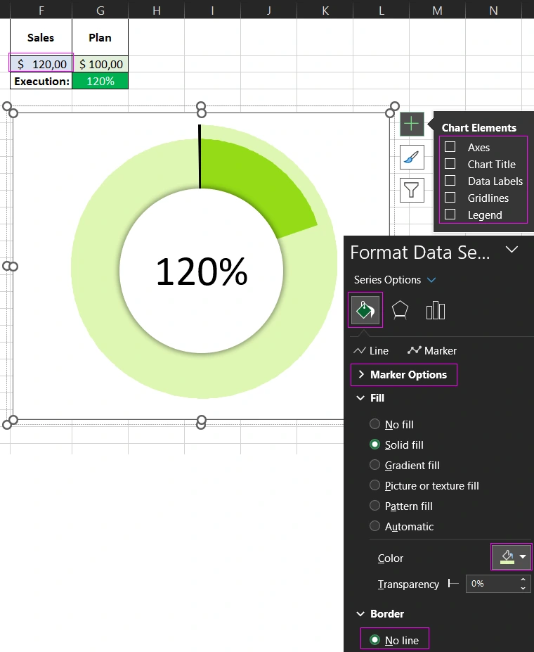
In the center of the chart, place an oval shape and get a donut chart. Colors should be set in the Marker Options section.
Pay attention! Now, when you change the value in cell F2, the share fragment on the chart is automatically redrawn. For example, if the sales plan is not fulfilled, the appearance of the visualization will be different.
Design for scenario number 2
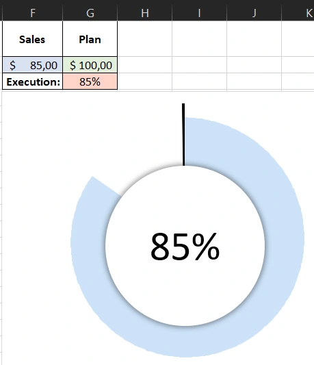
A beautifully designed visualization design blends easily and harmoniously into any dashboard.
How to create a chart greater than 200%
In a similar way, you can create a chart larger than 200% and even larger than 300%. To do this, you need to create a couple more columns with formulas, and the result will look like this:
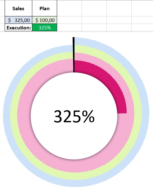
This is already beyond the limits of the readable view of the visualization. Therefore, it is better to use other chart styles when it is necessary to show the overfulfillment of the plan by more than 200% and more than 300%, 400%, 500% ... In any case, the Pie Chart example is more than 300%, with formulas added to the Excel file at See the Example sheet, which can be downloaded from the link below.
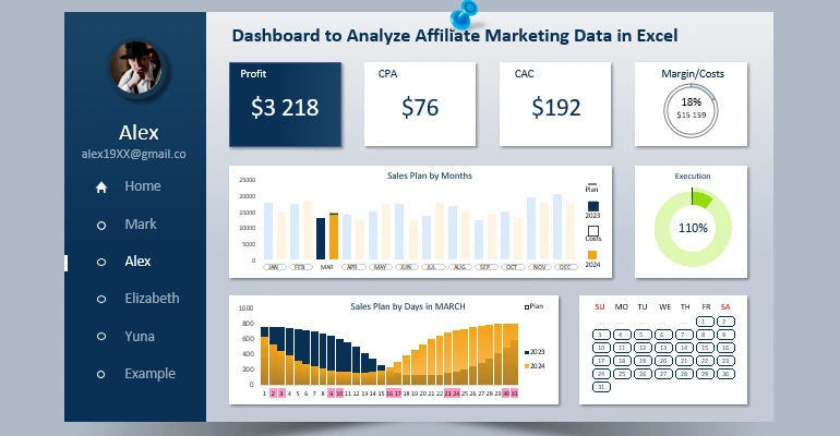
How and where to use Pie Chart with an indicator greater than 100%
Example of practical use of Pie Chart more than 100% on an affiliate marketing data analysis dashboard in Excel:
 Download Affiliate Marketing Data Analysis Example in Excel
In Excel, there are options for other presentation solutions to visualize more than 100% on a chart. There are many ways to create custom Pie Charts without using macros. Many such examples are found in other articles on this site.

Data Visualization Charts for Interactive Report Creation in Excel.
Dashboard Templates