Excel Sales Report Template on monthly and daily Chart
To compile readable reports in Excel with beautiful data visualization or infographics, the original combinations of standard charts and graphs with a harmonious color palette are mainly used. But you can also style Excel reports with the help of groups of vector shapes previously drawn in PowerPoint. The main thing is always and in everything to observe a measure! Consider this approach to data visualization using the example of a report on the implementation of a sales plan for products in Excel.
Excel sales team audit report template
First you need to familiarize yourself with how the report on the implementation of the sales plan for products works and to understand its functionality, we simulate the situation as an example.
The trading company has several established sales plans for entire groups of products: annual, quarterly, monthly, etc. Every week, the company holds a planning meeting to monitor the implementation of monthly product sales plans. It is necessary to create an interactive report with visualization of the implementation of the monthly sales plan for four categories of products (A, B, C and D) for weekly planning meetings.
The company holds a planning meeting every Monday for the following purposes:
- To summarize the sales success of the previous week and all the weeks of the current month.
- Analysis of previous months of the current year.
- Monitor and predict the prospects for the implementation of the sales plan for the current month and the successful closure of the current year.
Terms of reference for this model of audit of the sales department:
- The report should be broken down into the numbers of full and incomplete weeks of the selected month. Also provide the opportunity to switch between previous months to analyze the sales history of the current year.
- Trade values for all the past weeks of the current month are summarized to analyze the overall picture of the monthly plan.
- It should be possible to segment sales by product groups.
- Each group should be analyzed regarding the implementation of the average sales plan established for one group (by dividing the value of the general plan by the number of product groups).
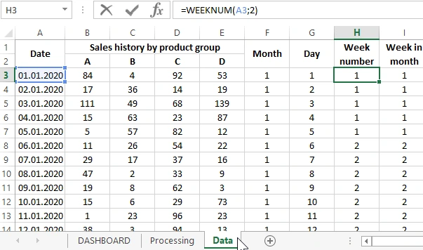
All the source data for the report is imported from the ERP system to the “Data” template sheet:
Further, on the “Processing” sheet, the entire sales history is processed with complex formulas for displaying on the main “DASHBOARD” sheet in the form of charts and graphs:

The contents of the DASHBOARD sheet should be reviewed and analyzed in more detail.
Description of the dashboard structure for benchmarking in Excel
The structure of the comparative analysis of weekly sales and the implementation of the monthly plan consists of 4 blocks. The first block consists of 4 diagrams that show how much is left until the average monthly plan is completed for each group of products (A, B, C and D) in percentage terms based on the results of the past weeks of the current month:

Below this block is the second block with an interactive calendar:

An interactive calendar allows you to switch between months. It also automatically highlights to visually display on the calendar the selected days of full and incomplete weeks of the current month for data analysis.
To beautifully design an interactive calendar, the report used the capabilities of drawing shapes with vector graphics in PowerPoint, which are significantly higher than in Excel. The result is a stylish calendar design as shown above in the figure.
The next 3rd block contains a graph of the dynamics of changes in sales indicators separately for each group of products, during the selected month by the calendar:

On the chart, we observe a selected area, which includes a report for displaying indicators on charts, a calendar and numerical values in the 4th block of the dashboard.
Now consider the 4th report management unit, which will explain the principle of selecting an area on the chart. On the fourth block are the controls for the whole dashboard:

Controls (scroll bars) change the values:
a vertical scroll bar controls the level of established sales plans;
horizontal - to switch between the numbers of full and incomplete weeks of the current month.
Accordingly, if we use the horizontal pole, the area on the graph along the X axis is filled. Since it contains the number of days of the current month. Now it is worth noting that the selection area on the graph and on the interactive calendar is equally colored and synchronously filled when switching the values of the week numbers of the month (in Roman numerals) under the control of the horizontal scroll bar.
If you use a vertical bar, then the selection area will be filled only on the chart along the Y axis - sales values.
All the blocks in integrity form a beautiful and convenient report with interactive data visualization to perform a comparative analysis of the implementation of the sales plan immediately for 4 groups of products:

 Download report on the implementation of the sales plan in Excel
This report template can be used to solve their similar problems. Or you can use only template elements for your reports: a beautiful interactive calendar and stylishly designed charts. Thus, vector shapes drawn in PowerPoint allow you to create interactive reports in Excel in an original way. The main thing is not to go beyond the bounds of the measure. In the end, it’s also worth noting that this interactive dashboard template does not contain macros!

Data Visualization Charts for Interactive Report Creation in Excel.
Dashboard Templates