100 000 USD from Excel Dashboard Development in 3 years
Every new Excel template is not just a file. It's a digital asset: a new page in search results, a new YouTube video, a new traffic source that keeps working without your involvement. One template at an average order value of $30 and a 1% site conversion rate generates about 30 sales. A hundred such templates — 3,000 sales and $90,000 in revenue. This personal finance dashboard for developers is built around exactly this kind of decomposition: an abstract $100K goal is transformed into a clear system with concrete KPIs — traffic, conversion, number of assets, and the dollar value of every hour worked.
Finance Tracking Dashboard for Excel Template Developers
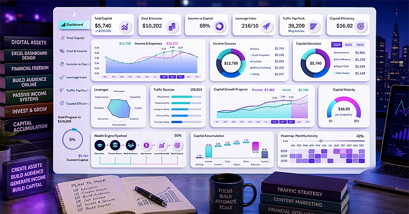
A waterfall chart, an hourly rate speedometer, and an activity heat map: how eight dashboard screens turn an accumulation strategy from a plan into a living process. A financial template that transforms a craft into a measurable capital-building system.
The main screen of the developer's personal finance dashboard:
- Line chart of income-to-expense ratio with interactive month buttons.
- Donut charts of income sources and capital distribution.
- Radar chart of influence lever distribution.
- Activity heat map with four levels.
- Donut progress bar of total accumulation.
- Waterfall chart for tracking the capital system.
- Traffic source ranking for identifying growth points.
And all of it is presented in a stylish interface design where the purple color scheme symbolizes financial independence.
Study the detailed dashboard usage guide in Excel. It describes how 6 dashboard screens turn an accumulation strategy from a plan into a living process:
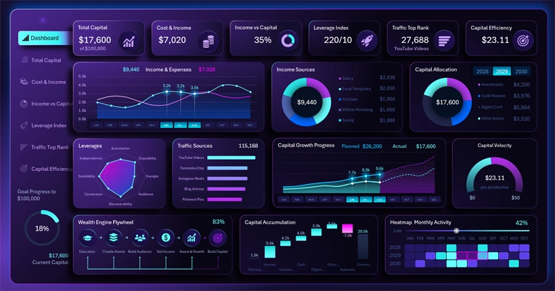
How to Build $100K in Capital by Developing Excel Dashboards
This dashboard differs from any other personal finance template in one fundamental way: it doesn't just record income and expenses — it manages a system for creating digital assets. An Excel template developer is in a unique position: their product is itself a tool for monetizing their skill. The more high-quality dashboards they produce, the stronger the organic traffic, the higher the conversion, and the faster capital grows. The waterfall chart illustrates this compounding effect year over year: with each period, expenses become a smaller obstacle to growth — this is exactly what compound interest looks like in action for those building capital through craft, not just investment.

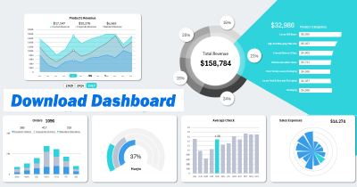
Data Visualization Charts for Interactive Report Creation in Excel.
Dashboard Templates