Template for personal finances of Excel Dashboard developer
Most Excel dashboards for personal finance only help answer two questions: how much did you earn and how much did you spend. This dashboard solves a different task – it helps an Excel dashboard developer build a system that, when skill and financial discipline are combined, can bring you closer to $100,000 in capital in three years. Excel dashboard templates are digital assets that are able to generate profit on their own as passive income. Study the structure of this version of the personal finance dashboard and see that it's real.
How to Build $100K in Capital from Developing Excel Dashboards
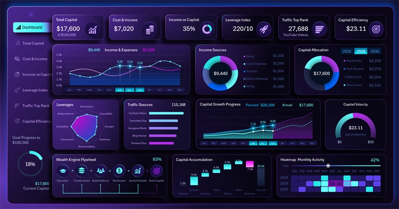
Any capital starts with a craft. A baker creates bread, a musician creates concerts, a writer creates books. An Excel Dashboard developer creates digital templates. The main difference of digital assets is that after publication they keep working without the author's constant involvement, attracting clients through Google, YouTube, Pinterest, marketplaces and their own website.
That's why every new template is not just a product. It's a new page on the website, a new video, a new source of organic traffic, and most importantly, a template is a new digital asset capable of generating income for years.
This dashboard is built on exactly this idea. It allows you to break down a financial goal into specific KPIs. For example, to grow capital from $10,000 to $100,000, at an average check of $30, about 3,000 sales would be needed. At a website conversion rate of 1%, that corresponds to about 300,000 visitors over three years. If each template brings about 30 sales, you would need to create around 100 quality digital assets.
Instead of the usual income and expense metrics, the dashboard tracks:
- capital,
- traffic,
- conversion,
- number of digital assets,
- growth forecast,
- financial plan completion.
Thanks to this, an abstract goal turns into a measurable system with clear performance indicators.
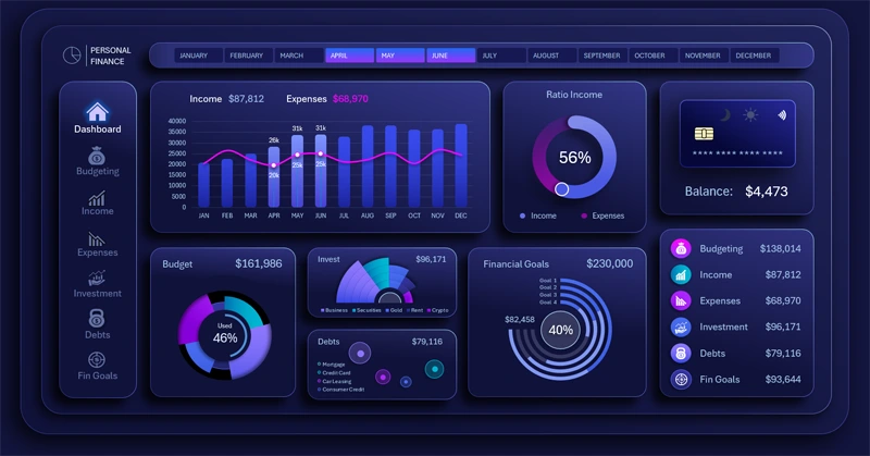
Presentation of a Personal Finance Dashboard template in Excel
The main idea is simple: capital is created not only through investments, but through digital assets as well. Each new Excel Dashboard strengthens the system, attracts new clients, and increases the likelihood of reaching the financial goal. Over time, such assets become the bridge between craft and personally accumulated, well-earned capital.
Data Visualization for the Personal Finance Dashboard
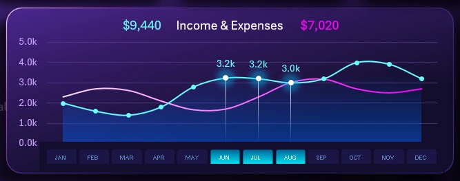
Even though the dashboard's main purpose is managing capital accumulation, it is still designed for personal finance. That's why the first visualization block features an important line chart of the ratio between monthly income and expenses.
Instead of month name labels on the X axis, this chart uses a block of buttons to switch months not only on the line chart but on the whole dashboard.
Moreover, as shown in the figure, you can select several months at once to specify different accounting periods: a month, a quarter, a season, a period of active or passive sales, a whole year, and so on. To do this, hold down the CTRL key on your keyboard while selecting the next PivotTable slicer button. As a result, all the data on the dashboard will be updated and recalculated automatically.
If the visualization block for analyzing such important income and expense data feels too small for you, you can significantly enlarge it. To do this, switch to the corresponding dashboard screen using the main menu option – Cost & Income:
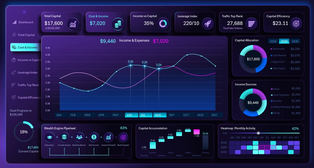
Now the line chart takes up more than half of the screen space. This makes the analysis significantly more comfortable. This mode will be especially useful for presenting a report.
Structure of Income Sources and Capital Distribution
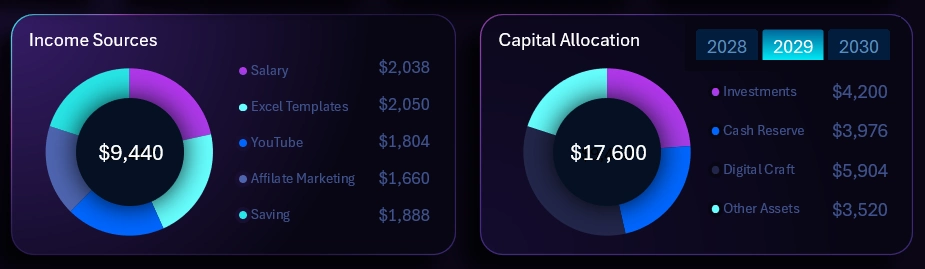
The next two blocks are very similar, so let's look at them together.
On the left is a chart segmenting personal income by source.
On the right is shown how part of the income is distributed across investment vehicles for storing capital. Even a little diversification matters for preserving personal finances. Don't keep all your eggs in one basket.
Note! In the upper right corner of the right-hand chart is a block of buttons for switching indicators by year. These buttons control the entire dashboard and all its screens.
The structure of income and capital has its own dedicated child screen on the dashboard:
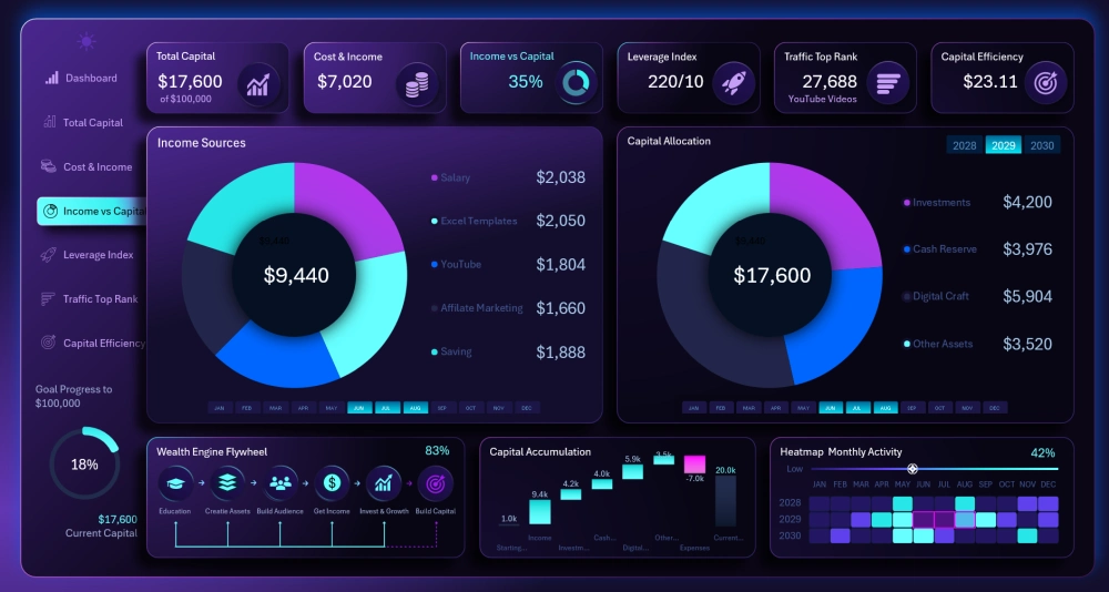
It's hard to admit that this kind of layout significantly improved the analysis. But what if there are many more income sources or capital storage locations? For example, if one chart has more than 10 indicators, this format will greatly improve the convenience of analysis. Also, for presenting on a projector, this screen will be quite useful even with as many indicators as shown in the picture.
Forecasting and Monitoring the Capital Accumulation Plan
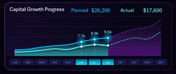
If a sailboat has no destination, no wind will be favorable for it. The same is true in the world of finance – you always need a goal. It always provides a large amount of energy and strong motivation to act. But a goal needs to be set correctly and also tracked regularly.
This chart lets you follow the process of reaching your goal through monthly accumulation of personal financial capital over all three years.
The legend of the capital growth line chart consists of four types of lines:
- The purple dashed line is the projected monthly savings plan.
- The dashed green line is the projected outcome of executing the monthly capital accumulation plans.
- The solid blue line represents the plans already approved based on current conditions.
- The solid green line represents the actual values of personal capital accumulation.
When switching between years, the chart updates automatically and accordingly.
On the main screen there are no labels on the vertical Y axis, but cursors show the current values for the plan, and dynamic labels show the actual values.
If you switch to the corresponding screen using the main menu, the vertical Y axis becomes visible and the visualization block itself is larger:
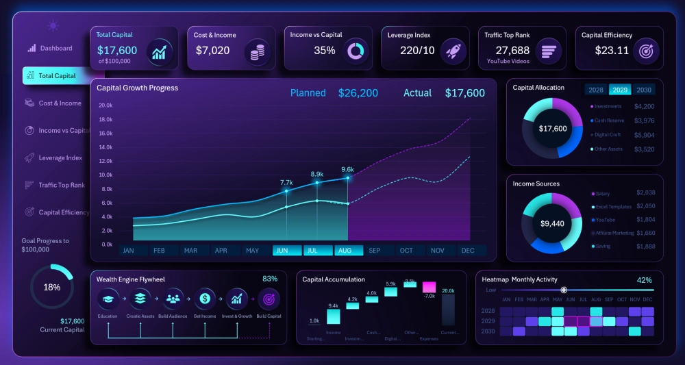
Here it's already much more convenient to analyze strategy and monitor the process of reaching the goal step by step.
Traffic Source Ranking
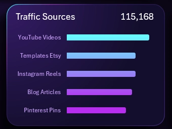
Why regularly analyze the ranking of traffic sources by number of visitors? It's important for maintaining the effectiveness of the system. It's important to always find and use growth points, so as to use your resources efficiently and direct them only toward the best opportunities, ignoring all the merely good ones.
Many might argue, but let's not forget that our goal is to accumulate $100,000 in capital in 3 years. That's a very high speed for personal finance amounts and the craft of an Excel template developer. So we'll make use of the good opportunities after achieving the result, but right now we're only interested in the best ones!
Being effective means being able to single out what matters most. Right now, what matters most is the growth points – the indicator where there is maximum influence on the result, meaning these are the points where we'll concentrate our efforts. If today the traffic indicator from YouTube videos is higher than from images on Pinterest, that means we'll make more videos and fewer images. In effectiveness, it's always important to strengthen what's already strong. As soon as the ranking changes, the strategy for using resources and time needs to be reviewed right away.
This is an important analysis and it also has its own dedicated screen on the dashboard:
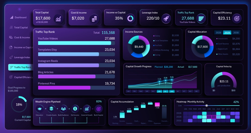
Always keep track of which of your actions correlate most strongly with big changes in the direction of reaching the goal.
Analyzing the Effectiveness of Levers of Influence on Results
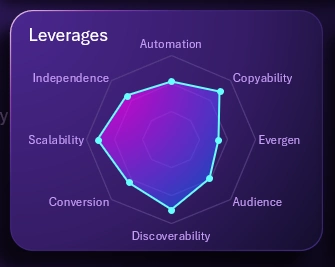
This topic is a continuation of the previous one. After all, strategic levers of influence on the result are effectiveness triggers.
At different times, under different conditions, different levers have their own influence coefficient values.
It's important to keep statistics – this also helps a great deal in quickly finding growth points to apply effort to in order to boost effectiveness.
This kind of approach is already a mastery-level skill, and mastery means achieving great results while applying less effort.
Note! There are so many technical levers in the craft of an Excel dashboard template developer. All of them can and should be used. Each lever is rated on a scale of 0–100 points. On the main screen we only observe the distribution of influence across levers at a surface level. The exact coefficient values can be tracked on a separate themed dashboard screen:
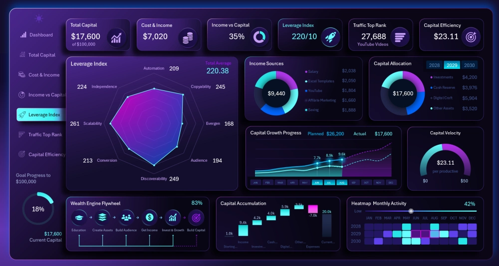
This is also an important analysis on the dashboard and fully deserves its own screen for convenient work or presentation.
Effectiveness of Personal Financial Capital Accumulation
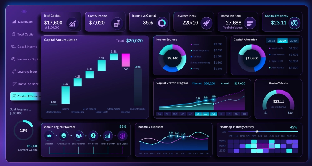
The last screen left to look at is capitalization effectiveness.
Here, the main data visualization is a waterfall chart. It clearly shows the size of the potential impact that income sources have on accumulation.
This waterfall chart should be read as follows:
- The first column is the starting savings amount.
- All the further green columns are income sources. Each green bar shows the size of its accumulation potential relative to the others.
- The second-to-last bar is the expense level (always a negative value). This bar can wipe out all the potential of every income source if personal finances are managed inefficiently. That's why it's important to track this chart.
- The last column is the final accumulated capital level.
Note! How much the waterfall chart changes each year. It's easy to notice that the expense level hinders reaching the goal less and less. This once again confirms that the hardest obstacles are always at the very start of the journey. Many people don't understand this and either lose motivation too quickly or, worse, underestimate the effort required at the start.
This screen also includes a progress bar in the form of a speedometer chart for tracking the hourly rate level of an Excel template developer's working time:
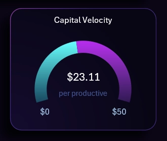
We need to manage to accumulate $100,000 in 3 years. That's approximately 7,200 working hours. If the rate is at or below $13/hour, we will physically never be able to achieve this result. The maximum level is $50, but on the "Processing" sheet you can set your own desired values if this isn't enough for your level or your specific conditions and needs.
Goal Progress Map Chart in Excel
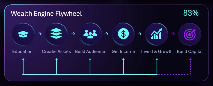
In this block, the dashboard user tracks progress through strategic stages on the way to reaching the main goal. The chart looks like a progress bar with the path divided into intermediate goals, which are completed according to the strategy plan.
You definitely won't find this custom visualization in Excel's standard chart template section. This chart template was built like a construction set, out of standard sets of chart shapes and formulas.
Monthly Activity Heat Map
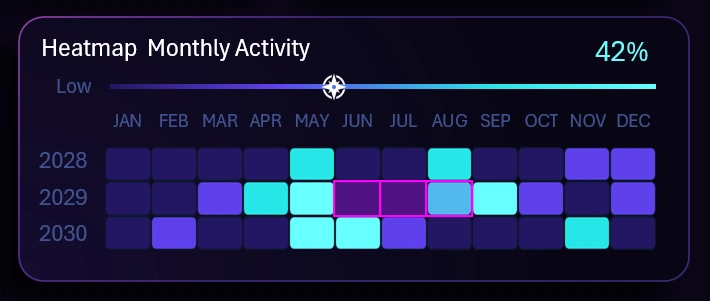
The main feature of this heat map is the presence of cursors for the selected months. In the upper right corner, the average activity value for the selected period is shown (in this example, 3 months – summer 2029, as shown in the picture).
There are 4 levels total, and each level has its own color:
- Passivity and procrastination:
- Low activity:
- Medium activity:
- High activity:
The heat map legend is also presented as a horizontal progress-bar-style chart with a cursor. It visualizes the final averaged value of monthly template development activity, and the cursor sits on the corresponding legend color.
Ring Chart of Overall Progress
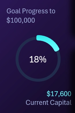
On the left, below the main menu, there is a ring-shaped chart showing the final result of capital accumulation through personal finances. This is the last chart on the dashboard.
Design of the Personal Finance Capital Accumulation Dashboard Template in Excel
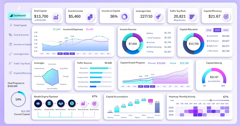
Download Dashboard Template for Personal Finances of Excel Developer
The main design color chosen was purple. It is often associated with wealth, magic, and wisdom. This fits the context of the dashboard: financial independence in today's world is already a form of wealth, and it's achieved through the "magic" of the compounding returns of digital assets. At the same time, the system's effectiveness is maintained through control of the levers, which is quite wise.
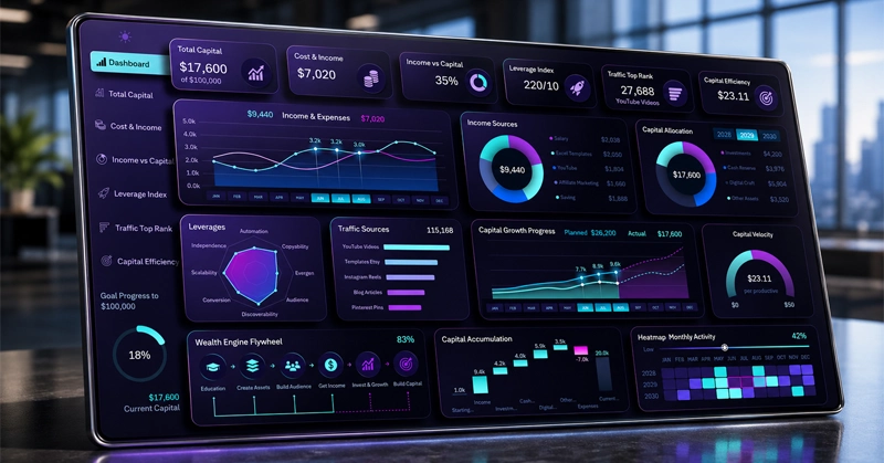
Download the dashboard template for fast personal capital accumulation in Excel 
This site presents materials and ready-made templates for learning Excel dashboard development. But it's also important to properly assess the potential return on the effort invested in learning, in the form of solid financial reward. An Excel dashboard developer can not only advance up the corporate career ladder, but also earn a decent income from their skills and craft. And they don't need to quit their job and start their own business to do it. It's enough to manage personal finances and goals effectively. And in this, they're helped by the results of their own creative work. Such a system is maximally effective and reliable. Corporate entrepreneurship is becoming increasingly popular.
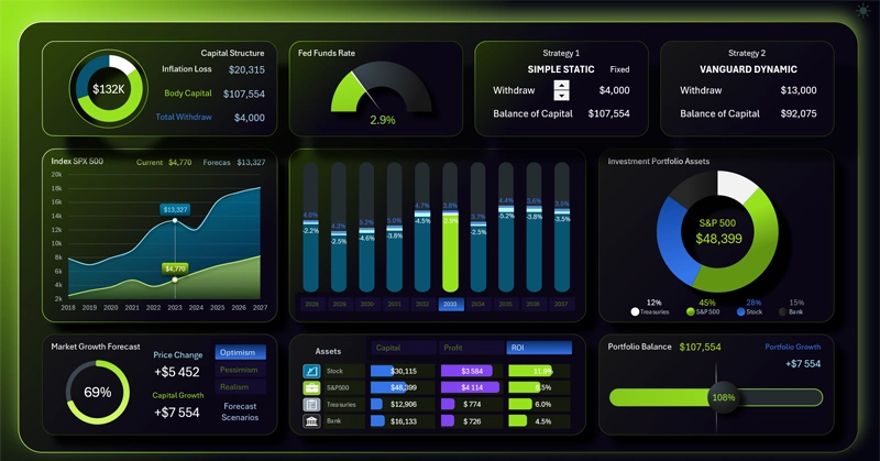
Data Visualization Charts for Interactive Report Creation in Excel.
Dashboard Templates