Coverage of Products on a Radar Chart in Excel by Regions
Use our dashboard template for interactive analysis of the reach of three product categories across different regions. A customized Radar Chart visually compares reach metrics in Excel, helping to identify strengths and weaknesses of each product category through ABC sales reach analysis. Download the template and explore its structure in detail!
Visualizing Target Audience Reach with a Radar Chart
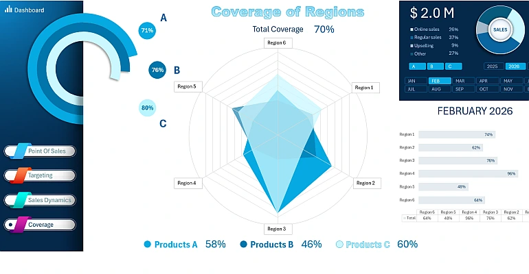
This approach provides a clear comparison of key metrics and helps identify growth opportunities. Now you have new possibilities for strategic product assortment planning or launching new products into the market. In the video below, we will create a Radar Chart in Excel for visual analysis of product audience reach. The following aspects are covered:
- Setting up a pivot table and connecting to it using the GETPIVOTDATA formula.
- Filling the raw data table with formulas for the Radar Chart.
- Customizing the Radar Chart to match the dashboard design.
- Configuring and adding data labels with formula-based references.
- Reviewing the final interactive visualization on the dashboard.
This is the final screen of the comprehensive dashboard on the topic:
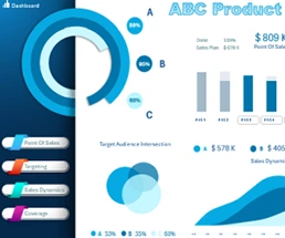
ABC Sales Analysis of Various Product Categories in Excel Dashboard
Use a Radar Chart in Excel to make more informed decisions and identify growth areas.
Download Dashboard template with a customized Radar Chart in Excel 

Data Visualization Charts for Interactive Report Creation in Excel.
Dashboard Templates