Download ABC Analysis of Product Sales in Excel Dashboard
Here’s an example of how to perform an ABC Analysis to develop a sales strategy for small businesses. All you need is an interactive dashboard created in Excel. You can download the ABC Analysis presentation template at the end of the article.
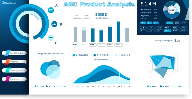
Example of ABC Product Sales Analysis in Excel
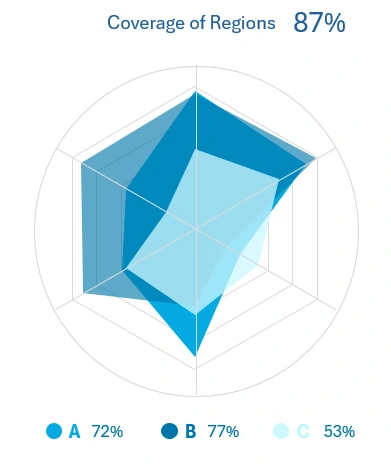
The main chart presents the results of testing across three product categories: A, B, and C.

How to make Interactive ABC Analysis Dashboard Template in Excel
The inventory analysis process uses an experimental approach that includes assortment expansion and upselling strategies. It also considers the fact that diverse products enhance overall sales by broadening the range.
ABC Analysis Example in Excel
Let’s consider three product categories: A, B, and C. Sales are distributed as follows:
- Category A: The most popular products that provide the baseline minimum sales.
- Category B: Moderately popular products that drive growth through a wider assortment.
- Category C: Rarely purchased items that encourage upsells or add-ons.
Data and results in percentages:
| Parameters | Only A (%) | A + B (%) | A + B + C (%) |
| Share of A Sales | 65% | 58% | 50% |
| Share of B Sales | 0% | 22% | 30% |
| Share of C Sales | 0% | 0% | 7% |
| Total Result | 65% | 80% | 87% |
Explanation of Testing Results:
- If only products from Category A are sold: Category A accounts for 65% of total revenue as it forms the foundation of the product range.
- Adding Category B products: Including Category B increases the sales share to 80% as some customers start choosing products from Category B, complementing purchases from Category A.
- Adding Category C products: When fully expanding the range (all categories: A, B, and C), the total sales share rises to 87%. Category C stimulates upselling and cross-selling but contributes only slightly on its own.
Conclusion: This approach demonstrates how range expansion and working with different product categories positively affect sales. ABC analysis not only compares product categories but also visually showcases how each category contributes to the overall sales volume.
This method of performing ABC inventory analysis is well-suited for small businesses considering whether it’s time to expand their range or focus on a narrow group of products within a micro-niche. However, there’s no universal answer to this question! Each situation in every product category is unique and requires its strategy. The right decision can only be achieved through experimental testing. Even the universe wouldn’t provide a precise answer to this question. Only the Pareto Principle helps—evolution works this way for both nature and business, fostering growth and development.
Comparative Analysis of Retail Locations
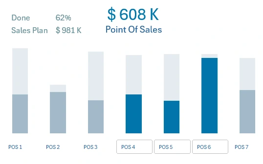
How to make Sales Point Management Dashboard in Excel for POS Systems
The top central block allows for analyzing sales volumes across retail locations. The light gray bars on the histogram represent sales targets, while the dark blue bars show actual sales volumes in monetary terms. On the X-axis labels of the bar chart, there is a button block to filter data for specific retail locations. The labels clearly show planned, actual sales figures, and the percentage of fulfillment.
Dashboard Control Panel
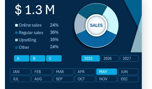
How to make Dashboard Control Panel in Excel
This section contains key controls for data segmentation on the dashboard:
- Filters for product categories A, B, and C.
- Distribution of indicators by year.
- Data filtering by months, quarters, and other accounting periods.
Additionally, this visualization block provides summarized financial sales figures segmented by category:
- Online sales.
- Regular sales in retail stores.
- Additional revenue from upsells of complementary products.
- Other sales revenues.
This block contains the primary summary of financial information and serves as the dashboard control panel, duplicated across all dashboard screens for convenience.
Target Audience Overlap Across Product Categories
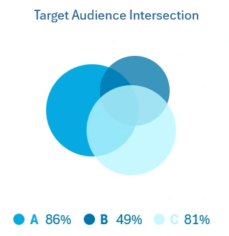
How to make Target Audience Market Overlap Dashboard Template in Excel
It’s no secret that each product category has its target audience, and often, these consumer groups overlap. The broader the category’s market appeal, the greater the overlap among target audiences. This fact is essential to consider when conducting a comprehensive ABC product analysis.
Sales Volume Dynamics by Product Category
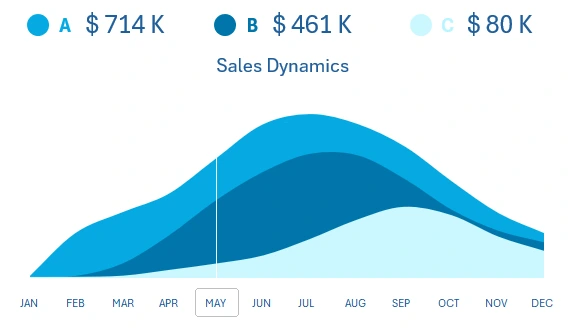
Example of a Sales Comparison Dashboard in Excel
This chart allows tracking changes in monthly sales figures across all three product categories. This data visualization block includes its control buttons for selecting values by month. These buttons perform the same function as those in the dashboard control panel but are conveniently located for this report.
Geographic Sales Coverage Analysis
Coverage of Products on a Radar Chart in Excel by Regions
This chart allows analyzing market coverage for three different product categories. Each category has its popularity across various regions. In this example, six regions are simultaneously analyzed using a Radar chart. In some regions, a significant imbalance in product category popularity is observed, necessitating appropriate assortment planning at specific retail locations.
Each product category has a different market coverage share across regions. The total market coverage figure always exceeds that of each individual product category.
Remember, if you don’t have 100% of the market, there’s always room for growth!
ABC Product Analysis Report Presentation
All visualization blocks are harmoniously combined into a cohesive dashboard. Thanks to integrative features, users of the ABC Analysis report can model various development scenarios for different strategies. This is the essence of data visualization.
Download the ABC Sales Analysis Dashboard Template in Excel 
By leveraging Excel’s standard capabilities, you can create highly effective tools for business development. The goal of every entrepreneur is to elevate their business to a level where just a single glance at the dashboard reveals the key levers influencing results. After all, a businessperson’s mind should be free and open to new creative ideas.

Data Visualization Charts for Interactive Report Creation in Excel.
Dashboard Templates