Animated Infographic Fish Chart for an Excel Dashboard
Animated infographics in Excel offer a unique way to present project progress data. A visualization featuring sharks opening their mouths makes trend analysis more engaging and visually striking. This format is ideal for presentations, allowing easy tracking of key metrics while capturing the audience’s attention.
Example of an Animated Shark Infographic in Excel
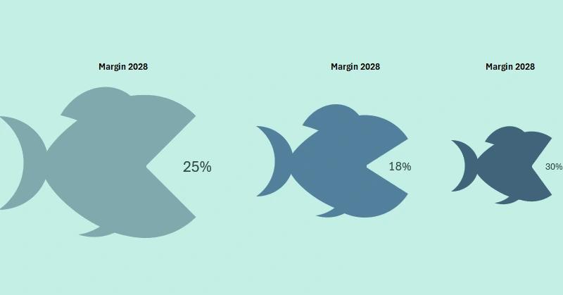
How can project data analysis be made more engaging and visually appealing? The animated shark infographic in Excel not only visualizes key metrics but also presents them dynamically. This presentation format draws attention and enhances information retention. Let's explore how to effectively present data using this approach!
In this video, we will cover how to use animated elements to evaluate and showcase annual project margin absorption. The tutorial structure includes:
- Creating an infographic template with a control panel.
- Formulas for a bubble chart representing budget volumes.
- Building a bubble chart template for annual budget comparisons.
- Formulas for an interactive infographic of the annual margin indicator using sharks.
- Designing fish-shaped infographics using charts and shapes in Excel.
- Testing the animation of the interactive infographic in Excel.
This is the final visualization element for the project development dashboard:
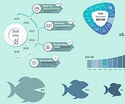
Excel Project Management Dashboard with Infographics
The animated shark infographic in Excel is an innovative and effective way to visualize data related to acquisitions in a project's evolution. This infographic helps track trends effortlessly, attracts attention, and makes presentations more memorable. Use this method to enhance data perception and make analysis more visually compelling and engaging!


Data Visualization Charts for Interactive Report Creation in Excel.
Dashboard Templates