Project Management Dashboard in Excel with Infographics
Effective project management is the key to small business success, especially when it comes to scaling. The biggest enemy of a business owner is multitasking. However, data visualization helps take control of multitasking and turn it into an advantage.
Scientifically Proven Interesting Fact: Multitasking is the leading cause of poverty! In this example, we will defeat multitasking with an interactive business process management dashboard. How? We demonstrate with a ready-made example that you can download at the end of this article.
How to Use a Dashboard for Business Project Management in Excel
Multitasking harms entrepreneurs. Their minds should be free and always open to new creative ideas. To prevent diverse processes from overloading the entrepreneur's brain, data visualization from interconnected metrics turns business management into an engaging game. A good interactive dashboard should not just tell a story and present a solution like a presentation—it should involve the user in the data analysis process.
A dashboard reminds entrepreneurs that business is not just work; it's a game. The main goal of this game is to help people! In any business, the most important thing is the customer. Money is just a measure of how effectively you help. Similar to earning points in a game for completing tasks, if no one pays for what you do, it means no one needs it. In reality, selling = helping people! And there is no business without sales.
The dashboard is designed for dynamic management and tracking of key scaling processes in small retail businesses. The scaling strategy is based on increasing the number of new sales points. In most cases, businesses scale in only one direction because it's a safer strategy. However, to demonstrate the dashboard's capabilities, we will present business scaling in four directions simultaneously:
- Grocery Products – Fruits & Vegetables Store.
- Digital Home Appliances – Electronics Store.
- Textiles – Clothing & Style Store.
- Home Retail – Home & Living Store.
This example illustrates that the template can be used for both safe and high-risk market expansion strategies. Moreover, such a visual example demonstrates the possibilities of testing new niches.
Model for Business Process Management in Excel
To quickly grasp the principles of dashboard usage and construction, we first model a scenario for a technical task (TT).
A retail business owner decides to scale up. They choose the four directions listed above. Scaling across four directions at once is very risky but feasible. Therefore, the entrepreneur approaches this strategy with great care.
Each direction starts with just one sales point. Each sales point has a 12-month launch timeline, with each month dedicated to completing a sequential task:
- Market Analysis and Location Selection — studying competitors, target audience, foot traffic, and rental options.
- Finding a Location and Signing a Lease — negotiating terms, signing the contract, and handling necessary documentation.
- Developing a Design Project — planning the store layout, branding, and visual identity.
- Renovation and Site Preparation — construction work, finishing, and utility connections.
- Purchasing and Installing Equipment — shelving, cash registers, lighting, and furniture.
- Forming the Product Assortment — signing supplier contracts and stocking initial inventory.
- Hiring and Training Staff — recruiting employees, conducting training, and handling documentation.
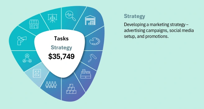
- Developing a Marketing Strategy — advertising campaigns, social media setup, and promotions.
- Testing Internal Processes — trial sales, POS system setup, and logistics testing.
- Launching an Advertising Campaign — announcements, promotions, and attracting first customers.
- Grand Opening of the Store — holding an opening event and starting sales.
- Evaluating Effectiveness and Adjusting Strategy — analyzing KPIs, improving processes, and planning future growth.
Each month, key indicators of the scaling process change. Each metric has a dedicated visualization block for dynamic analysis and assessment of new achievements and risk levels. Below, we will examine each block in detail.
Progressive Timeline in Excel
First, let's look at the main timeline progress bar block:
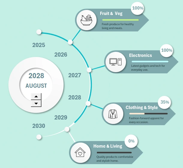
Interactive Roadmap in Excel for a Project Dashboard
The chart tracks the process of scaling a project. Each year, a new sales point is opened. All points simultaneously develop in a new direction (in this example). The horizontal progress bar for each store shows the completion of planned finalization processes. This represents the period from the MVP launch day to full operational capability and achievement of all real sales plans. It is worth noting that the payback period for a retail sales point is usually no less than two years.
This visualization block also includes a dashboard control element.
In all project management dashboards, the timeline plays a crucial role. In business, as in life, the complexity of a task is determined by its deadlines. In other words, there are no difficult tasks without time constraints. Conversely, even the simplest task can become challenging if given a short deadline. We often forget that quantitative results matter less than time-related metrics. The final result is not as important as when it will be achieved. Any favorite activity can become unbearable if it must be done urgently. Therefore, time planning deserves special attention.
This data visualization technique is also frequently used for presenting roadmaps.
Segmenting the Year into Monthly Tasks and Subtasks
Task Manager Menu in Excel for Project Progress Analysis
Opening each store requires one year. Throughout the year, 12 sequential monthly processes will be completed, starting with market analysis and ending with final steps after store opening. Each process is allocated one month and a predefined budgeted amount.
When the current month changes on the dashboard, the corresponding process icon is highlighted in this block. Additionally, the process name and a brief description are updated on the right.
Profitability Planning
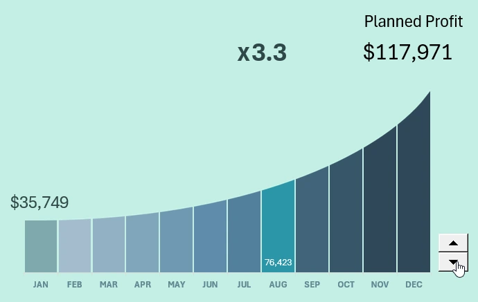
Interactive Exponential Growth Bar Chart Template in Excel
This unique bar chart includes a control element that allows us to adjust the profitability level. The first value represents the initial expense amount, while the final value shows the sum after adding the profit margin. Using the control buttons, we modify the multiplier. For example, in the image, the multiplier is set to x3.3. As a result, the final amount—profit—changes. The greater the difference between the initial and final sums, the more pronounced the exponential curve distortion.
The amount shown for the currently selected month represents the revenue, considering the multiplier and exponential growth as of the current month.
Such high profitability may seem unrealistic, even in retail. However, in this business, profit growth is not only achieved through markup increases!
A high turnover rate can also significantly boost profits. For example, if we sell just one product with a cost of $35,749 and a 25% markup, we only need to produce and sell it 14 times within a year to generate revenue of $117,971.
Given:
- Markup: 25%
- Product Cost (C): 35,749
- Desired Revenue (D): 117,971
- Period: 1 year
- Looking for the turnover rate (N) – the number of times the product must be sold per year.
Step 1: Calculate Profit per Sale
A 25% markup means that profit is 25% of the cost price (if calculated as a percentage of cost rather than the final price).
Profit per sale:
Step 2: Calculate the Number of Sales
To achieve revenue of 117,971, the product must be sold N times, with each sale generating a profit of 8,937.25.
Answer:
The turnover rate must be at least 14 times per year since fractional sales are impossible (rounding up is required).
In other words, if the product is sold as a whole unit, it must be produced and sold 14 times per year.
Therefore, this dashboard chart is highly relevant and useful for business profitability planning.
Budget Load Control
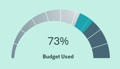
Speedometer-Style Progress Bar as an Excel Dashboard Widget
This gauge monitors the annual budget expenditure allocated to all 12 processes for opening a single retail sales point. Each project has different budget expenditure plans and profit expectations.
Monthly Expense Analysis per Project
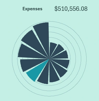
Polar Chart for Project Data Analysis in Excel Dashboard
The petal chart (also known as the wind rose) presents the dynamics of cumulative expenses over time. The more processes are completed, the faster the total expenses accumulate. Everything follows a predictable pattern.
Comparative Budget Analysis
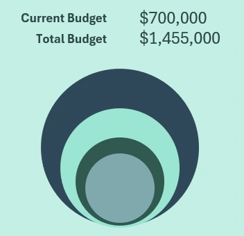
The bubble chart compares the annual budget volumes of different projects. Data labels show the current and total final budget amounts for all projects in absolute values.
Infographic for Margin Analysis
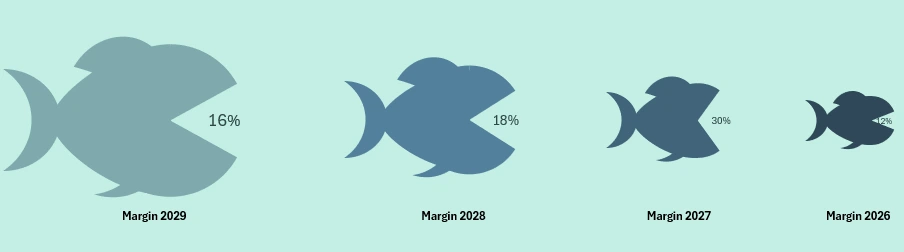
Animated Infographic Fish Chart for an Excel Dashboard
A creative infographic for presenting the profitability of all four business projects. The dynamic infographic follows this scenario: each year, a new project is launched with an increasing budget. The larger the budget, the bigger the fish. Each year, a new fish opens its mouth. The mouth opening level corresponds to the business margin. The maximum opening is 48%, which is rarely reached. It is important to remember that margin, unlike markup, cannot exceed 100%. Therefore, this is a justified approach to presenting data using fish-shaped infographics.
Project Management Dashboard Template in Excel
All data visualization blocks are harmoniously combined into a single presentation with a dynamic gamified design.
Download Project Management Dashboard in Excel 
This time, the infographic design was created in a monogram style with pleasant pastel colors for the eyes. There is also a high-contrast version of the dashboard template design.
Now, mastering multitasking and managing business processes effectively for scaling becomes easier.

Data Visualization Charts for Interactive Report Creation in Excel.
Dashboard Templates