Bar chart for analyzing reinvestments on sales in Excel
Reinvesting profits is the key to stable business growth. Visualizing this process in Excel helps clearly assess what portion of income is directed toward development, purchases, or other goals. In this article, we will explain how to create a chart that reflects reinvestment dynamics based on sales data and show a practical example with a ready-made template.
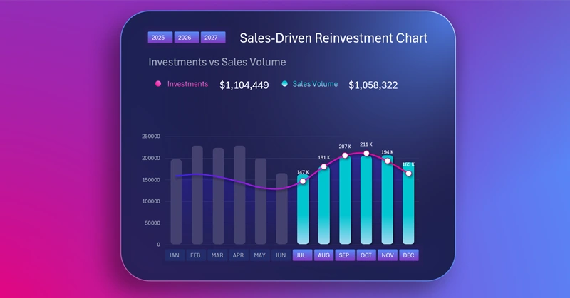
Example of an interactive combined bar chart in Excel
It is great that Excel provides the ability to create combined charts with interactive features. This is one example that can be effectively used in the development of entire dashboards. How to build such a data visualization block in Excel is shown in the video tutorial. The construction steps are as follows:
- Create a beautiful gradient for the background of the visualization.
- Draw the base for the chart with semi-transparent color effects in Excel.
- Prepare source data and build pivot tables.
- Add slicer buttons to control data selection.
- Formula to connect to pivot tables and extract values.
- How to create a template for an interactive bar chart in Excel.
- How to round the corners of the chart bars.
- Design customization for slicer control buttons.
- How to combine a bar chart with a line chart in Excel.
- Add dynamic and static data labels using formulas.
- Example of how the chart works to analyze reinvestments against sales performance in Excel.
This Excel chart is part of a dashboard, providing interactive data display for effective analysis:

Product investment profitability dashboard in Excel for distributors
The reinvestment chart in Excel allows you to quickly assess the efficiency of profit allocation and adjust your investment strategy. This tool is useful for business owners, analysts, and financial managers. You can download the ready-made template and adapt it to your own data for more accurate financial flow control.
Download Bar chart for analyzing reinvestments on sales in Excel

Data Visualization Charts for Interactive Report Creation in Excel.
Dashboard Templates