Excel Dashboard for analyzing product investment ROI
Example of a dashboard for analyzing the profitability of investments in purchasing goods. The template is designed for distributor companies operating under the B2B business model. The dashboard helps analyze the purchasing plan according to the profitability level of reinvestments in the business for effective growth. Using such an interactive report, you can control parallel cycles: revenue, sales, purchases, and payback. In distribution companies, these cycles are often highly unsynchronized and require quality control.
Excel investment profitability analysis for purchasing goods
How to Make Sales-Driven Reinvestment Chart in Excel
An important feature of distributors is the need to supply goods to retail outlets on consignment with deferred payment. This means that the revenue figure often significantly lags behind the sales volume. For the same reason, purchase plans from manufacturers for retail distribution become unsynchronized.
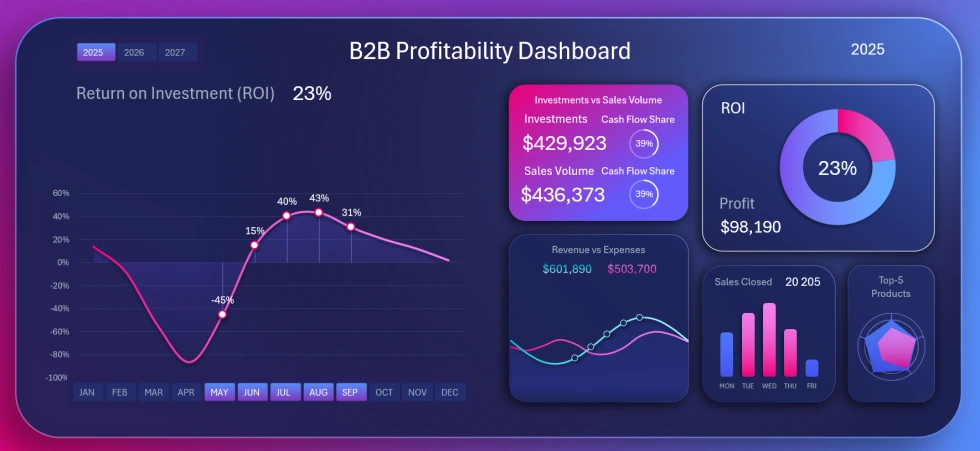
This dashboard helps control the reinvestment volume in relation to sales volume while taking into account key business performance indicators.
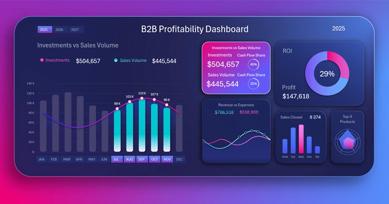
The data visualization on the dashboard is designed so that on the left side, analysis is performed with interactive controls for selecting data for different accounting periods. On the right side, interconnected key indicators are presented as additional visualization blocks, which act as a menu for switching between dashboard screens.
Each screen of the dashboard corresponds to a visualization block. For example, in the image above, the main screen shows an analysis of the volume of reinvested financial resources in purchasing goods compared to sales volumes.
Overview of all analytical capabilities of the dashboard in Excel
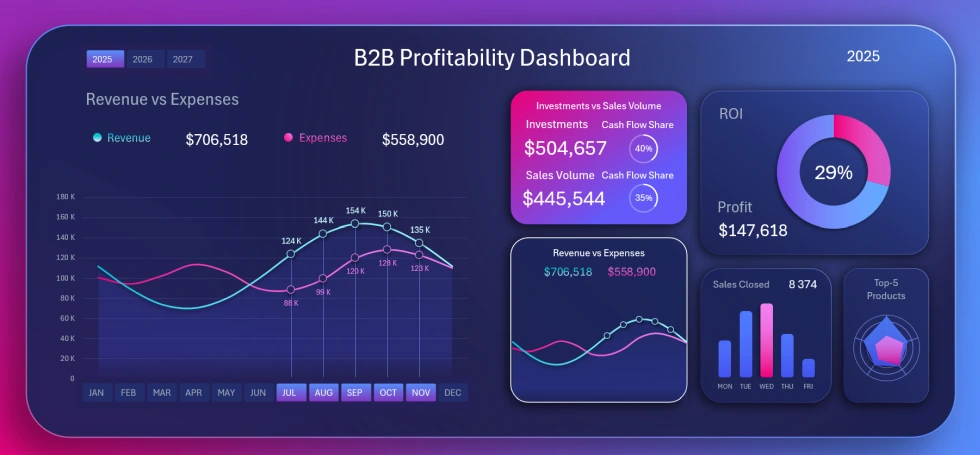
Screen showing the ratio of revenue and expenses dynamics:
How to Build Excel Chart to Feel Flow of Profit from Pulse of Revenue and Expenses
It is important to ensure that revenue always covers expenses. Why not analyze against revenue alone? Because revenue always lags due to deferred payments, while expenses do not. It is safer to track revenue against total expenses.
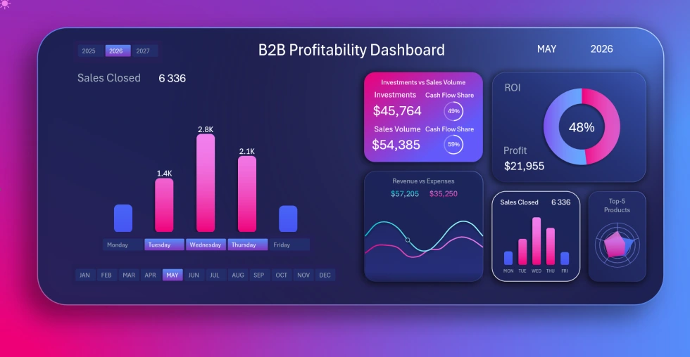
Screen showing sales activity by day of the week:
How to Create Interactive Excel Bar Chart for Flow of Closed Sales Deals Across the Week
Here we analyze which workday in which accounting period has more or fewer closed deals. The bar chart visualization contains a local button block, and its controls do not affect the entire dashboard. Using the day-of-the-week buttons, we can switch between days and analyze sales individually or by groups of days.
Screen for analyzing revenue and sales volume distribution by main product categories for the same accounting period:
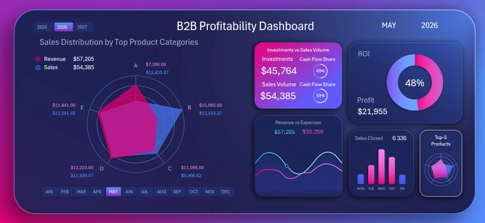
How to Visualize the Sales Horizon by Product Categories Using Excel Radar Chart
The Radar Chart allows you to visually present distribution data. When changing the selected time periods, the chart data updates automatically along with other visualization blocks on the dashboard. This makes it easier to find valuable patterns and identify the most effective growth points for investing in the business. Different product categories yield different returns at different times.
Screen showing the history of ROI performance changes for goods investment:
How to Make Mini Return on Investment Dashboard in Excel for Success Story Presentation
Some months may have negative ROI values, especially in the early years of the business. This happens because revenue, delayed due to deferred payments, cannot cover expenses in time. We can also observe abnormal growth when accumulated revenue from previous sales periods is received. To avoid losing control from stress or euphoria, it is important to monitor average indicators as well. For example, you can select a group of periods — several years or months at once. The dashboard allows multi-selection of accounting periods in groups.
Example of a dashboard for evaluating the profitability of goods investment
Each dashboard screen provides unique value for analysts and business owners. Effective business investment is always about long-term growth with lasting results. But to achieve this, you need to analyze key investment capital efficiency indicators daily using the dashboard:
Download the dashboard for analyzing goods investment profitability in Excel 
This dashboard design template is well-suited for use on tablets and can always be kept on hand, so you can spend just 15 minutes a day monitoring key indicators. You will also be able to develop the best strategies for scaling your business from anywhere in the world thanks to the identified growth patterns. Data visualization makes information more pleasant to perceive, meaning you can better see the current situation.

Data Visualization Charts for Interactive Report Creation in Excel.
Dashboard Templates