Clustered bar chart with grouped spending in Excel
Budgeted payroll spending isn't spread evenly across the week, and that unevenness carries important information. If master technicians drive the bulk of the budget load on Monday, while the sales department drives it on Friday, there's an operational logic behind that — one you want to see, not guess at. A clustered bar chart in Excel solves exactly this problem: each day of the week is broken down into three internal segments by employee category — technicians, office staff, salespeople — making it immediately clear who drives the spending peak, and when.
Interactive clustered bar chart in Excel
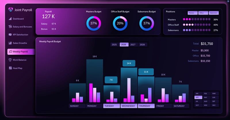
This clustered bar chart in Excel is designed for analyzing weekly budgeted spending. Its main features are three employee categories within each day:
- Technicians.
- Office staff.
- Sales department.
Plus interactive day selection and grouping of weekdays versus weekends — with values updating automatically according to the Excel pivot table data.
Weekdays separately, weekends separately: how grouping days and toggling categories on and off changes the picture of budget load on a single chart.
In the weekly budgeted-spending clustered bar chart template: each composite column includes three mini-bars, which can be excluded from the data visualization using filter buttons. The large, wide columns that span one group of three small bars represent the sum of values for that group.
Interactive buttons under the X-axis control day selection and grouping. As you work with the chart, the pivot table updates automatically, driven by the data slicers.
See how effectively this grouped-column bar chart can be used on a large interactive dashboard:

Excel Dashboard for analyzing payroll as an investment, not an expense
A clustered bar chart with grouped budget spending is a dual-purpose analytical tool: it shows both the overall picture for the day and each category's contribution to the total figure. Being able to turn off one of the categories and instantly watch the columns shrink and the pivot table on the right recalculate isn't just a convenience — it's a fundamentally different way of asking questions of your data. Weekdays versus weekends, technicians versus salespeople, plan versus actual — any combination comes together in seconds without a single manual formula. It's exactly this flexibility that turns a weekly budget snapshot from a routine report into a living operational-management tool.
 Download the clustered bar chart with grouped columns in Excel

Data Visualization Charts for Interactive Report Creation in Excel.
Dashboard Templates