Combined Column Chart in Excel for Interactive Dashboard
Combined column charts allow you to display multiple metrics at the same time and compare their correlation on a single chart. In Excel, this approach is especially useful when creating interactive dashboards, where both data accuracy and ease of perception are important. Ergonomics should also not be forgotten. Combined charts allow you to use dashboard space for data visualization as efficiently as possible.
Interactive Combined Bar Chart Template in Excel
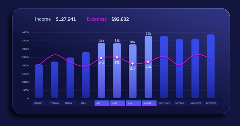
The standard features of Excel allow you to add such a useful tool as pivot table slicers. Their buttons can be placed rationally along the X-axis to switch cursors on an interactive bar chart. This is very convenient to use and looks visually stylish. You can highlight a specific portion of the data in the visualization and get a conditional selection of values based on user input. For example, only second-quarter data against annual indicators.
You have a great opportunity to become the owner of this template by downloading the Excel file at the end of the article. But there is even better news — you can quickly learn how to create such templates yourself using the video tutorial. It shows the following:
- Formula table for the interactive bar chart.
- Create a standard clustered column chart template.
- Control parameters for different data series of the chart.
- Add pivot table slicer buttons to control the chart.
- Use shapes to design the panel for data visualization placement.
- Change the design of the interactive bar chart control buttons.
- Create a clean and attractive design for the combined chart.
- An example of how to create rounded columns in an Excel bar chart.
- Add dynamic data labels with references to formulas.
- Test the interactive capabilities of the combined chart in Excel.
This combined column chart works well on a large dashboard:
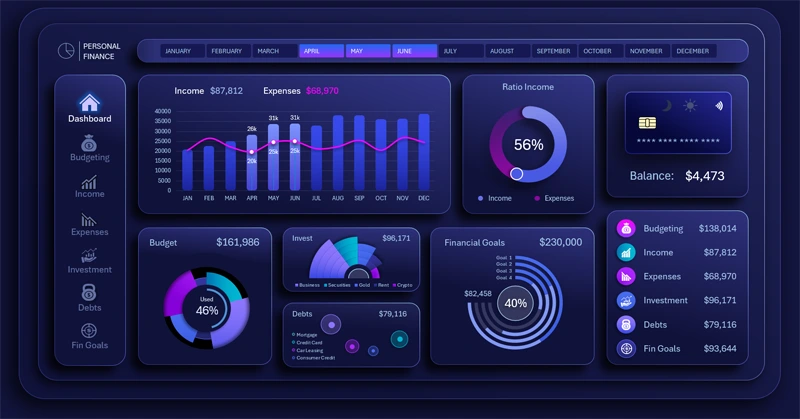
Example of an interactive personal finance management dashboard in Excel
The combined column chart in Excel makes a dashboard more informative and functional. It helps compare indicators, see relationships between metrics, and make decisions faster. Use this type of visualization to improve the quality of analytics and the design of your reports.


Data Visualization Charts for Interactive Report Creation in Excel.
Dashboard Templates