Best Dashboard for Personal Finance Management in Excel
A multifunctional dashboard for managing personal finances in Excel. Interactive data visualization allows you to monitor incoming and outgoing cash flows as well as their accumulation. Gain maximum control over your monthly expenses and income. Moreover, analyze the cumulative growth of your investment portfolio.
What a personal finance dashboard in Excel can do

True power is mastering yourself! And to master money, you need effective personal finance management. If you don’t control your money, your money will control you. In today’s world, poor personal finance management leads to losing the highest power – self-mastery. Why does a person need the highest power? – It is the need for development!
There are many organizer apps for tracking personal income and expenses. In this example, we want to show what Excel is capable of, specifically data visualization. In this dashboard, visualization is the main advantage, setting this template apart from competitors.
Data visualization directly affects:
- Motivation to act, persevere, and achieve new financial results.
- Reaction – quickly making the most effective decisions.
- Clear understanding of the correlation between current and projected situations in the near future.
This time, a rich multi-screen dashboard was developed with various charts aimed at personal finance tracking. It demonstrates not only expense monitoring but also:
- Budget segmentation by fixed and variable income and expenses.
- Correlation between income and expenses.
- Analysis of an investment portfolio for personal finance.
- Tracking credit debt to banks.
- Monitoring progress toward personal financial goals.
Next, we will look in detail at the principles of operation and practical use of each data visualization block on the dashboard.
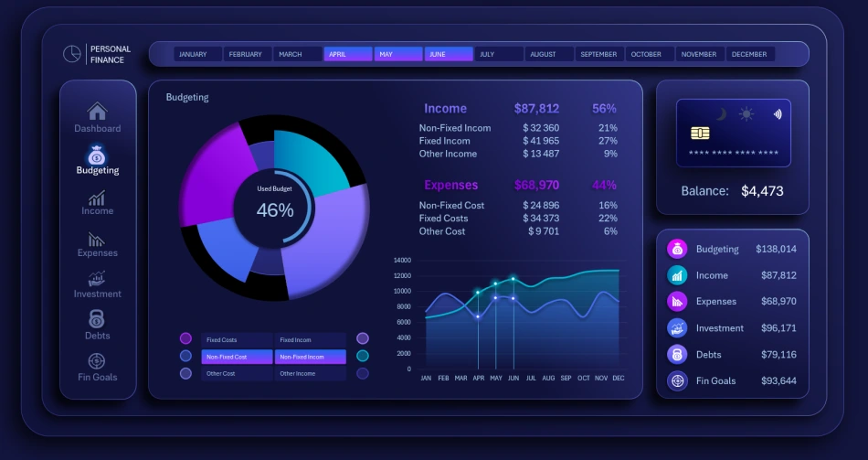
Data visualization for personal finance management in Excel
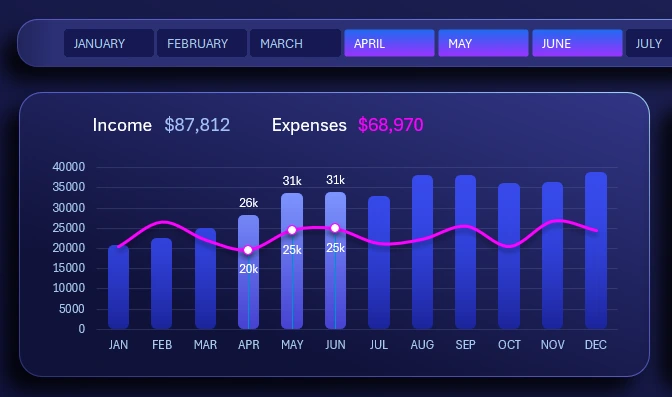
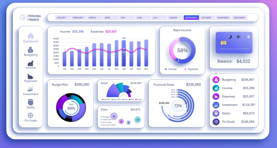
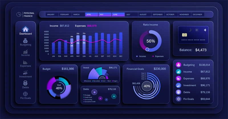
At the top, below the horizontal month selection menu on the dashboard, there is a visualization block showing the correlation between income and expenses in a combined bar chart format.
Selected months are highlighted with bars and value labels. By holding the CTRL key while using the horizontal menu, multiple months can be selected simultaneously, and their values are grouped into a single total.
All blocks support multi-selection of data, allowing you to choose multiple months for analyzing different accounting periods: quarters, half-years, seasonality, and more.
Income to expense ratio
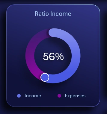
Immediately to the right is a chart showing the percentage ratio of income to expenses. It is important that this indicator is always above 51%. Getting rich is simple: just always spend less than you earn.
Balance infographic

The vector illustration of a credit card displays the final account balance at the end of the selected month or other accounting period. It also includes buttons to switch between the dark and light versions of the dashboard.
Personal finance budget segmentation
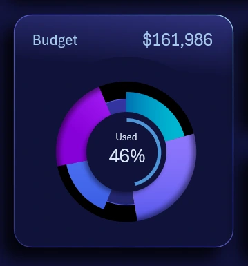
Multi-Layer Budget Segmentation Chart in Excel
A chart showing the distribution of the budget by main expense and income categories. Budget structure segmentation in this visualization block is implemented in the simplest way. The first three segments are:
- Variable income
- Fixed income
- Other income
The next three segments relate to expenses:
- Variable
- Fixed
- Other
The progress chart in the center shows the percentage of the annual budget PLAN used (not the actual budget itself).
Investment portfolio for personal capital
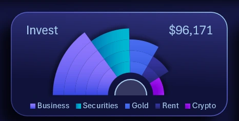
The fan-style chart design effectively presents the distribution structure of personal capital across an individual investment portfolio. Capital is segmented into shares of investment assets with varying risk levels:
- Business investments.
- Securities.
- Gold.
- Real estate (from parking spaces to commercial properties).
- Cryptocurrencies.
The modern financial world offers a wide range of investment options with a low entry threshold for building a portfolio to preserve and grow personal finances.
Loan management
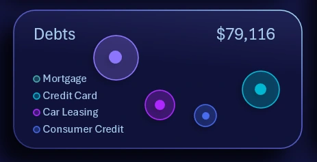
A bubble chart for monitoring repayment of debt across different bank products with varying interest rates:
- Mortgage.
- Credit cards.
- Car leasing.
- Consumer loans.
The larger the bubble, the greater the debt amount. Additionally, the further the bubble is from the left side of the block, the higher the interest rate of the loan product, making it riskier and requiring higher repayment priority. This is shown in detail on the "Debts" dashboard screen.
Personal financial goals
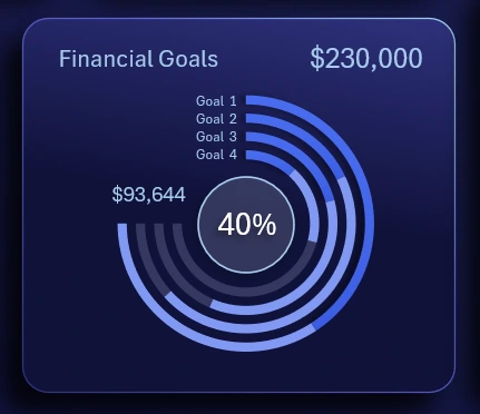
A progress chart for achieving personal financial goals. Four financial goals totaling $230,000 were planned for one year. As of June, 40% of the total has already been achieved. Each goal has a different planned amount, so they will progress at different rates across months. To conveniently track these parameters, the chart is designed as running tracks in a stadium, which is familiar to the human eye. Additionally, a large amount of information for different goal parameters is compactly displayed on a small dashboard area.
Summary table
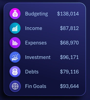
A summary table of all financial indicators for effective tracking and managing personal finances in Excel.
We have reviewed the main dashboard screen in detail. Next, we move on to explore all screens of the dashboard for a detailed analysis of financial metrics and personal fund usage.
Budgeting expenses and income
A dashboard screen for detailed analysis of expenses and budget allocation. Here, you can analyze both overall budget segmentation and the historical dynamics of spending and income by month.
The local button block allows selective comparison of different curves on the line chart. By default, it is recommended to compare two curves of expenses and income for different categories. However, the interface imposes no restrictions, allowing the user to compare any number of curves, even all six metrics on a single chart, or show each parameter with 1, 3, 4, or 5 curves on a line chart with a cursor.
Analysis and planning of personal income
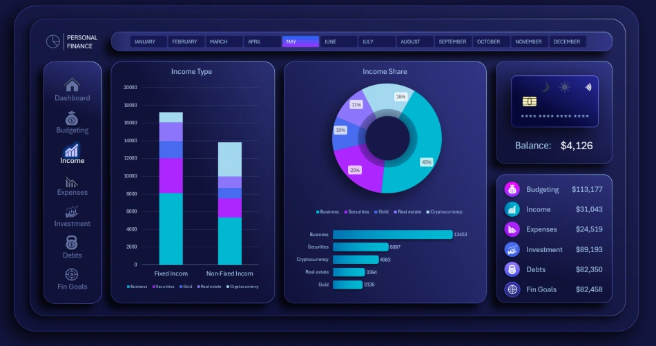
Income is first analyzed on a clustered bar chart consisting of only two bars for two categories: fixed and variable. Each bar is then divided into five income sources.
The income chart segments data by five sources. Below it is a horizontal bar chart ranking the volume of income sources in descending order.
Monitoring personal expenses by category
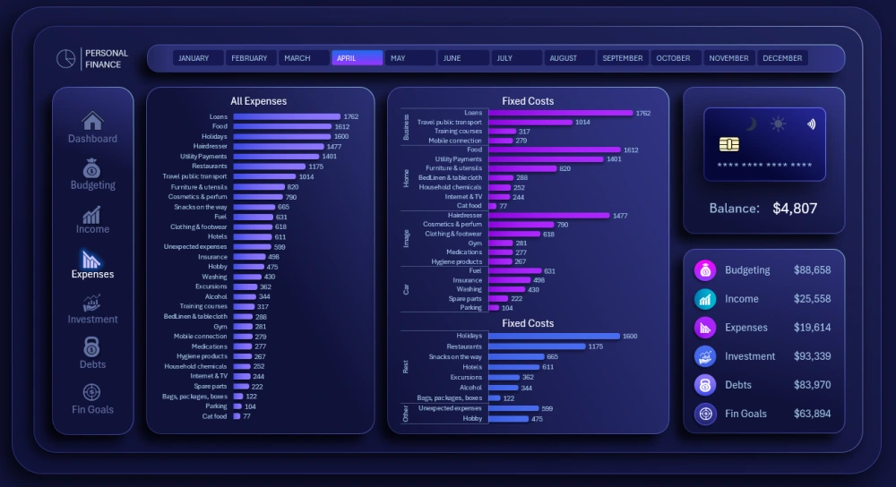
Expenses are analyzed by category on ranking charts sorted in descending order.
On the left side of the dashboard is a chart ranking all annual expense categories in descending order:
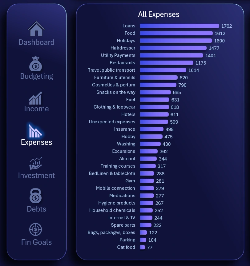
Here, users can assess the overall picture and understand where money is spent the most.
On the right side, structured rankings by category of personal expenses are displayed:
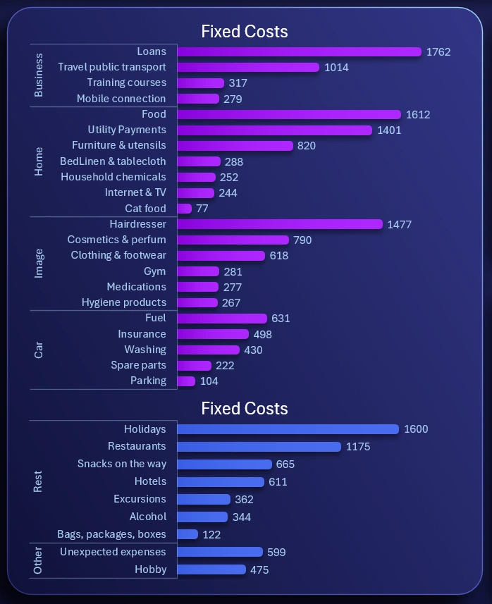
These are the same data presented in a structured format.
There are more than 30 expense categories. This covers all possible ways personal finances can be spent in a year. Some expense categories may have a value of 0 in certain months, but that does not mean they won’t recur in the following month. Certain items are purchased less frequently than monthly, but all expenses are visible throughout the year.
Analysis of personal investment portfolio
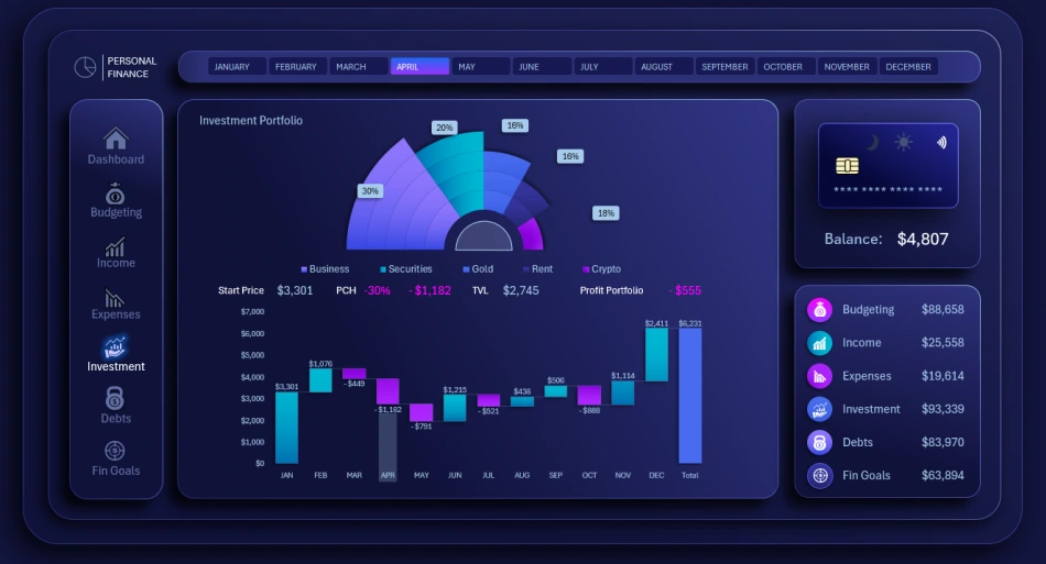
A detailed analysis of the personal investment portfolio is presented in two types of charts. The first summary chart shows how the portfolio is segmented by investment assets.
The lower waterfall chart shows how the total portfolio value changed month by month throughout the year.
This allows tracking decreases and increases in personal investment value and the absolute difference compared to the previous month. The height of the bars visually represents relative percentage changes.
Optionally, a horizontal line can be added across all months and bars at the level of the first bar in January, representing the portfolio value at the beginning of the year. This visually helps assess drawdowns below the level or profits above it, but avoid overloading the chart with unnecessary enhancements.
When selecting each month, a semi-transparent cursor highlights the corresponding bar for convenient use.
Managing Bank Loan Repayments
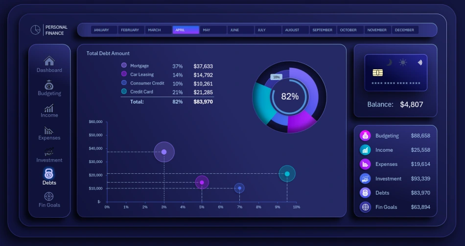
A screen for analyzing debt obligations across bank loan products. The analysis is done using two visualizations. At the top, a multi-layered chart shows the progress of loan repayments. The chart is segmented by loan type, with the last segment representing the total share of repaid loans. In the center, a summary progress chart shows how much remains to be repaid from the total initial debt across all loans.
The bubble chart below displays the debt amount using the size of each bubble and the interest rate using its distance from the left side of the screen. The X-axis represents the interest rate. The higher the interest rate, the further the bubble is from the left edge, indicating a more expensive loan to service. Higher-cost loans carry higher risk and should be repaid faster.
Monitoring Progress Toward Personal Financial Goals
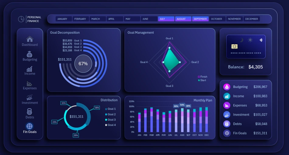
Analyzing progress toward personal financial goals is essential in any personal finance management application. Unfortunately, not all developers fully appreciate this feature. In most cases, the focus is on expense control, but the user’s true goal should be pursuing financial rewards rather than merely reducing expenses. This represents a completely different and significantly higher level of motivation.
Of course, expense control is important, but the user must always remember the answer to the most critical question in life – “WHY?” This answer determines motivation. Without motivation, a person cannot overcome debt or even take a breath. Discipline is also important, but if a person is properly motivated, staying disciplined comes naturally, making it easier to achieve positive results.
The main progress chart, designed as running tracks in a stadium, is responsible for monitoring personal financial goals.
The next diamond-shaped chart shows progress on the four goals from a helicopter view (bird’s-eye perspective). It provides a high-level view without being too distant, allowing a clear assessment of the overall situation during the selected accounting period.
Two additional auxiliary blocks visualize goal-related data: a segmentation chart showing the volume of the four personal financial goals, and a clustered bar chart displaying monthly progress.
Dashboard Template Presentation for Managing Personal Finances in Excel
Light version of the Dashboard design
All charts and dashboard screens are harmoniously combined into a comprehensive tool for managing personal finances in Excel:
Download the best template for managing personal finances in Excel 
Despite the wide variety of data visualizations on this dashboard, there is always room for improvement. After downloading the template, you can continue expanding its capabilities. For example, the ability to switch between years would be a valuable addition for users planning their personal budgets and financial goals over the long term.
Perfection has no limits. Use this template as a concept for your future family budget applications or other systems in this category. It already contains practical ideas, such as a list of more than 30 annual personal expense categories, a collection of chart designs, and much more.

Data Visualization Charts for Interactive Report Creation in Excel.
Dashboard Templates