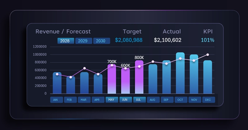
Combo bar chart for revenue forecast analysis in Excel
Revenue analysis and sales forecasting are key tasks for evaluating business performance. In Excel, this process can be organized through a unified control block of interactive data visualization that defines analysis parameters for the entire dashboard.
How to effectively manage revenue analysis and sales forecasting in Excel
Excel allows you to create combined charts for reports with high visual informativeness. Moreover, they can be made interactive. Pivot table filter buttons not only control the data in visualizations but also enable segmentation and grouping of metrics based on user-defined conditions. This level of interactivity significantly expands the capabilities of a visual report, turning it into an effective presentation tool.
It is exactly the presentation elements in data analysis that help improve the effectiveness of managing that data. After all, what is the main goal of a presentation? Not just to attract attention, but to demonstrate a solution.
The combined column chart in Excel displays actual revenue by month as columns and a sales forecast line with markers, complemented by a KPI indicator for plan achievement. This creates a clear understanding of the factors influencing positive outcomes. That is the essence of any effective analysis. It is not enough to know the situation — it is far more important to apply that knowledge in practice. Knowledge that is not applied becomes informational noise. Wisdom is not just knowledge, but the application of knowledge. That is what distinguishes a manager from an analyst.
See an example of how this visualization block can be applied in practice on a dashboard. As a result, a complete system of interconnected values is formed, where all cause-and-effect relationships can be easily tracked:
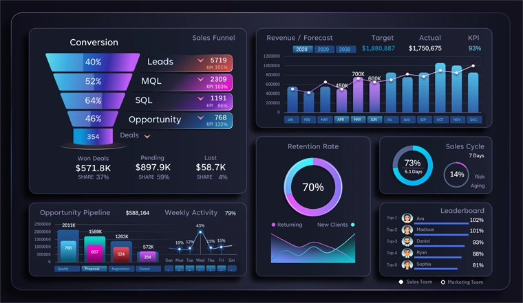
Dashboard for analyzing and presenting CRM data in Excel
The flexibility of selecting periods and segmenting data allows analytics to be adapted to different business scenarios and provides precise management insights. Therefore, always create dynamic charts, and your Excel dashboard will become the best presentation tool for reports — something that cannot be achieved in PowerPoint.
Using a combined chart and an interactive control panel transforms Excel into a powerful tool for sales analysis. Flexible period selection and the ability to combine them provide deep data granularity and accurate KPI evaluation. This approach helps track plan performance, identify trends, and make informed decisions for revenue growth.
 Download the combined bar chart for revenue forecast analysis in Excel

Data Visualization Charts for Interactive Report Creation in Excel.
Dashboard Templates