CRM dashboard for effective sales management in Excel
The sales performance analysis dashboard template for a CRM system allows you to create interactive reports in Excel. It includes all the most essential data visualizations that a CRM dashboard should display. An example of how Excel can support business sales management systems.
How Excel Flexibly Extends CRM System Capabilities
Each year advertising becomes more expensive while the return on investment continues to decline. The cost per lead keeps increasing. The reason is clear — intense competition for customers. The time has come to focus on sales quality rather than the number of leads squeezed from inflated advertising budgets.
In the software development industry today, the market is mainly divided between two categories: B2B and entertainment. If we look deeper into the marketing analysis of the B2B consumer segment, the largest share belongs to sales management solutions, followed by project management.
From a global perspective, the primary challenge in the sales management category today is maintaining the profitability of the advertising budget. Without advertising, nothing gets sold. The idea that a good product should sell itself is a myth. This claim has been disproven by many experiments. One of the most famous was conducted by The Washington Post on January 12, 2007. Joshua Bell stood in the L'Enfant Plaza metro station passage in Washington during rush hour and played his Stradivarius violin (made in 1713), which at the time was valued at around 3.5 million dollars. In 45 minutes, 1,097 people passed by him and he earned only 32 dollars and 17 cents (20 dollars of that amount were given by the one person who recognized him). There are many similar examples, and if you are an entrepreneur, you have probably encountered undervalued products and services in the market more than once.
Advertising will exist as long as money exists. Advertising even exists in nature — for example, flowers are a vivid form of advertising for bees and other insects.
As a result, businesses today face a difficult situation. On the one hand, advertising cannot be abandoned. On the other hand, advertising continues to become more expensive. The only solution is to improve the quality of product or service delivery. This is exactly what software tools for effective sales management are designed for. ERP and CRM systems help businesses improve the quality of customer interaction. Interactive data visualization capabilities in Excel increase flexibility in sales management by enabling fast, high-quality, and relatively simple development of CRM dashboards tailored to specific business or market conditions.
You can verify this by using our free template. To understand the principles behind the dashboard structure and its usage, we will review all visualization blocks in detail so they can later be used or customized according to your conditions and requirements.
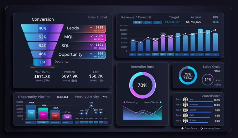
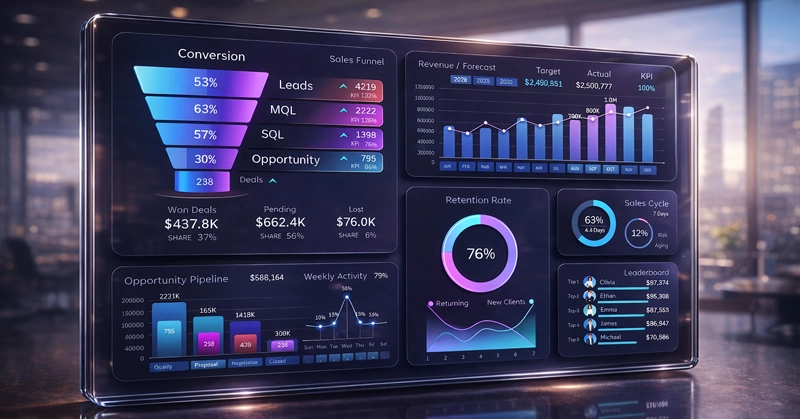
Sales Funnel for Managing Lead-to-Deal Conversion
The first visualization block in the CRM dashboard is, of course, the funnel:
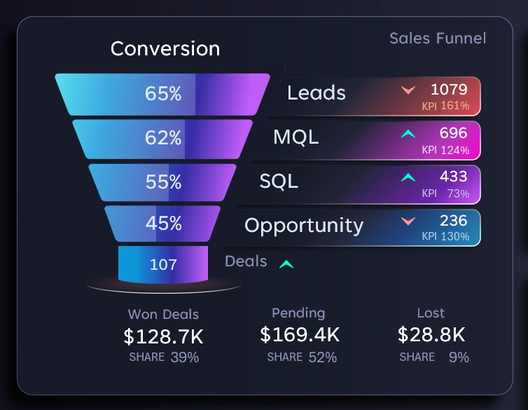
Here the user can analyze the stages of converting leads into successful deals. This block is primarily important for the marketing department. In this version of the sales funnel, four progression levels are presented:
- Raw Lead - a contact that has shown initial interest.
- MQL = Marketing Qualified Lead - a lead that has passed marketing qualification and matches the target customer profile.
- SQL = Sales Qualified Lead - a contact confirmed as a real opportunity for closing a successful deal.
- Opportunity – the stage where the sales department works with customers within the pipeline.
- the deal value is recorded;
- the negotiation stage is defined;
- there is an expected closing date;
- a deal status is assigned with the probability of closing (%).
As a result, the funnel of leads returns a certain number of successful deals and, most importantly, a specific total value.
Final metrics:
- Volume of closed successful deals.
- Volume of deals in progress.
- Volume of lost deals.
At each stage of the sales funnel, the conversion rate and the number of potential customers are displayed.
Arrows highlight the comparison of the metric with the previous equivalent reporting period (higher or lower).
Visualization of Pipeline Stages in Excel
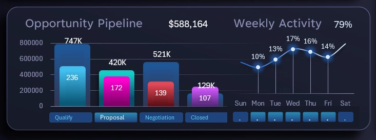
This block shows the structure of lead processing at the lowest level of the funnel – Opportunity. The entire sales funnel is built and managed by the marketing department, but the final level is largely the responsibility of the sales team. It is at this stage that sales representatives are most responsible for converting leads into actual sales.
The process consists of four sequential stages:
- Qualification – the goal is to confirm the viability of the deal by conducting discovery meetings or calls to determine the potential customer's needs.
- Proposal – the objective is to present the unique advantages of the offer tailored to the buyer’s needs.
- Negotiation – agreement on the conditions required to finalize a successful deal.
- Contract – the primary goal is to formalize the deal, and the secondary goal is to build and accumulate a base of loyal customers.
The visualization is implemented as an interactive two-layer bar chart:
- Layer showing deal value metrics.
- Layer showing the number of deals in the queue.
On the right side of the block there is a small sparkline used to analyze and monitor the average sales activity across the days of the week. The total weekly volume is distributed across seven shares in percentage terms. With simultaneous selection, it is possible to determine the share of activity on specific days. For example, you can estimate the percentage of activity that occurs on weekends, compare peak days with other days, or track anomalies in activity increases or decreases during holidays.
All interactive buttons have limited permissions that do not extend beyond the visualization block. They are intended exclusively for local interaction with the data.
Monthly Revenue Analysis and Forecast
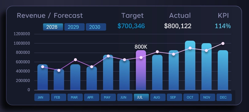
This is the main control block for managing the dashboard. The permissions of all its interactive elements apply to the entire dashboard and are intended for global dashboard control.
It is in this block that we specify reporting periods for selecting data by years, months, quarters, half-years, or active and passive sales seasons. Multi-selection on pivot table slicer buttons in Excel allows grouping and segmenting ranges of time intervals. For example, if we simultaneously select April, May, and June (while holding the CTRL key on the keyboard), we create a data selection for the second quarter across the entire dashboard.
The visualization block itself is quite informative and does not require detailed explanation. The combined bar chart displays monthly revenue dynamics, while the line with markers represents the predefined monthly sales plan forecasted by the analytics team.
The KPI indicator (in the upper right corner) shows the percentage of plan fulfillment for a given month or any selected reporting period.
Switching between years also allows selecting data for multiple years simultaneously. For example, in this case you can see a three-year KPI if all years are selected on the control panel at once. If a single year and all months are selected, the result will be an annual KPI indicator, and so on.
Analysis of Customer Retention and New Customer Acquisition
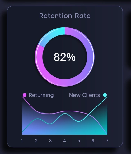
60% of profit comes from returning customers. The most effective advertising always achieves higher profitability when it targets businesses or customers that already recognize your brand.
This block shows the share of customers who return within one week for a second purchase.
Below are two lines on the chart. The first descending line represents the dynamics of customer retention. The second line represents the growth of new buyers over the same period. It is also interesting to track the intersection points of these two curves. Their intersection point is called substitution, also known as the equilibrium point or stagnation level.
Three analytical models for evaluating retention of existing customers and the inflow of new customers based on the position of the equilibrium point:
- Customer base replenishment and renewal rate – if the intersection point is closer to the left side, it means the database renewal rate is high; however, the further the equilibrium point moves toward the right side, the higher the overall customer base growth rate.
- Marketing strategy “capacity” limit. The further the intersection point shifts to the right, the stronger your marketing strategy.
- Viral loop efficiency. If the intersection of new and returning customer activity occurs too early on the chart (on the second or third day), it is a negative signal indicating that customer engagement retention declines too quickly and cannot be compensated by the inflow of new customers for explosive growth. Conversely, if the intersection point is located far from the beginning, it indicates a potential long-term growth trend. In such cases, it is advisable to maintain sufficient inventory or other resources to fully capitalize on opportunities created by potential viral growth — which is particularly useful when working with social media promotion algorithms.
A simple but highly useful data visualization block for analyzing marketing strategies and evaluating sales management effectiveness when working with CRM systems.
Sales Cycle Analysis
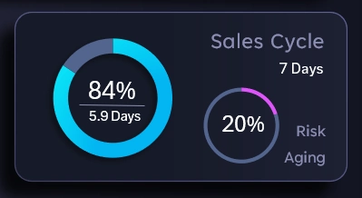
In this example, according to the planning of the analytics team, one sales cycle should take no more than 7 days. The average time per deal is 5.9 days. Therefore, 84% of the available time buffer is being used.
Next to it is the percentage of deals that were closed outside the established cycle plan, meaning older than 7 days. Even though these deals were successfully closed, it is already a warning sign indicating a growing risk of the conversion process becoming outdated. Under these conditions, spending more than 7 days per customer represents an excess in time, financial, energy, human, and other types of resources. It also reflects a significant loss of customer focus toward closing their need relative to their expectations. In other words, the customer may be warmed up using our company’s resources but ultimately fulfill their need with our competitors. The higher the percentage of outdated successful deals, the higher the share of inefficient deals, even if they were closed with profit.
Interactive Leaderboard in Excel
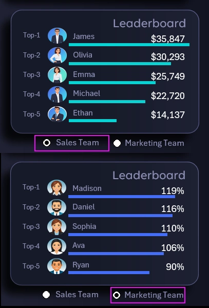
Everything is simple here. A Top-5 ranking of employees from different departments. This block allows identifying leaders during a specific reporting period.
Regardless of whether sales are increasing or decreasing, there is always a debate between two departments: marketing and sales. If sales grow, each department attributes the positive result to its own influence. If sales decline, these two departments exchange mutual accusations for the failure. For this reason, a department switcher was added to the Top-5 leaderboard table. The sales department is evaluated using absolute metrics such as sales volume. At the same time, the marketing department is evaluated using relative performance indicators based on KPI plan fulfillment percentages.
Presentation of a Standard CRM Dashboard in Excel
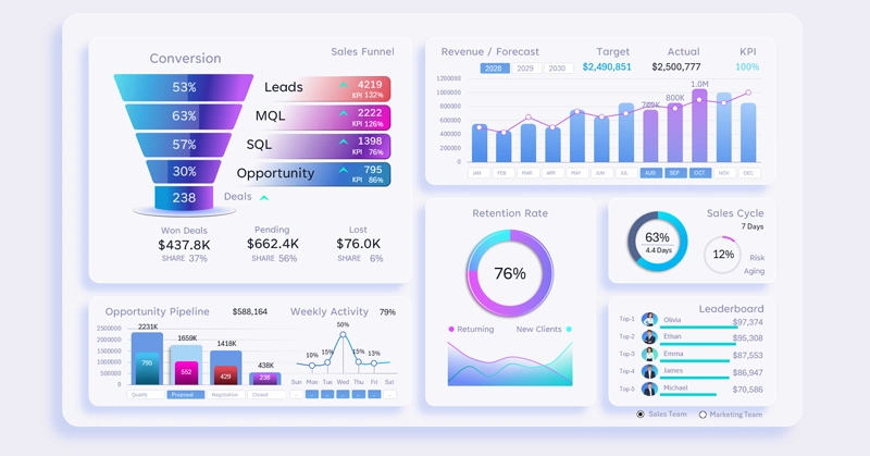
This template analyzes all the core metrics that every classic CRM dashboard should include:
- Sales funnel.
- Pipeline stages.
- Sales dynamics.
- Revenue forecast.
- Average deal closing cycle.
- Manager team activity.
- Customer acquisition and retention metrics.
As shown in this example, all requirements are implemented. You can download the ready-made template and optimize it for the unique conditions and needs of your business:
Download the CRM Sales Management Dashboard in Excel 
In the following examples, new CRM dashboards will be reviewed with different ideas aimed at improving lead conversion quality and advertising budget ROI. Thanks to its simplicity, Excel allows you to quickly create ready-made solutions for unique tasks. It also enables building prototypes for useful software products and developing better technical specifications for developers.

Data Visualization Charts for Interactive Report Creation in Excel.
Dashboard Templates