Comparative analysis using a spaghetti chart in Excel
How can you compare the dynamics of multiple indicators simultaneously in Excel? Classic line charts can overload visual perception. An interactive spaghetti chart in Excel allows you to filter curves on the graph and display selected lines from multiple series within a single view.
How the spaghetti chart works in comparative analysis
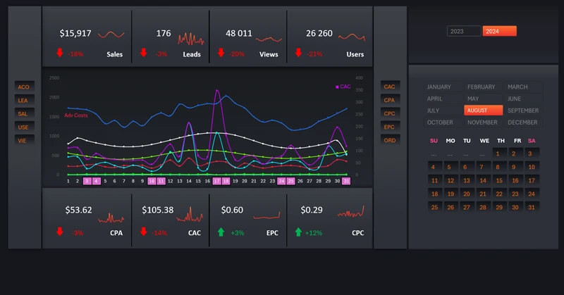
The core implementation principle is based on using Pivot Table filter buttons. These slicer buttons can be added from the Pivot Table tools menu under the Insert section. This provides users with the ability to:
- Identify differences in indicator trends.
- Locate intersection points.
- Determine correlations and interdependencies.
- Track trends across different data categories.
Multiple lines on the chart illustrate changes in metrics across various categories over the selected period. Insight emerges through comparison.
This is a powerful tool not only for analysts but also for Excel dashboard developers. Consider the example below, which demonstrates effective use of a spaghetti chart visualization block for comparative sales performance analysis.
Marketplace sales analysis dashboard in Excel
The spaghetti chart is an effective tool for analyzing complex dynamics and identifying patterns within large datasets in Excel. With proper structuring and visual optimization, it helps reveal:
- deviations from trends;
- growing and declining patterns;
- relative performance efficiency.
An interactive spaghetti chart provides deeper insight into comparative analytics in Excel.


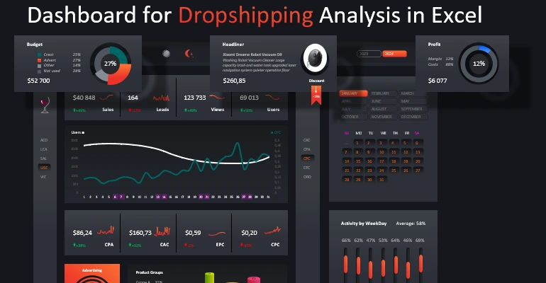
Data Visualization Charts for Interactive Report Creation in Excel.
Dashboard Templates