Data visualization composition for a sales dashboard in Excel
A stylish sales dashboard is not about flashy design or a random set of charts—it is about thoughtful data composition. Proper placement of KPIs, trend charts, and analytical blocks in Excel creates a logical structure that simplifies perception and accelerates managerial decision-making.
Interactive component template for building an Excel dashboard
Balanced dashboard structure:
- Key performance indicators at the top.
- Trend analytics in the center.
- Segment-level breakdown below.
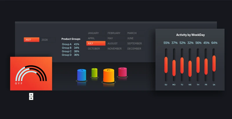
This set of components is designed specifically for the third stage of dashboard construction—segment-level analysis. It includes the following charts:
- Doughnut rating indicators by sales source: G – Google Ads, Y – YouTube, F – Facebook.
- 3D bar chart for comparative analysis across product categories (A, B, C, and D).
- Clustered column chart showing sales activity by day of the week.
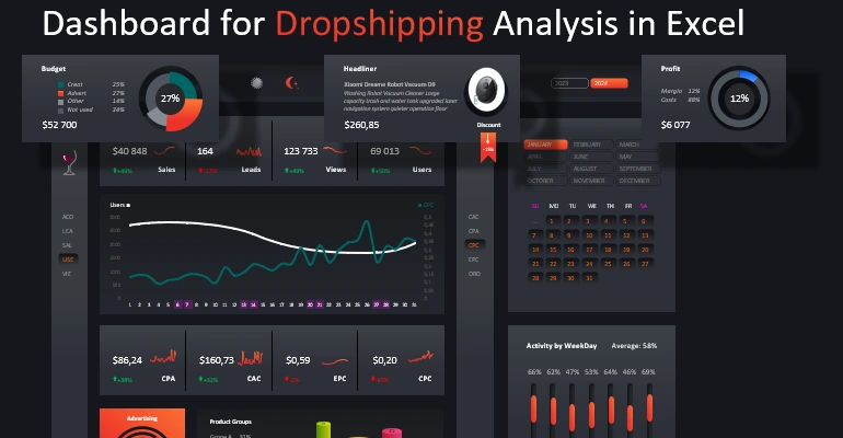
All these blocks create a balance between KPIs, activity metrics, and comparative analysis to form a cohesive data visualization composition in Excel. Below is an example of how this structural solution integrates harmoniously into the overall dashboard style without unnecessary visual overload:
Excel dashboard template for marketplace sales analysis
The composition of visual elements within a dashboard determines its effectiveness as a management tool. Clear data hierarchy, logical zoning, and consistency of graphical elements transform Excel into a strategic analytical panel where each chart supports a unified business overview.
 Download the data visualization composition template in Excel

Data Visualization Charts for Interactive Report Creation in Excel.
Dashboard Templates